

Trade: The Pipeline
The Diagnostic Dozen: A Framework for Reading the Macro Cycle (7 of 12)

Previously in this series: Labor: The Source Code | Prices: The Transmission Belt | Growth: The Second Derivative | Consumer: The Last Domino | Housing: The Collateral Engine | Business: The Forward Commitment
Trade is where domestic policy meets global reality. Every tariff, every currency move, every supply chain disruption flows through the same pipeline: border prices change, input costs adjust, margins compress or expand, and eventually the consumer pays. Most analysts treat trade as a sideshow to growth or inflation. That is backwards. Trade is the transmission belt connecting all three. The dollar is the price of American competitiveness. Import prices are the leading edge of inflation. And the trade balance is the ledger where policy ambition collides with economic gravity.
This pillar matters more now than at any point since the 1930s. The 2025 tariff regime has rewritten the rules of cross-border commerce. Trade policy uncertainty has exploded to record levels. Supply chains that took decades to build are being rerouted in months. The strong dollar is amplifying every tariff into a double hit on exporters while masking the true cost of imports. Understanding how these forces interact is no longer optional for macro investors. It is the difference between seeing the inflation pipeline before it hits and reacting after the CPI print surprises you.
We are going to walk through the indicators that define our Trade Conditions framework. Not as isolated data points, but as a connected system where the dollar drives prices, prices drive competitiveness, competitiveness drives flows, and flows drive the balance. Once you see the chain, the individual readings start telling a story.
The Core Insight: Trade Is a Pipeline, Not a Snapshot
Most people look at the trade deficit and stop. It is big. It is chronic. It is structural. All true, all useless for forward-looking macro. The real value of the trade pillar is not the deficit number. It is the pipeline dynamics underneath.
Here is the chain: A stronger dollar makes imports cheaper and exports more expensive. Cheaper imports suppress import price inflation in the short run, which feels like a tailwind for consumers. But it also destroys export competitiveness, which crushes manufacturing orders, which eventually hits employment. Meanwhile, tariffs work in the opposite direction on prices, pushing import costs higher even as the dollar pushes them lower. The net effect depends on which force is bigger. Right now, we have both forces running simultaneously at historically extreme levels. That is not normal.
The framework tracks this pipeline in real time: dollar strength at the top, import/export prices in the middle, trade volumes and balances at the bottom, and inventory behavior as the feedback loop where trade flows meet domestic demand.
What to Watch and Why
The Trade Conditions Index synthesizes seven weighted components into a single reading. But the individual indicators matter as much as the composite because the sequencing tells you where you are in the cycle.
When the dollar strengthens first and import prices have not yet adjusted, the pipeline is building pressure. When import prices start rising and CPI goods have not followed, the pass-through is in transit. When inventories start building at the wholesale level, importers are front-loading ahead of expected tariffs. Each stage has a different investment implication.
The Indicators That Matter
U.S. Trade Balance: The Structural Deficit
The trade balance is the headline everyone cites and almost nobody uses correctly. The monthly goods and services balance measures the difference between what we export and what we import. A deficit means we consume more than we produce, financing the gap with capital inflows. That is not inherently bad. It is a function of the dollar’s reserve currency status and America’s relative consumption intensity.
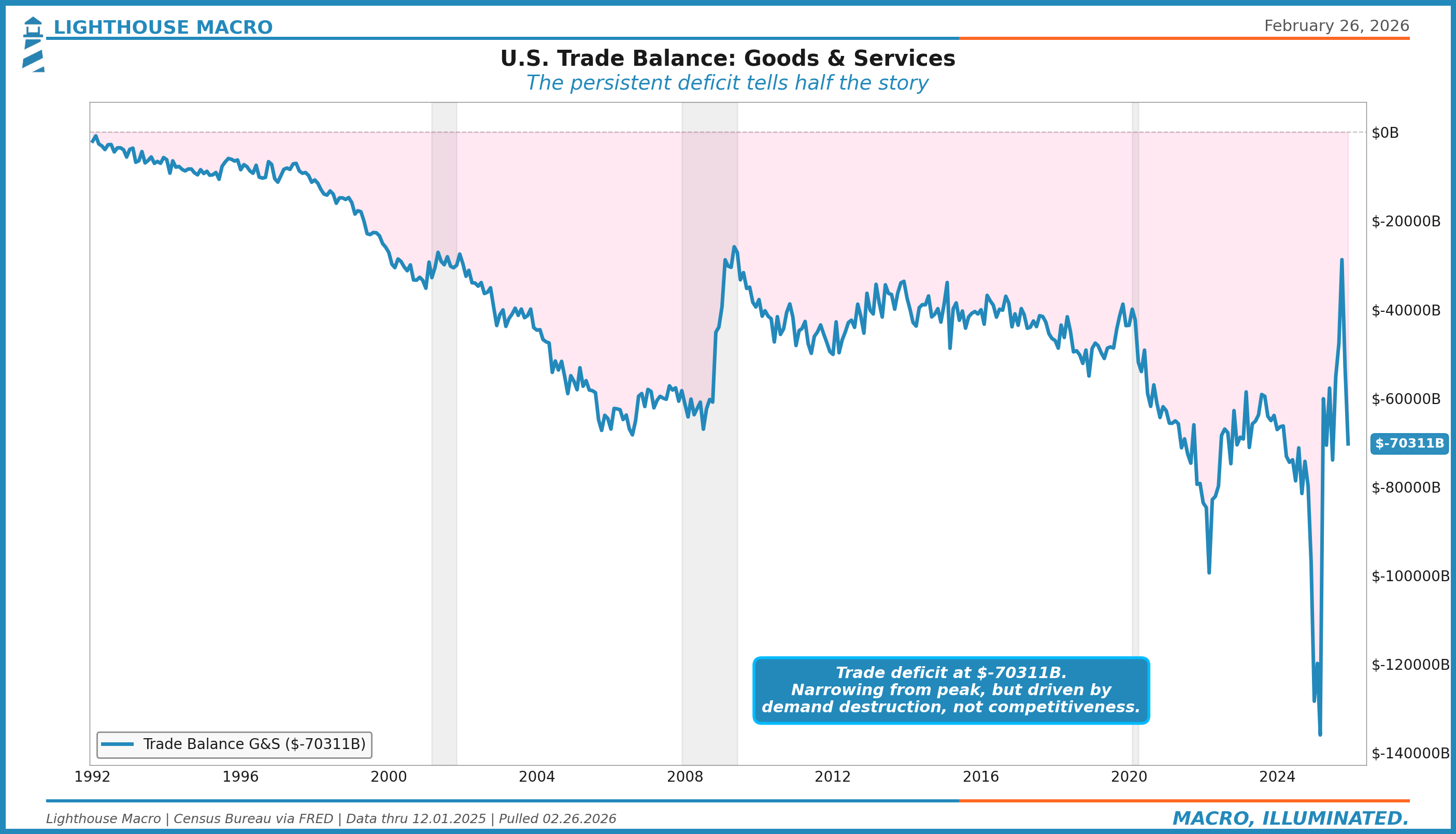
The deficit ran at $70.3 billion in December 2025. That is narrower than the pandemic extremes but wider than anything pre-2020. What matters for macro is not the level but the direction and the driver. A deficit narrowing because exports are growing is bullish. A deficit narrowing because imports are collapsing is recessionary. You need to look inside the number.
The current narrowing is mixed: exports rebounding at 6.3% year-over-year while imports are contracting at -2.6%. That divergence is unusual and worth watching. When exports lead the improvement, it typically signals strengthening global demand. When imports contract simultaneously, it may signal domestic demand weakening or tariff-induced import substitution. The composition tells you the story the headline cannot.
Exports & Imports: Volume Dynamics
The year-over-year growth rates of total exports and imports tell you about demand on both sides of the border. When both are growing, global trade is expanding. When both are contracting, you are looking at synchronized weakness. The divergence between them is the signal.
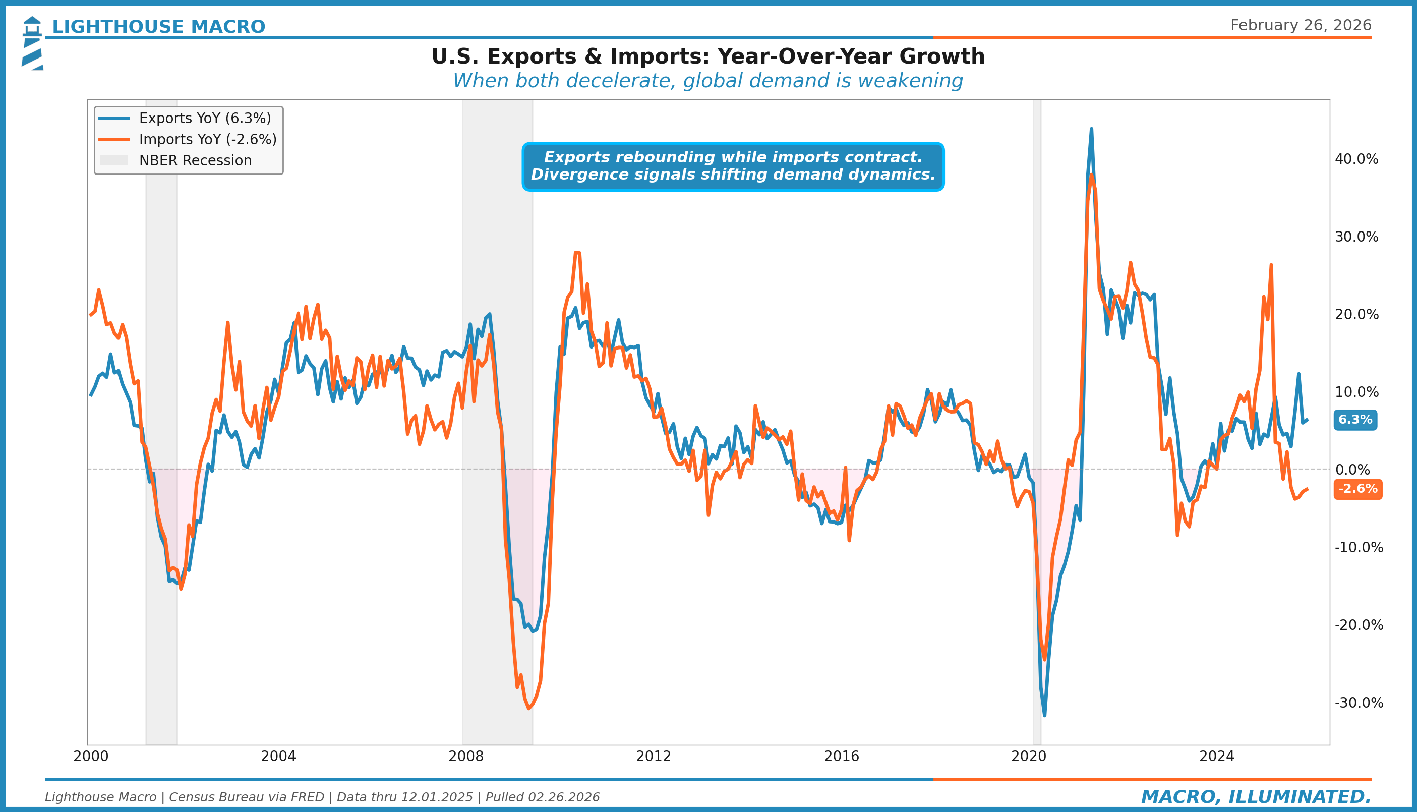
Exports are growing at 6.3% year-over-year while imports are contracting at -2.6%. This is an unusual divergence. Exports rebounding suggests overseas demand is holding up, possibly driven by a weaker global supply of competing goods or restocking by trading partners ahead of tariff uncertainty. Imports contracting could signal domestic demand softening, tariff-induced import substitution, or front-loading effects washing out.
Historically, when exports and imports move in opposite directions for more than two quarters, it signals a structural shift in trade dynamics, not just a cyclical swing. The 2018-2019 trade war episode showed a similar pattern: imports from China collapsed while total exports initially held up before eventually rolling over as retaliation hit. Watch for whether export growth sustains or whether this is a last gasp before tariff retaliation bites.
The Trade-Weighted Dollar: The Competitiveness Gauge
The dollar is the single most important variable in the trade pillar. It determines the price of every import and the competitiveness of every export. We track three versions of the Federal Reserve’s trade-weighted dollar: Broad (all major partners), Advanced Foreign Economies, and Emerging Markets.
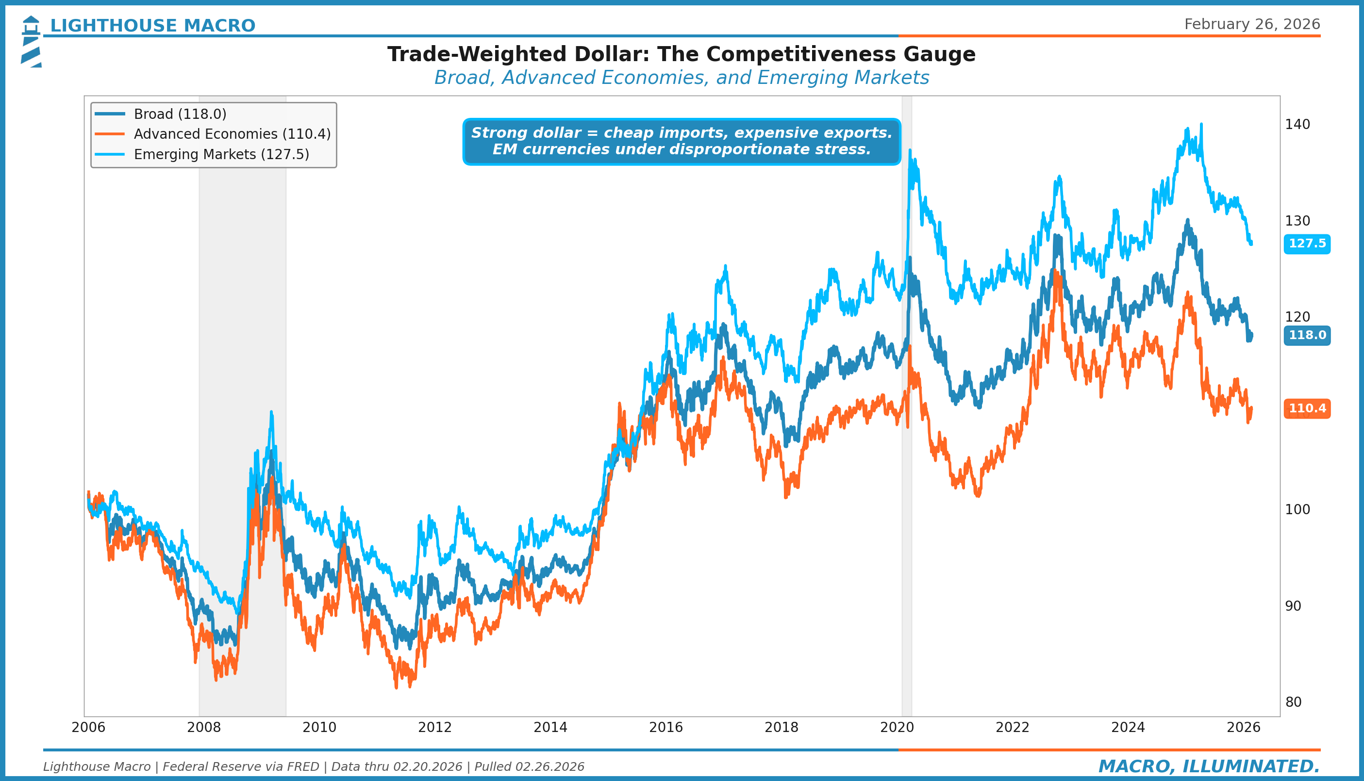
The Broad dollar index stands at 118.0, near its highest levels in two decades. But the decomposition is what matters. The Advanced Economies index at 110.4 is elevated but not extreme. The Emerging Markets index at 127.5 is near record highs. This divergence tells you where the pressure is concentrated: EM currencies are bearing the brunt of dollar strength, which means EM-sourced imports are becoming dramatically cheaper while EM export markets for U.S. goods are becoming prohibitively expensive.
For the framework, strong dollar conditions create a specific pattern: import prices stay suppressed (deflationary for goods), export volumes weaken (drag on growth), and trade-sensitive sectors like manufacturing and agriculture face margin pressure. The current dollar strength is acting as a deflationary force on one side while tariffs push inflationary on the other. These two forces are running a tug of war in real time.
Dollar Z-RoC: The Momentum Signal
Knowing the dollar’s level is useful. Knowing its momentum is better. The Dollar Z-RoC takes the 63-day rate of change in the trade-weighted dollar and z-scores it against a rolling one-year window. This strips out the level and isolates whether the dollar is accelerating or decelerating relative to its own recent history.
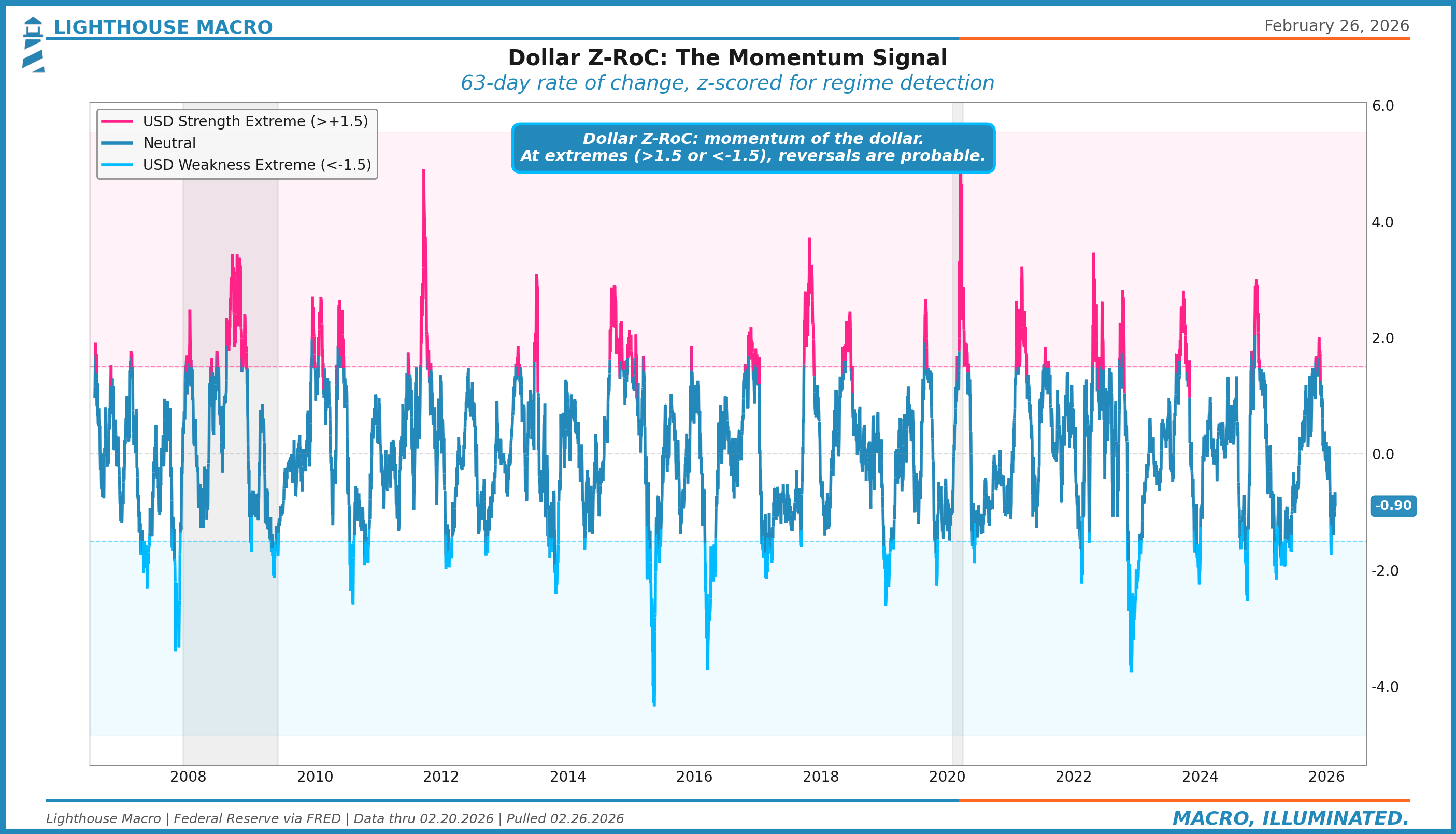
At extremes above +1.5, the dollar is strengthening at a pace that historically reverts. At extremes below -1.5, the dollar is weakening at a pace that typically stabilizes. The current reading near -0.90 is in neutral territory but drifting toward weakness, which would be consistent with tariff-driven capital flow shifts. For the trade pipeline, dollar momentum matters more than dollar level because import price adjustments respond to the rate of change, not the absolute value.
U.S.-China Bilateral Trade: The Decoupling
The China bilateral trade relationship is the single largest component of the U.S. trade deficit and the epicenter of every tariff regime since 2018. Tracking exports to and imports from China separately reveals the structural decoupling that headline numbers obscure.
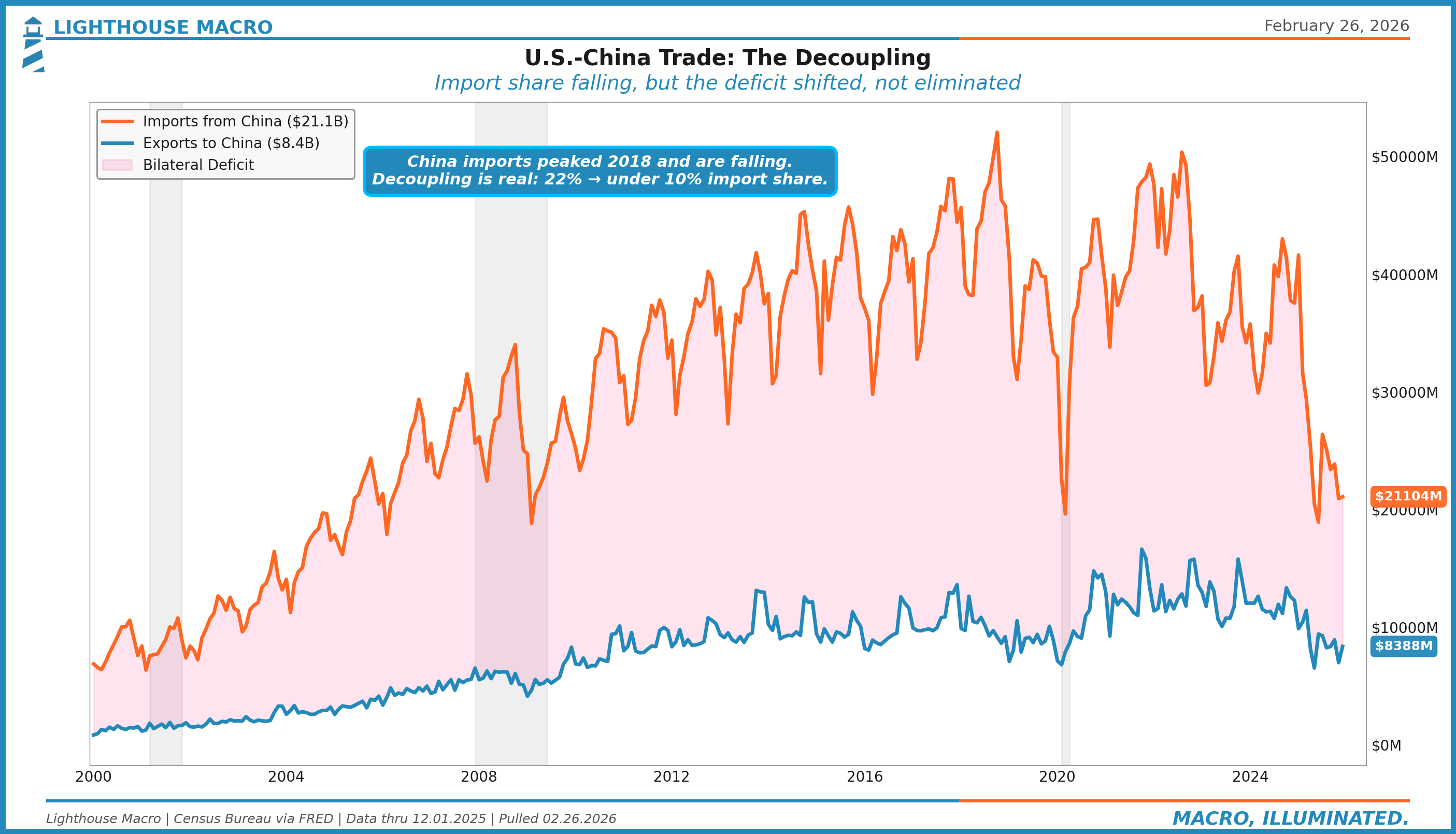
Imports from China peaked in 2018 and have been structurally declining since. China’s share of total U.S. imports has fallen from roughly 22% to under 10%. That is a real decoupling. But the deficit did not shrink proportionally. It shifted. Vietnam, Mexico, India, and other manufacturing hubs absorbed the redirected flows. The aggregate deficit persists because the fundamental driver was never China-specific. It is the combination of U.S. consumption intensity, the reserve currency premium, and comparative advantage in services over goods.
Exports to China at $8.4 billion monthly remain a fraction of imports. The bilateral deficit is structural and deeply embedded in supply chain geography. For the framework, China bilateral data is a proxy for tariff regime effectiveness. When China imports fall but total imports hold steady, trade diversion is dominating trade reduction. The tariffs changed the routing, not the volume.
Import Prices vs. CPI Goods: The Inflation Pipeline
This is the most underappreciated lead-lag relationship in macro. Import prices lead CPI goods by three to six months. The mechanism is straightforward: when what you pay at the border goes up, what you pay at the register eventually follows. The lag exists because retailers absorb margin compression before passing costs through, and because inventory buffers create a time delay between purchase and sale.
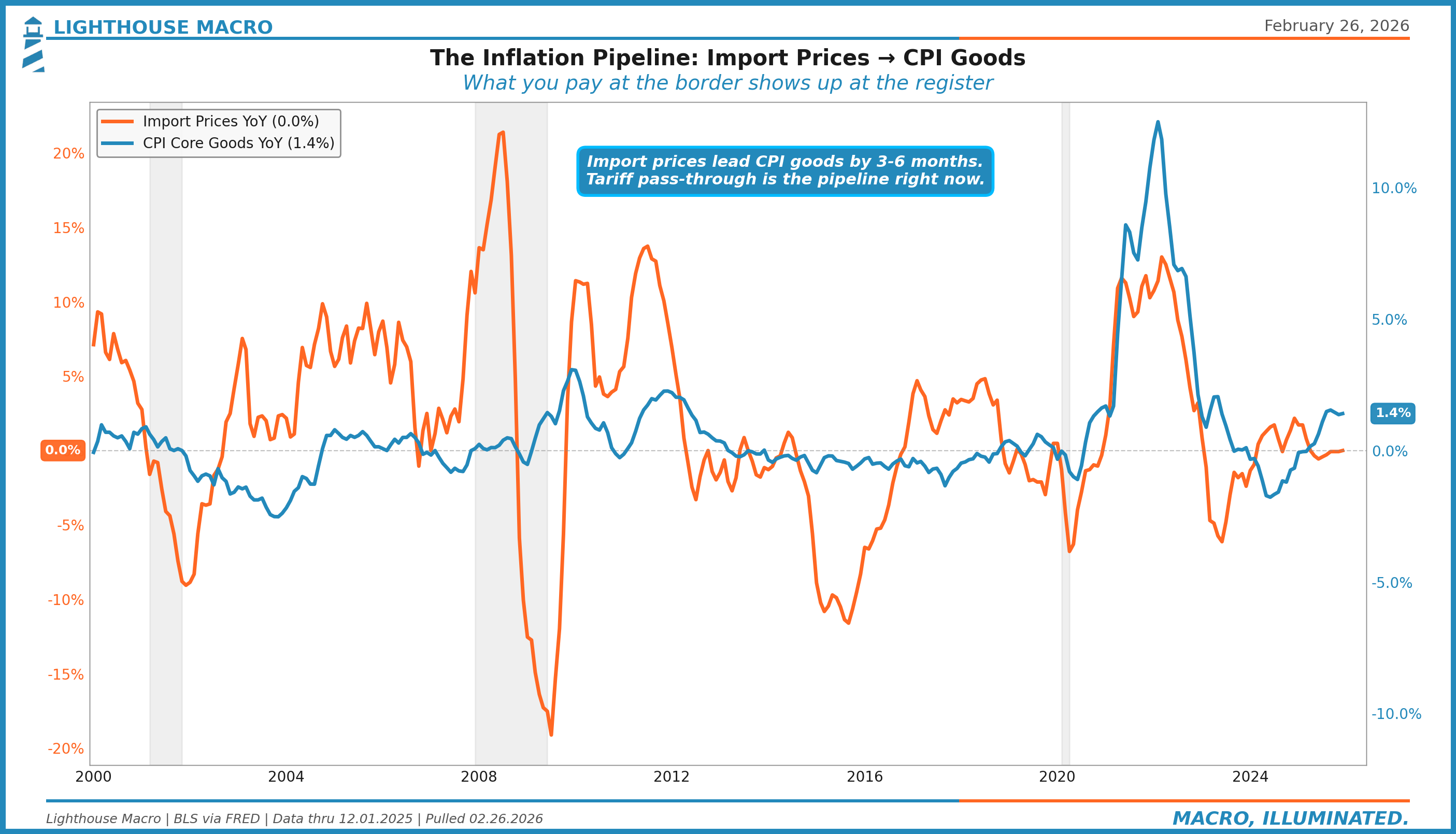
Import prices are essentially flat year-over-year at 0.0%. CPI core goods are running at 1.4%. The pipeline is calm. But this is December 2025 data, before the full implementation of the 2025 tariff regime. The question is not where import prices are. It is where they are going.
The historical pattern is clear: every significant import price acceleration has preceded a CPI goods acceleration by three to six months. The 2021-2022 episode was textbook. Import prices surged above 11% year-over-year in mid-2021. CPI goods followed, peaking months later. The pipeline works in both directions. The 2023 disinflation was also led by import price deflation. This relationship is one of the most reliable in our framework.
Import Price Components: Where the Pressure Lands
The headline import price index is dominated by petroleum, which makes it noisy and unreliable for tracking tariff pass-through. Decomposing import prices by end-use category reveals where the actual pressure is building.
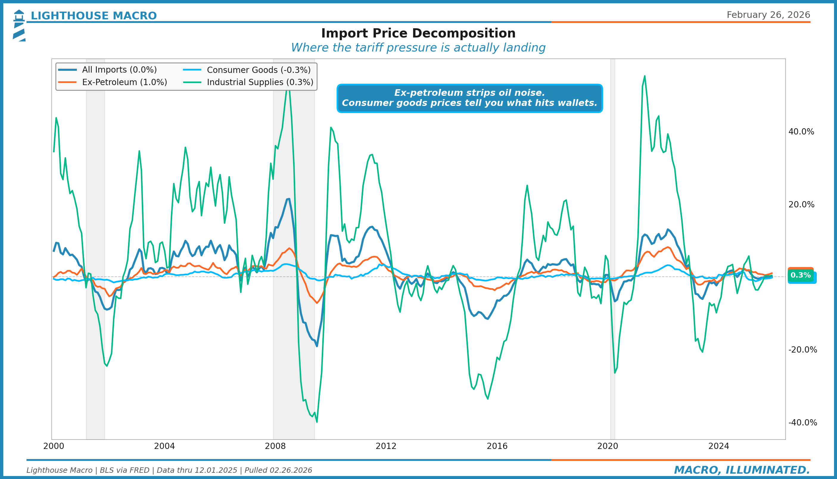
The ex-petroleum index at +1.0% year-over-year is the cleanest read on underlying import inflation. It strips out the oil noise that dominates the headline. Consumer goods prices at -0.3% are still deflating, which tells you that tariff pass-through to final goods has not yet materialized in the data. Industrial supplies at +0.6% are barely positive, suggesting input cost pressures are muted.
This decomposition matters because different components hit different parts of the economy at different speeds. Industrial supplies feed into PPI and manufacturing costs within one to two months. Consumer goods feed into CPI goods within two to four months. Capital goods prices affect investment spending decisions on a longer horizon. Right now, all three are near zero. That calm will not last if the 2025 tariff schedule takes full effect.
The Tariff Pipeline: Import Prices to Core PCE
If import prices vs. CPI goods shows the pipeline for goods inflation, this chart shows the deeper pipeline to the Fed’s preferred measure. Import prices ex-petroleum, lagged four months, track Core PCE with remarkable consistency. This is the chain the Fed is watching.
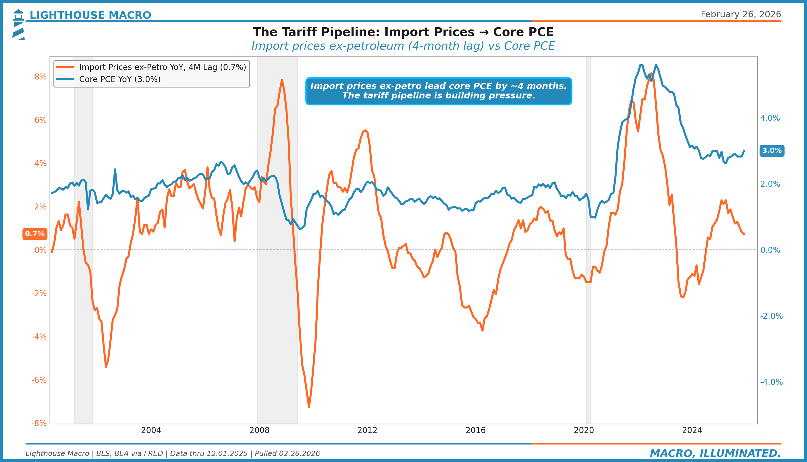
Import prices ex-petroleum lead Core PCE by approximately four months. The current reading of 0.7% on import prices suggests Core PCE pressure should remain contained in the near term. But the lag is the weapon. If import prices accelerate from here due to tariff implementation, the Core PCE impact arrives in mid-2026, right when the Fed is trying to navigate its next rate decision. This is the pipeline that keeps the Fed in a box: they cannot cut rates to support growth if trade-driven inflation is coming through the pipeline.
Terms of Trade: The Competitiveness Barometer
The terms of trade ratio (export prices divided by import prices, indexed to 100) tells you whether the U.S. is getting a better or worse deal on its cross-border transactions. Above 100 means we earn more per unit of exports than we pay per unit of imports. Below 100 means the opposite.
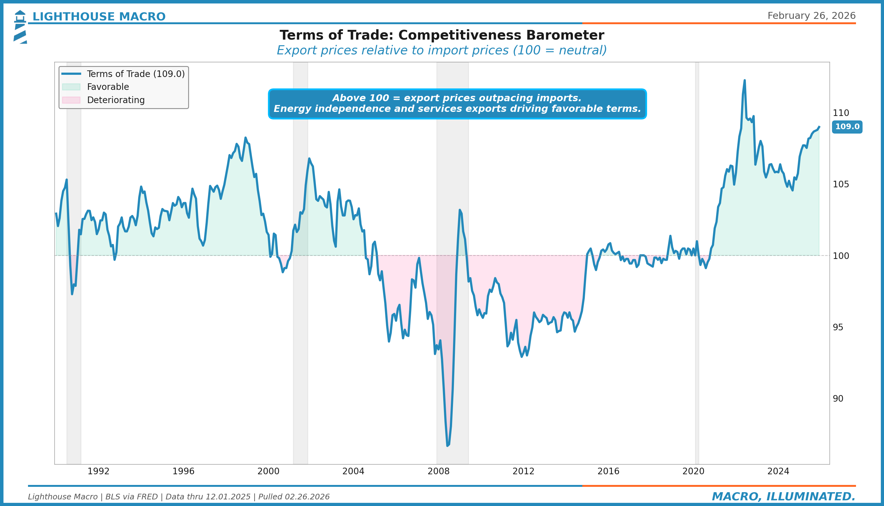
The terms of trade at 109.0 is near its highest level in decades. This is counterintuitive. How can U.S. terms of trade be favorable when the trade deficit is $70 billion? Because the U.S. exports high-value goods (capital goods, technology, agricultural commodities) while importing lower-value manufactured goods. The dollar’s strength suppresses import prices more than it suppresses export prices because U.S. exports are priced in dollars and face less competitive substitution.
For the framework, favorable terms of trade are typically expansionary but can mask building imbalances. If the terms of trade are favorable because import prices are depressed by dollar strength rather than genuine productivity gains, the reversal, when it comes, creates a sudden inflationary impulse. A 10-point decline in the terms of trade historically corresponds to a 1-2 percentage point increase in import price inflation within six months.
Trade Policy Uncertainty: When Businesses Cannot Plan
The Economic Policy Uncertainty Index for trade (from PolicyUncertainty.com) measures the frequency of trade policy-related uncertainty in news coverage and economic forecasts. It captures the meta-level of trade disruption: not the tariffs themselves, but the inability to plan around them.
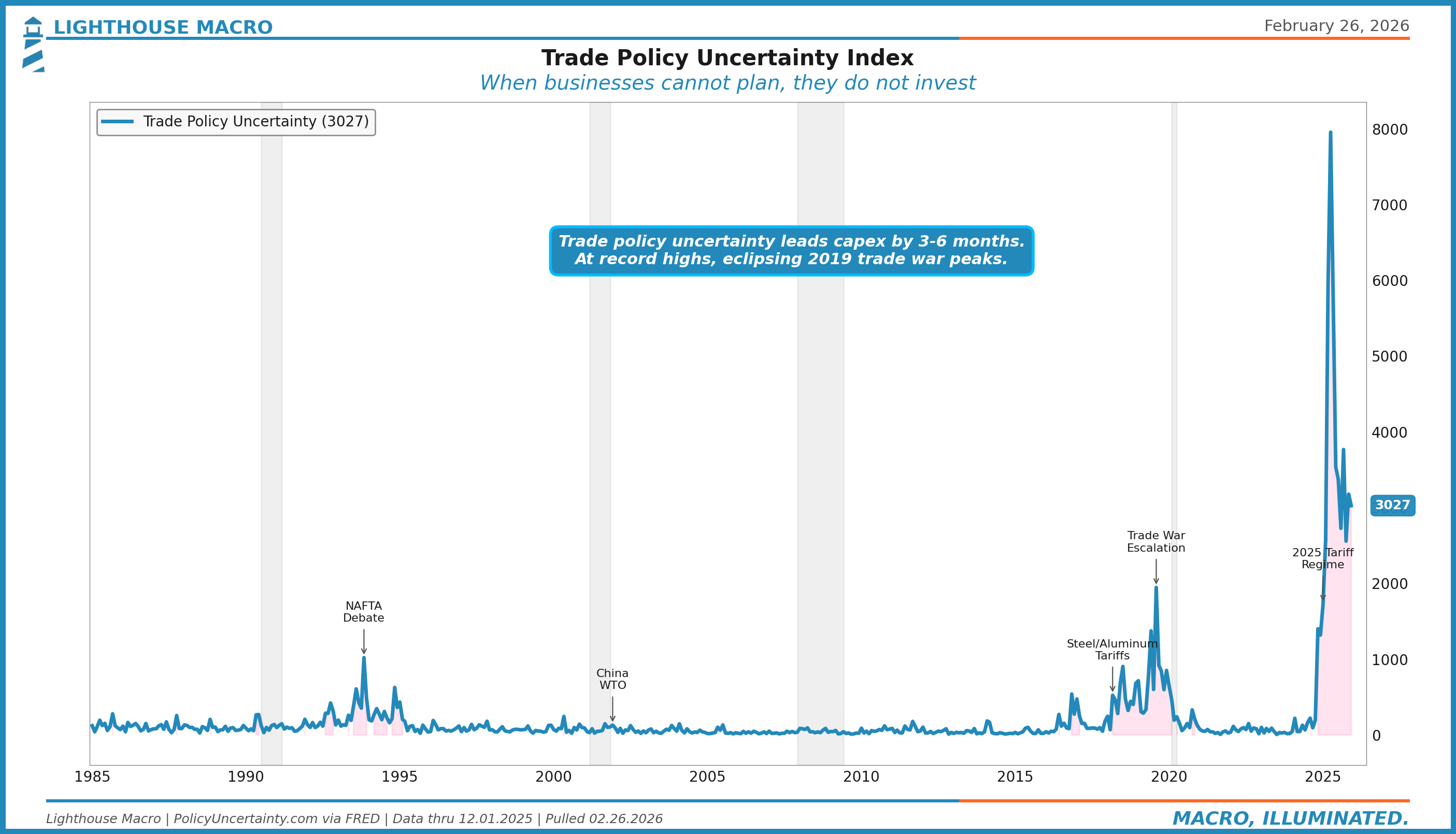
This chart is the single most important visual in the trade framework right now. Trade policy uncertainty at 3,027 is not just elevated. It is at record highs by a wide margin. The 2019 trade war peaks, which felt extreme at the time, registered around 1,000-1,500. The NAFTA debates of the early 1990s barely moved the needle by comparison. The current reading is in uncharted territory.
Why this matters: trade policy uncertainty leads capital expenditure by three to six months. When businesses cannot plan their supply chains, they do not invest. When they do not invest, orders contract. When orders contract, employment follows. The transmission from trade uncertainty to real economic activity is well-documented. The current level of uncertainty is consistent with a significant capex pullback in the second half of 2026, all else equal. This is the single biggest risk from the trade pillar feeding into the Business pillar.
Current Account: The Financial Mirror
The current account balance is the broadest measure of U.S. external transactions. It includes the trade balance (goods and services) plus primary income (investment returns) and secondary income (transfers). Every trade deficit must be financed by a capital account surplus, meaning foreigners must buy U.S. assets to offset the trade imbalance.
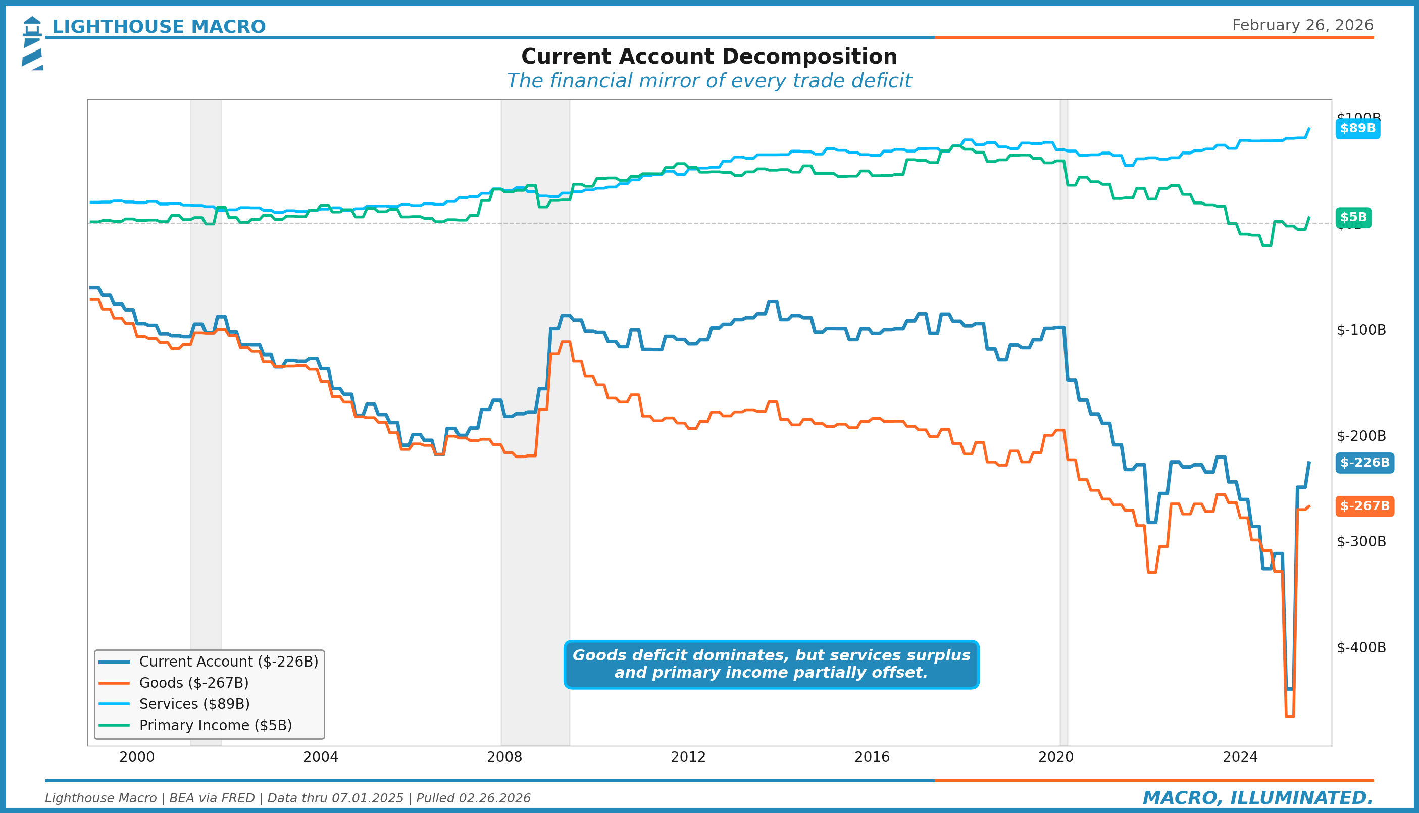
The quarterly current account deficit of $226 billion (annualized roughly $900B) is dominated by the goods deficit at $267 billion. Services run a consistent surplus of $89 billion, reflecting U.S. dominance in financial services, technology licensing, and tourism. Primary income is nearly balanced at $5 billion.
For the macro framework, the current account is structural rather than cyclical. It moves slowly and tells you about long-term sustainability rather than near-term direction. The key risk is not the deficit itself but the financing mechanism. When foreign appetite for U.S. assets weakens (rising term premium, declining Treasury demand), the current account deficit becomes a funding vulnerability. This is where the Trade pillar connects to the Government pillar: fiscal deficits widen the current account, and both must be financed by the same pool of foreign capital.
Real Net Exports: The GDP Drag
Net exports as a GDP component puts the trade deficit in growth terms. Real net exports measure the actual subtraction from GDP in chained dollars, stripping out price effects to show the volume drag.
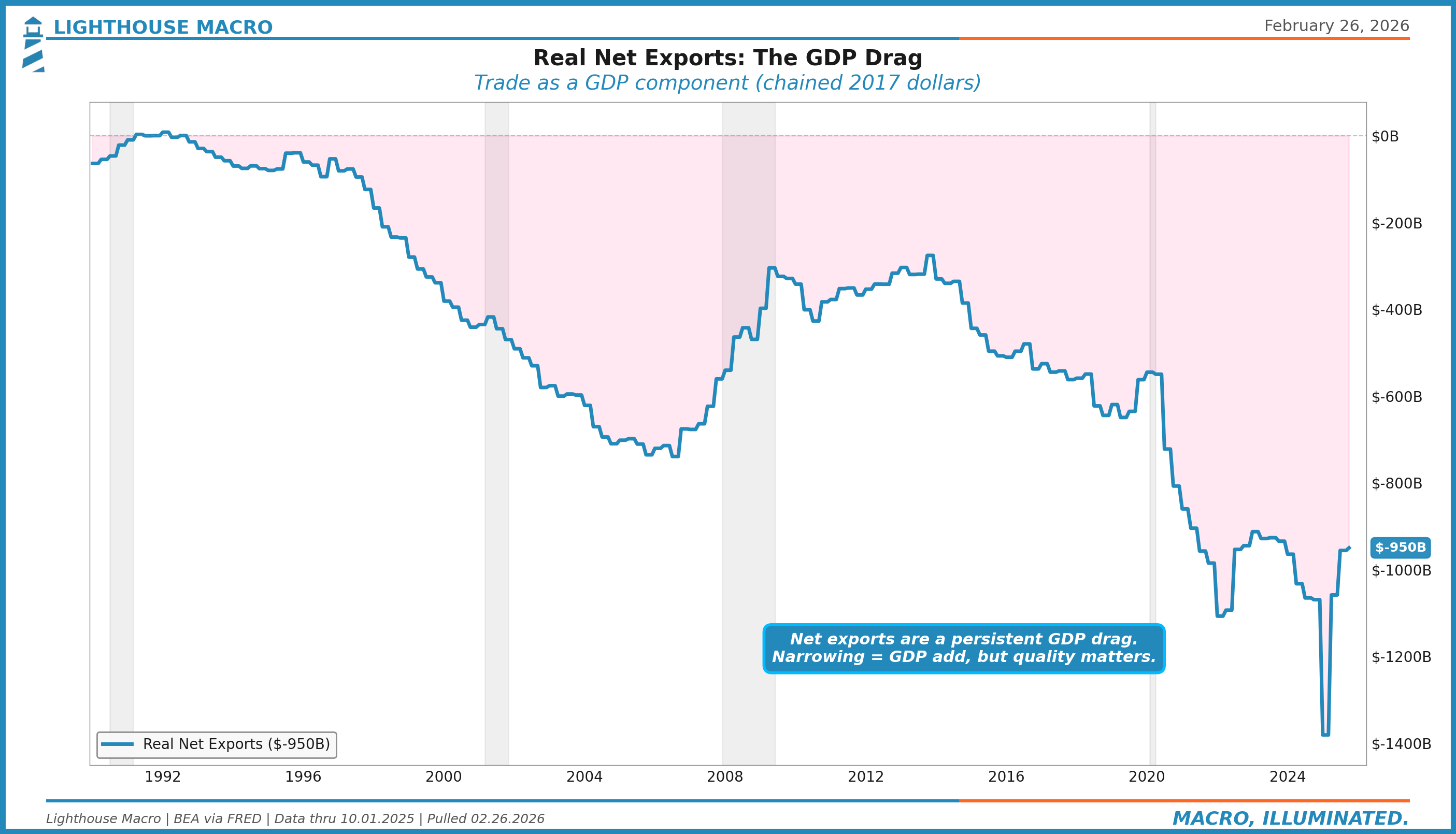
Real net exports at -$950 billion represent a substantial drag on GDP growth. When this number narrows (becomes less negative), it adds to GDP. When it widens, it subtracts. The recent deterioration to levels worse than the pre-pandemic trend reflects the combined impact of strong domestic demand pulling in imports and tariff uncertainty disrupting normal trade patterns. For GDP forecasting, watch the quarterly change rather than the level. A narrowing of $50 billion in a quarter typically adds roughly 0.2 percentage points to GDP growth.
Inventory-to-Sales Ratios: The Feedback Loop
Inventories are where trade flows meet domestic demand. The inventory-to-sales ratio measures how many months of sales are sitting in warehouses. Rising ratios mean either demand is weakening or importers are front-loading. Falling ratios mean either demand is surging or supply chains are constrained.
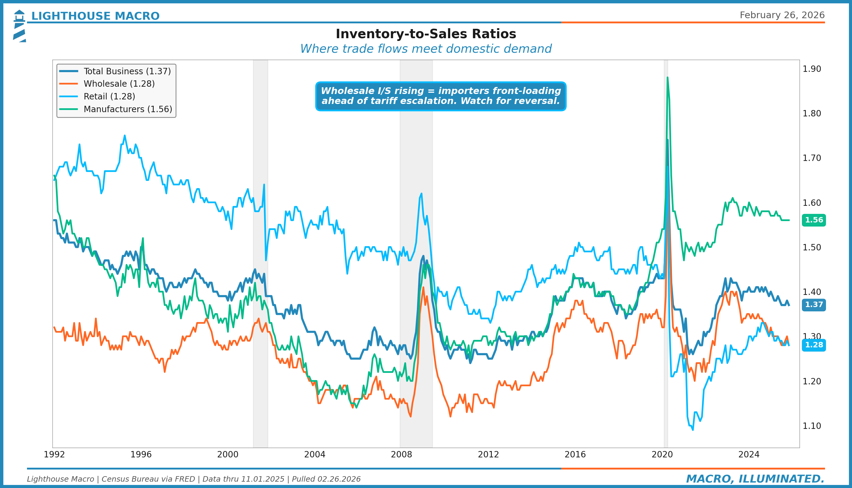
Total business inventory-to-sales at 1.37 is above the pre-pandemic norm of ~1.35 but below the 2020 spike. The more interesting reading is the decomposition. Manufacturers at 1.56 are carrying elevated inventories, consistent with softening orders and production. Wholesale and retail at 1.28 each are closer to normal.
For the trade framework, wholesale inventories are the key series. When tariffs are announced but not yet implemented, importers front-load, pulling forward demand and building wholesale inventories. When the tariffs actually hit, demand drops and those inventories become a drag. The 2018-2019 trade war showed this exact pattern: wholesale inventories surged in late 2018 as importers raced to beat tariff deadlines, then became excess inventory that suppressed import demand for two quarters. Watch for a repeat of this cycle.
The Consensus Trap
The consensus treats trade data as backward-looking confirmation of what everyone already knows: the deficit is big, tariffs are disruptive, and the dollar is strong. This misses three things.
First, the pipeline dynamics. Import prices lead CPI goods by three to six months. By the time the CPI print surprises, the import price data already told you it was coming. Most analysts look at import prices and CPI separately rather than as a connected pipeline.
Second, the tariff arithmetic. A 25% tariff does not mean 25% higher prices. It means 25% higher costs on the tariffed goods, partially absorbed by foreign producers cutting margins, partially absorbed by domestic importers cutting margins, and partially passed through to consumers. The actual pass-through rate historically runs 40-60% within the first year. Consensus either ignores this nuance or assumes 100% pass-through, both of which are wrong.
Third, the trade diversion effect. Tariffs on China did not reduce total imports. They rerouted them through Vietnam, Mexico, and India. The aggregate deficit barely moved. The consensus framing of tariffs as “trade reduction” ignores the overwhelming empirical evidence of “trade diversion.” The macro impact is real but different from what the headlines suggest.
Where We Are Now
Current readings across the trade framework:
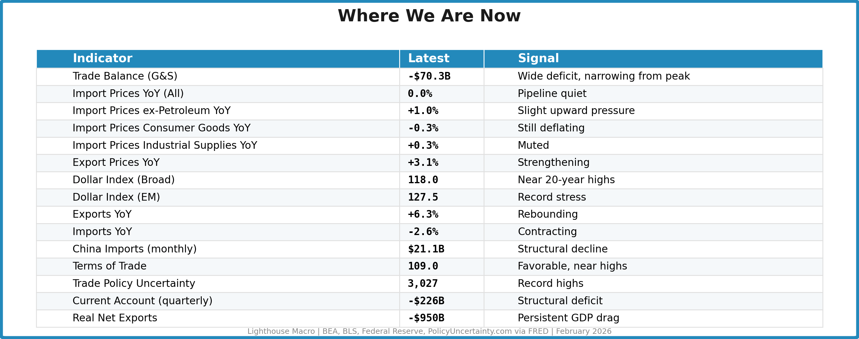
Net assessment: The trade pipeline is calm but coiled. Import prices are flat, the dollar is strong, and the terms of trade are favorable. That is the current snapshot. The forward-looking picture is different. Trade policy uncertainty at record highs will suppress capital expenditure. The 2025 tariff regime has not yet fully flowed through to import prices. When it does, the pipeline from import prices to CPI goods will reactivate. The key variable is the dollar. If it stays strong, it partially offsets tariff-driven import inflation. If it weakens, tariffs and currency depreciation compound into a significant inflationary impulse. We are watching the ex-petroleum import price index as the cleanest forward signal. A move above 3% year-over-year would confirm tariff pass-through is materializing.
How to Track This
Monthly (first tier, ~35-day lag): Trade balance, exports/imports by country, wholesale inventories. Released by Census Bureau.
Monthly (second tier, ~14-day lag): Import/Export price indices from BLS. These are the leading indicators. Watch all imports, ex-petroleum, and the end-use components.
Daily/Weekly: Dollar indices from the Federal Reserve. The trade-weighted broad dollar and EM component are updated daily with a one-day lag.
Monthly (supplemental): Trade Policy Uncertainty Index from PolicyUncertainty.com. Not a traditional economic indicator but one of the best predictors of capex behavior during trade regime transitions.
Quarterly (~75-day lag): Current account balance from BEA. Slow-moving but essential for understanding the financing dynamics and term premium implications.
Invalidation Criteria
Bullish case breaks if:
Import prices ex-petroleum sustain above +3% YoY (tariff pass-through confirmed)
Trade policy uncertainty stays above 2,000 for two consecutive quarters (capex freeze)
Dollar broad index breaks above 125 (competitiveness destruction)
Bearish case breaks if:
Import prices stay below +1% YoY despite tariff implementation (absorption by foreign producers)
Trade policy uncertainty falls below 500 (regime clarity restored)
Dollar weakens below 110 broad (competitiveness improving)
Export growth sustains above 5% YoY for three months (global demand holding)
The Bottom Line
Trade is not a sideshow. It is the pipeline connecting the dollar to inflation, connecting tariffs to capex, connecting supply chain disruption to inventories, and connecting all of it to the current account that finances America’s consumption habit.
Current conditions: calm on the surface, coiled underneath. The import price pipeline is flat, but the tariff regime has not yet fully materialized in the data. Trade policy uncertainty at record highs is the clearest forward risk. The dollar’s strength is masking inflationary pressure while simultaneously crushing export competitiveness.
Watch the ex-petroleum import price index. When it accelerates, the pipeline is active and CPI goods inflation follows in three to six months. As long as it stays near zero, the tariff bark is worse than the bite. But at record trade policy uncertainty, businesses are not waiting for confirmation. They are already pulling back on investment. That is where the real damage shows up, not in the trade deficit, but in the capex freeze that follows.
This is how we analyze international trade and the dollar.
This is the 7th in a 12-part series on the Lighthouse Macro framework. Next up: Government and Fiscal Dominance.
Follow Lighthouse Macro on X (@LHMacro) for real-time chart drops and framework updates.
Bob Sheehan, CFA, CMT
Founder & CIO, Lighthouse Macro