

Labor: The Source Code
The Diagnostic Dozen: A Framework for Reading the Macro Cycle (1 of 12)

There is no economy without labor. This is not a metaphor.
People make things, build things, produce things. It is the literal foundation on which everything else rests.
When we talk about economic cycles, we are really talking about labor cycles dressed up in different clothes. The transmission chain runs in one direction: employment leads to income, income enables spending, spending generates revenue, revenue justifies credit, credit supports housing, and housing anchors household wealth. Change the labor picture, and everything downstream changes with it.
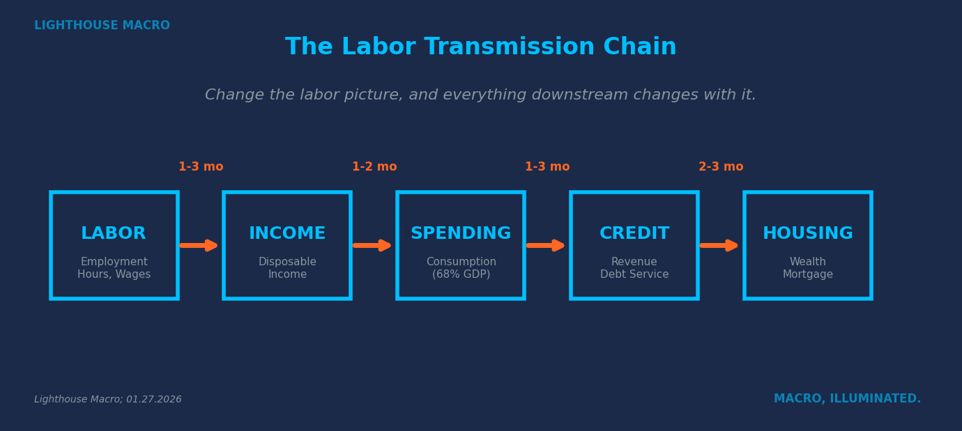
If the engine sputters, the car eventually stops. It does not matter how much gas is in the tank or how smooth the road is. Mechanics dictate outcome.
This is why labor sits at the center of our framework. Not because it is one indicator among many, but because it is the source code. Understanding labor means understanding the economy.
The Core Insight: Flows vs. Stocks
Here is the conceptual unlock that separates useful analysis from headline-watching.
Labor data splits into two categories: flows and stocks. The distinction matters more than almost anything else we will discuss.
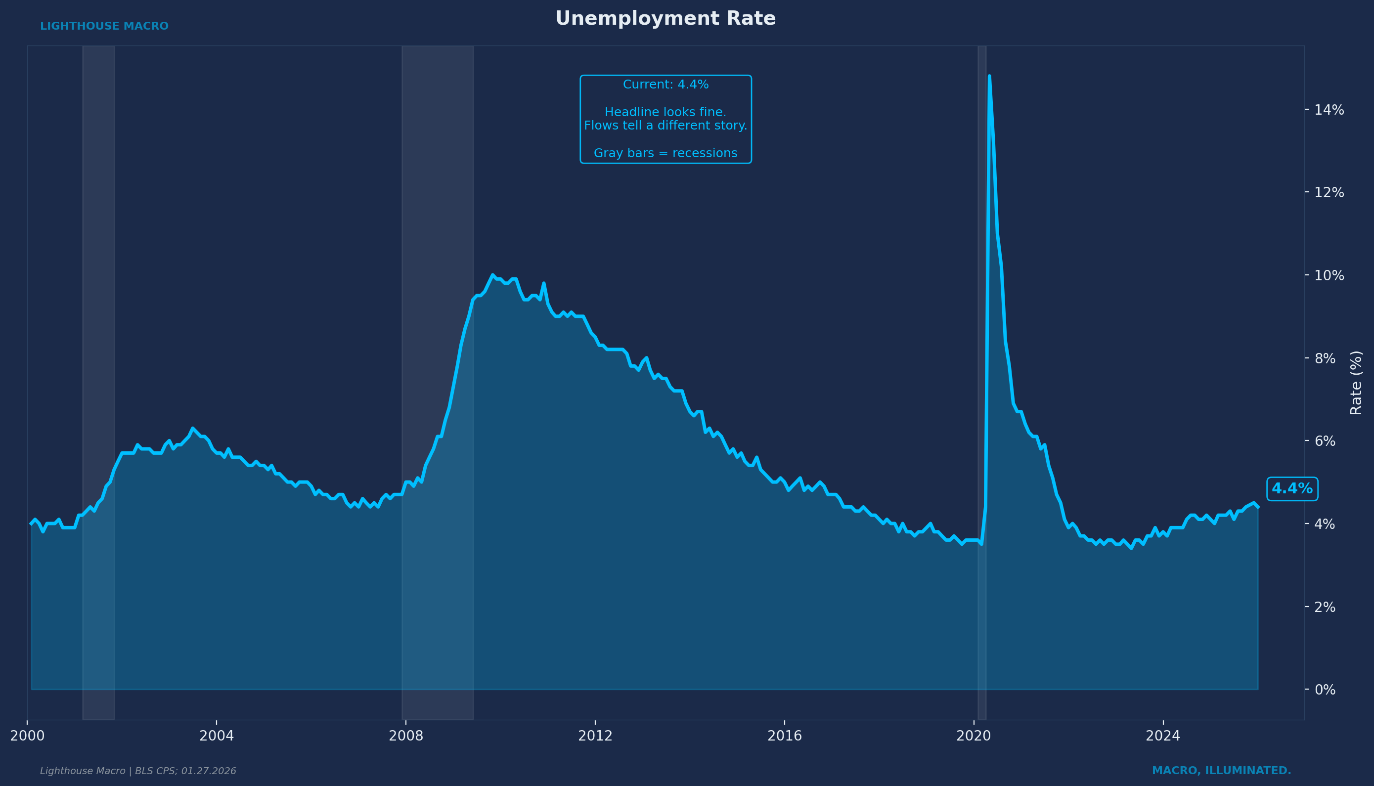
Stocks measure the cumulative result of past decisions. The unemployment rate. Total payrolls. These are the numbers you see in headlines, the figures politicians cite, the data points that anchor consensus narratives. They tell you where the labor market has been.
Flows measure what is happening at the margin right now. How many people are quitting their jobs. How many are being hired. How temp agencies are adjusting their staffing. Flows tell you where the labor market is going.
Why do flows lead stocks? Because decisions happen before outcomes.
When employers sense trouble on the horizon, they do not fire workers immediately. They freeze hiring. They let headcount decline through attrition. They stop bringing on temps. The actual layoffs come later, sometimes much later, because firing people is expensive, disruptive, and hard to reverse. Companies remember 2021 and 2022 when they could not find workers at any price. That scar tissue makes them hoard labor longer than they probably should.
The same dynamic operates on the worker side. When employees sense the labor market tightening, they do not wait to get laid off. They stop quitting. They hold onto the job they have rather than chasing a better one. The quits rate is the economy’s truth serum. It strips away narrative and exposes what workers actually believe about their options. And workers sense the shift before management admits it.
The early signals show up in flows. The headlines focus on stocks. That gap is where consensus gets caught.
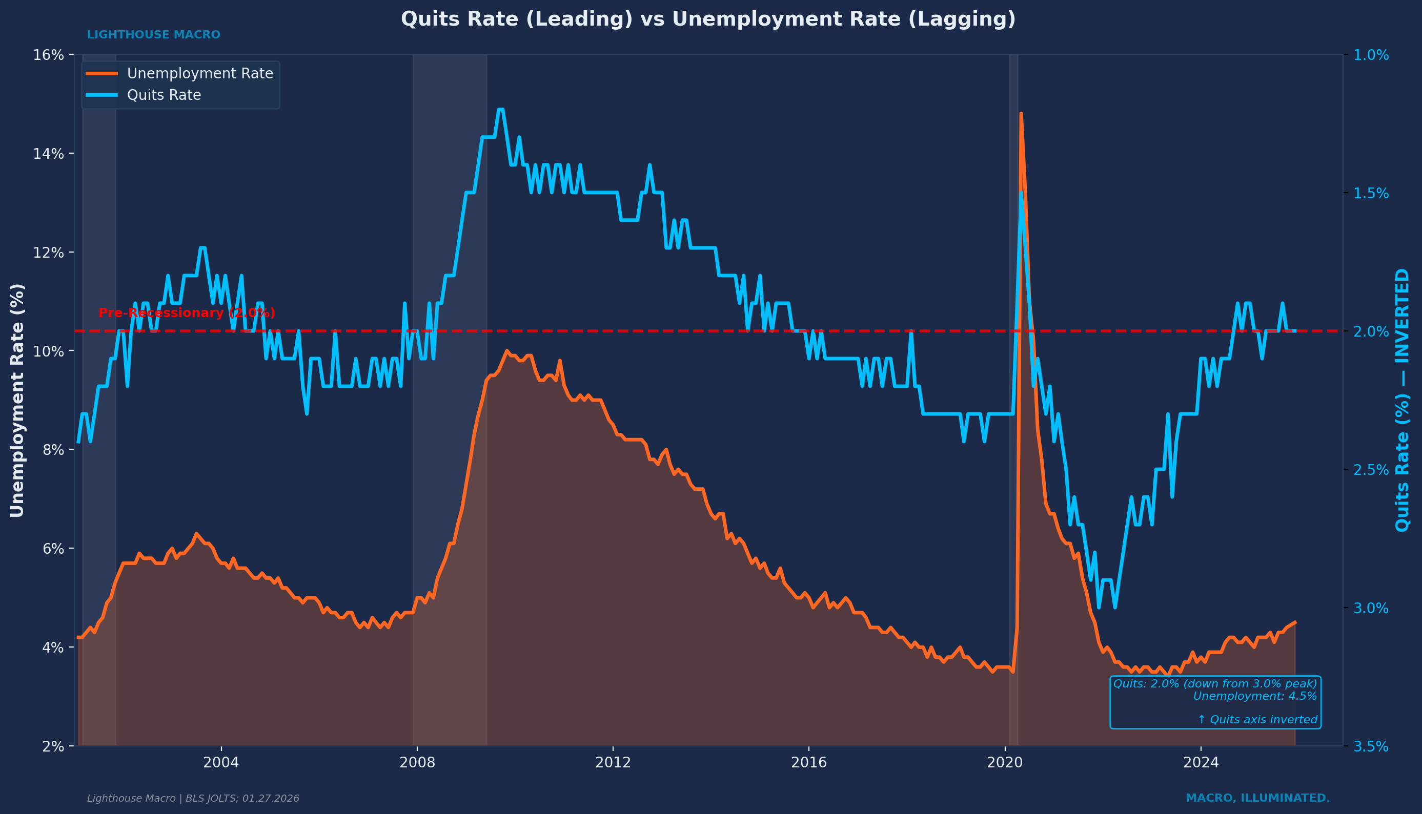
This chart makes the relationship visible. The quits rate turns down six to nine months before unemployment turns up. The pattern has held across every recession since JOLTS data began in 2000. When workers stop quitting, unemployment eventually rises. The lag is predictable. The sequence does not fail.
What to Watch and Why
We approach labor analysis through four lenses. Not a checklist, but a mental model.
Leading indicators move first. They are the canaries. These capture decisions being made today that will show up in headline data months from now. When companies stop hiring temps, when workers stop quitting, when the hiring rate begins to slide even as unemployment stays low, these shifts register in real time. Their implications will not become obvious until the lagging data catches up.
Breadth indicators reveal whether weakness is localized or spreading. A single sector struggling is not necessarily alarming. But when stress starts showing up across multiple states, across different industries, across both manufacturing and services, that is a different signal entirely. Breadth is how you distinguish between noise and regime change.
Confirming indicators validate what the leading data suggested. When unemployment starts rising, it is not telling you something new. It is confirming what the flows already showed months earlier. But that confirmation matters because it eliminates the possibility that the early warnings were false positives.
Direction changes often matter more than levels. This is counterintuitive but critical. An indicator’s turn can be leading even when its level is lagging. The unemployment rate is the classic example. It is called a “lagging indicator” because its level peaks after recession ends. But its trough, the point where it stops falling and starts rising, actually precedes recession by several months. Watch the turn, not just the level.
We have validated these relationships against every post-war recession. They hold. The lag times vary, but the sequence does not.
The Indicators That Matter
The key signals, what they measure, and why they work.
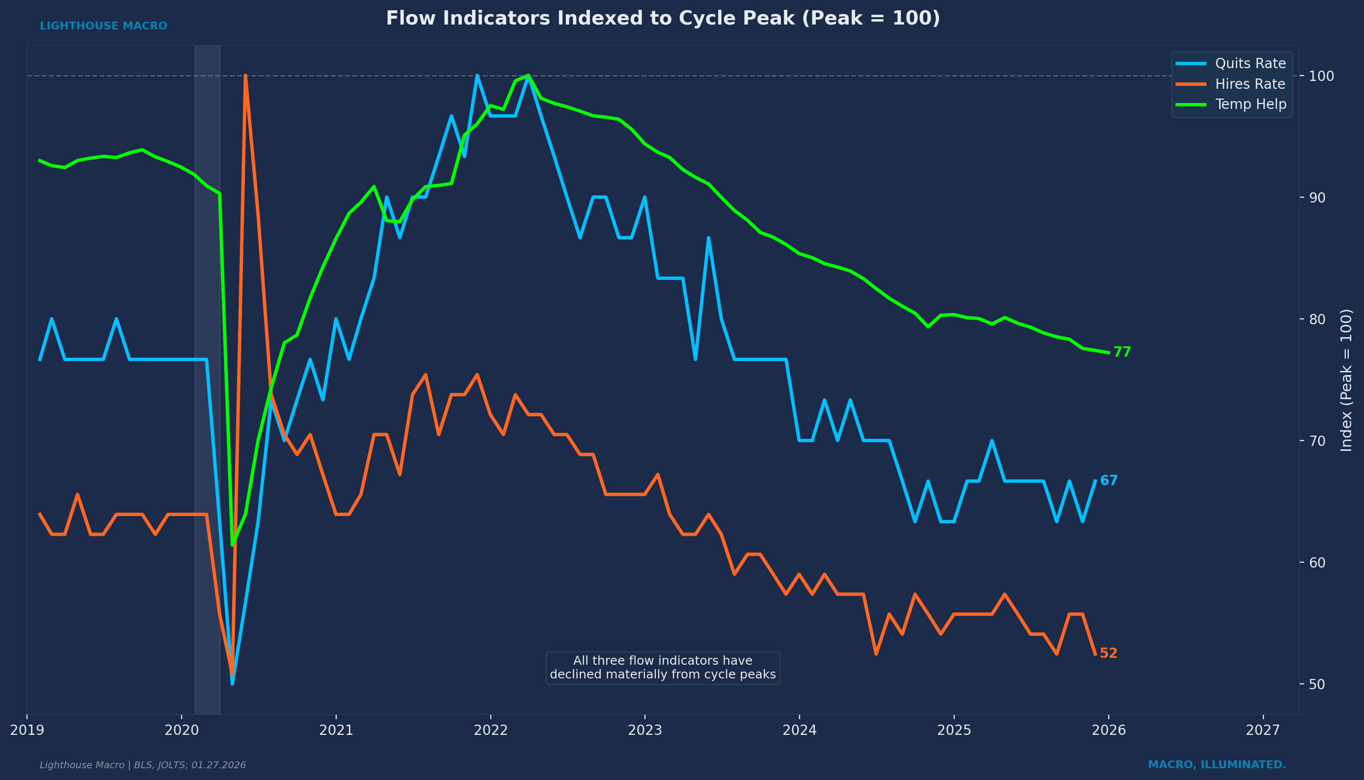
The Quits Rate measures voluntary separations as a percentage of total employment. When a worker quits, they are making a statement: “I believe I can find something better.” This is a real-time confidence barometer. Unlike surveys that ask people how they feel, the quits rate captures what they actually do.
The quits rate is arguably the single most important flow indicator in labor market analysis. Workers have asymmetric information about their own situations. They sense weakness in their company, their industry, their local market before it shows up in aggregate data. When they stop quitting, they are telling us something management has not admitted yet.
Historical validation: The quits rate has declined from cycle peak before all three post-2000 recessions with lead times of 6-9 months. Current reading sits at 2.0%, down from a peak of 3.0% in April 2022. That is a one-third decline from cycle high. Workers have already adjusted their behavior.
Temporary Help Services employment measures workers employed through temporary staffing agencies. This is the canary in the coal mine with an exceptional track record.
Why it works: Temp workers are the adjustment valve for corporate labor demand. When companies sense softening demand, they do not immediately fire permanent employees. That is expensive, disruptive, hard to reverse. They stop renewing temp contracts. Temp help is the first to go and the first to come back.
Historical validation: Temp help employment YoY has gone negative before all three post-2000 recessions with lead times ranging from 1 to 12 months. Current reading shows YoY contraction of approximately 3-4%, persisting for over two years.
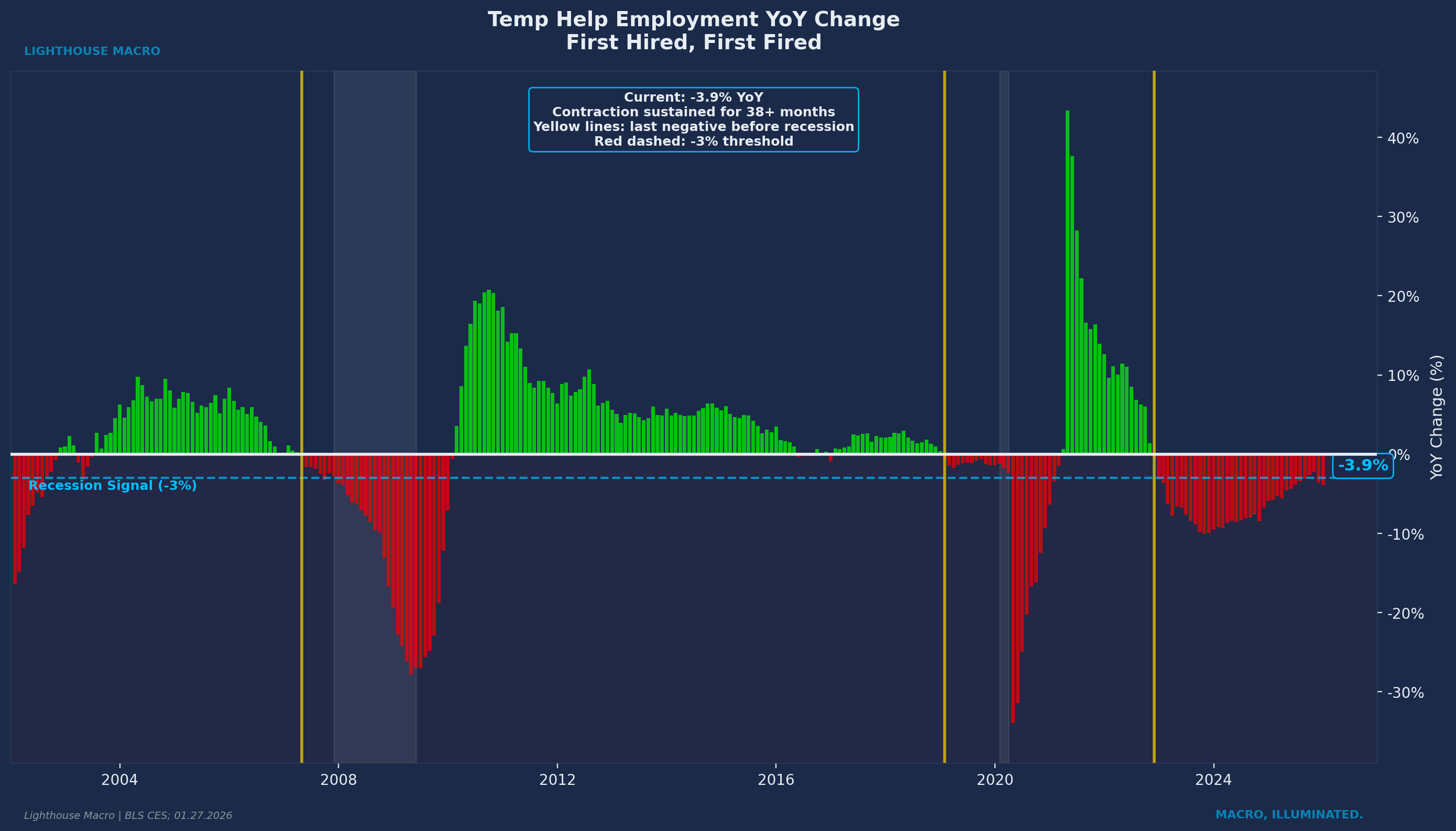
A caveat worth addressing directly: recent academic research (Tito and Bowdle, 2024) found that pandemic-era labor shortages boosted temp demand by 25-85%, and the subsequent easing reduced temp employment by 5-20%. That is a meaningful distortion. But even after accounting for pandemic-era overshoot, the contraction exceeds what normalization alone would explain. Since March 2022, temp employment has fallen by 577,000 jobs (18.1%), the largest decline outside a recession in the indicator’s modern history. The signal may be noisier than pre-2020, but it has not lost its directional value. We weight it accordingly: lower than before, but still part of the mosaic.
The Hiring Rate shows new hiring as a percentage of employment. When paired with the layoffs rate, it reveals the “hiring freeze without firing wave” phenomenon that characterizes late-cycle labor markets.
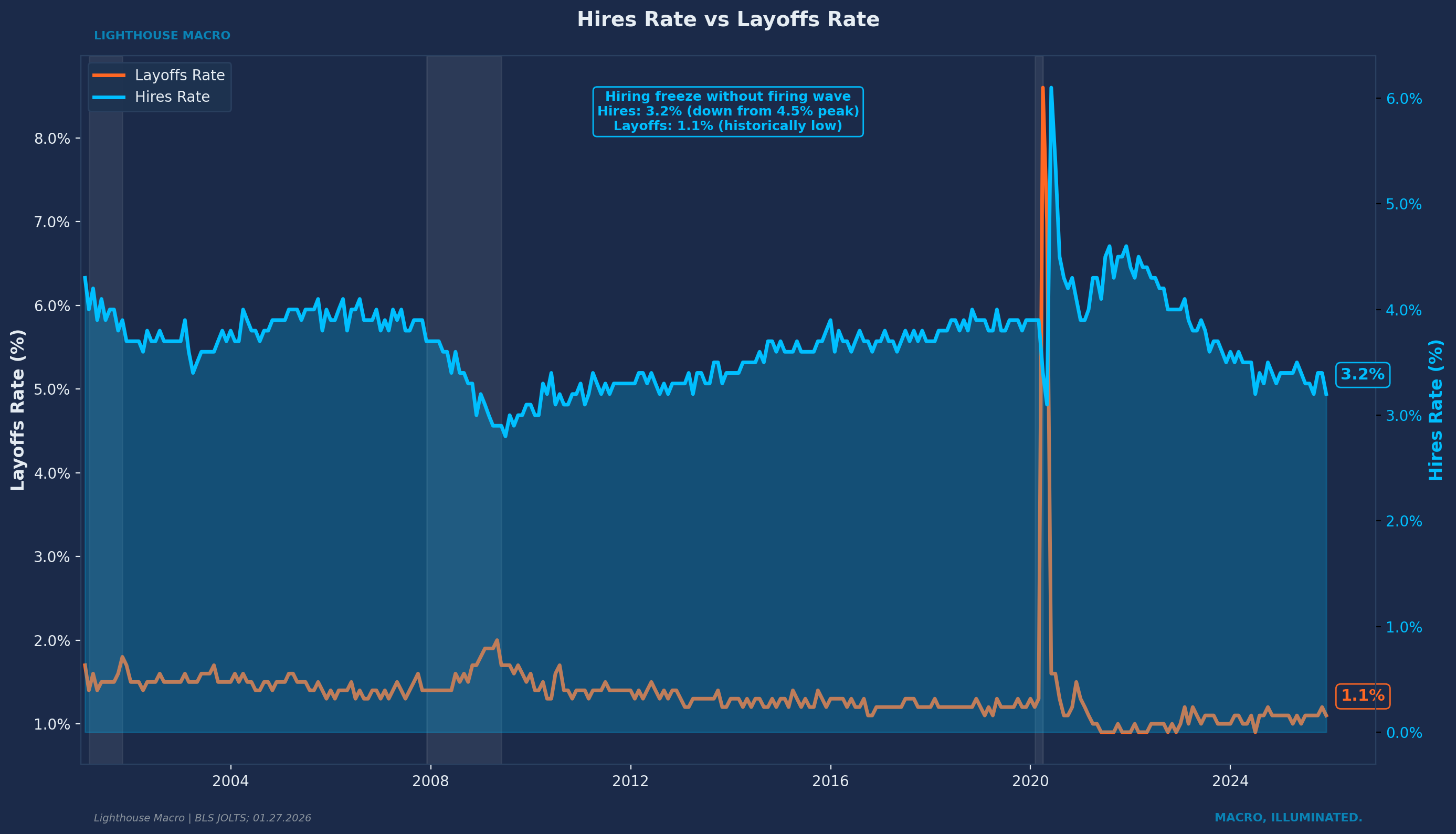
Current configuration: The hires rate sits at 3.2-3.3%, down from 4.5% at the 2022 peak. The layoffs rate remains at 1.0-1.1%, historically low. Companies are not yet cutting workers because they remember how hard it was to hire in 2021-2022. But they have stopped adding headcount. The labor market is frozen, waiting for the break.
This can persist for extended periods, but history says when it breaks, it tends to break toward layoffs rather than renewed hiring.
Aggregate Hours Worked captures something payrolls miss entirely. Before companies lay off workers, they reduce hours. Before they reduce hours on paper, they cut overtime. This is the most reversible lever employers have, and reversible levers get pulled first.
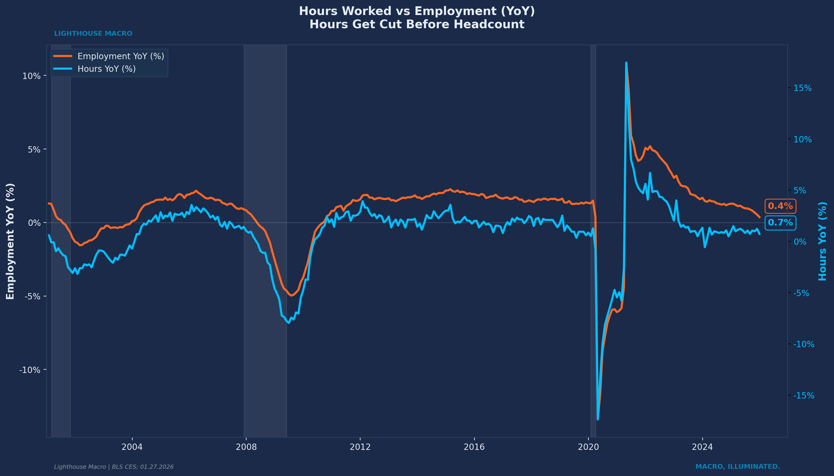
The chart shows aggregate hours (YoY) plotted against employment (YoY). Hours consistently turn down before employment at cycle inflection points. The logic is straightforward: cutting hours costs nothing. Cutting workers costs severance, institutional knowledge, and the risk that you cannot rehire when conditions improve. So hours absorb the initial shock. When hours decline while employment holds steady, that divergence is a warning. The economy is weakening at the intensive margin (fewer hours per worker) before it weakens at the extensive margin (fewer workers).
Current configuration: aggregate hours growth has decelerated sharply from post-pandemic highs and is now oscillating near zero. Employment growth has followed the same trajectory but with a lag. The pattern is consistent with prior late-cycle behavior.
State Labor Market Diffusion measures the percentage of state-level labor markets experiencing rising unemployment over a three-month window. It captures geographic breadth of weakness.
Why it works: A single state struggling is not necessarily alarming. That could be idiosyncratic. But when weakness spreads across geographies, it reveals systemic stress. In recessions, this measure approaches 100%. Everyone hurts simultaneously.
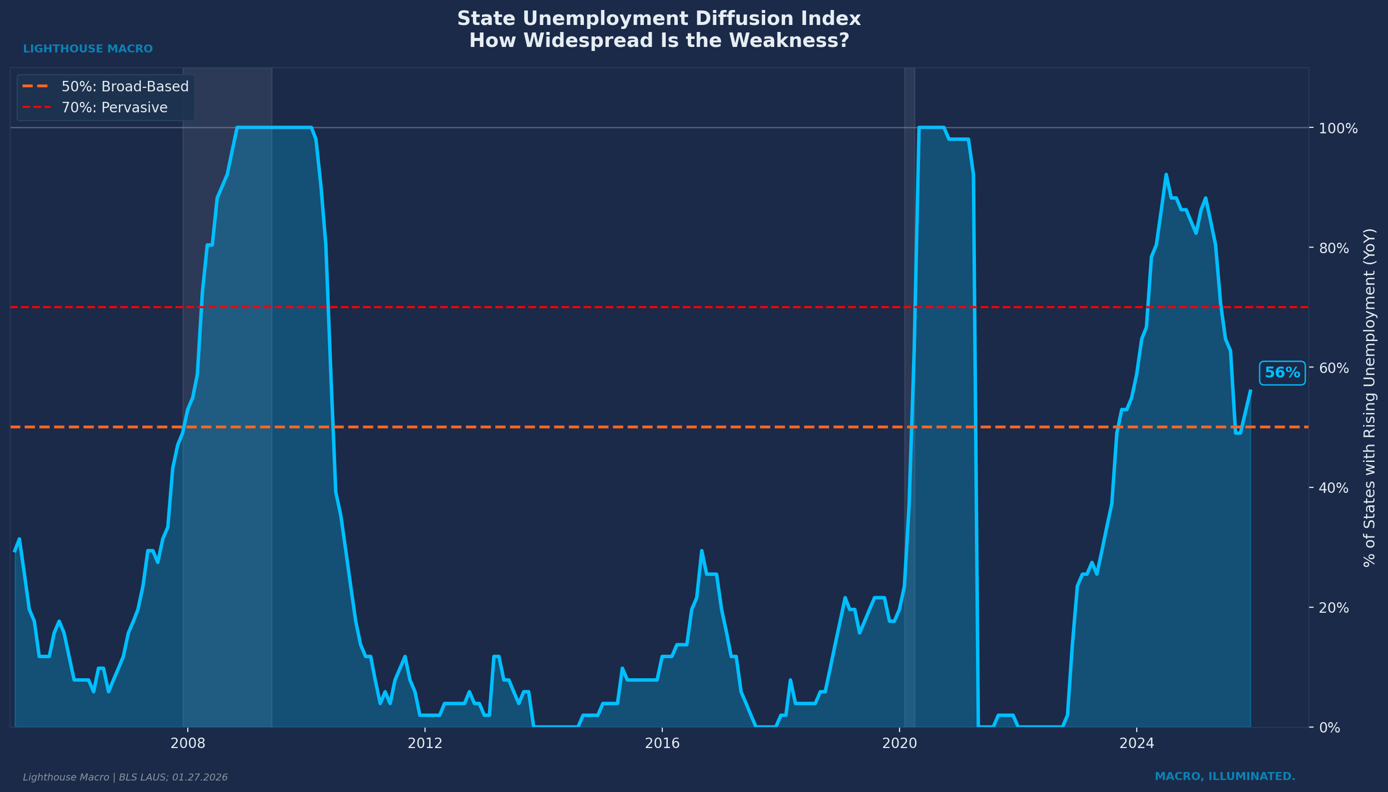
Historical validation: State diffusion sustained above 50% has preceded every recession in the dataset with lead times of 2-14 months. Current reading hovers around 47-52%, oscillating near the majority threshold. Weakness is not universal, but it is not localized either.
The Job-Hopper Wage Premium is a microstructure signal most people miss. Throughout history, workers who switch jobs earn higher wage gains than those who stay put. That makes intuitive sense. You quit your current job when you have a better offer somewhere else. The premium varies with the cycle, widening when labor markets are tight and workers have options, narrowing when conditions deteriorate and staying put becomes the safer play.
What most people miss is that this premium can actually reverse. When job-switchers start earning less than job-stayers, something unusual is happening. Workers are taking new positions out of necessity rather than opportunity. They are moving laterally or even down, accepting whatever is available because their current situation became untenable.
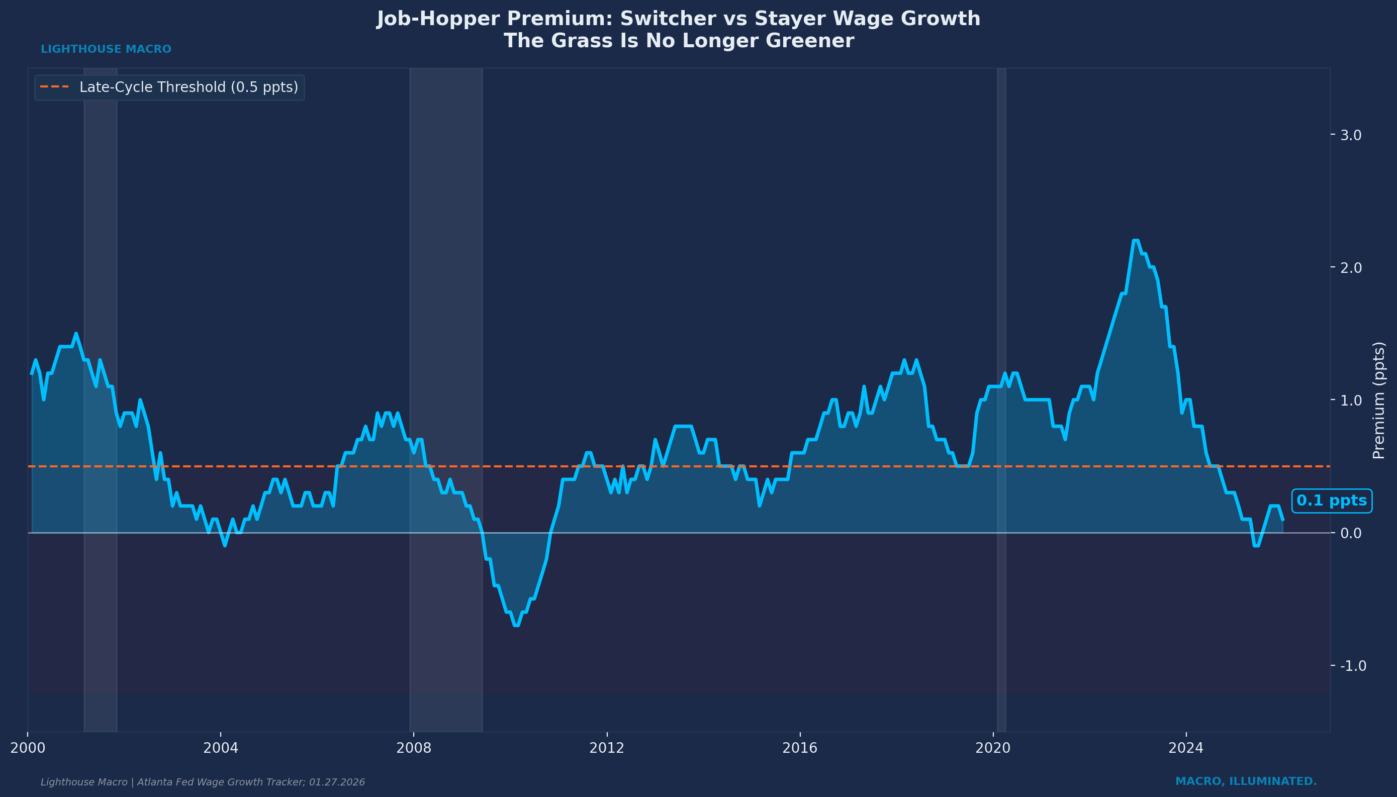
Historical pattern: The premium collapsed to near zero around every recession since the Atlanta Fed Wage Growth Tracker began. Current reading sits at 0.1-0.2 percentage points, down from over 2 percentage points in 2021-2022. The grass is no longer greener. Workers know something.
Long-Term Unemployed Share measures the percentage of unemployed workers who have been jobless for 27 weeks or more. This is a lagging indicator by level but a confirming indicator by direction.
Why it matters: Long-duration unemployment has permanent effects. Skills atrophy. Networks fade. Employer bias against long gaps is real. Once someone crosses the six-month threshold, their probability of finding work drops significantly. Rising long-term share is early structural damage, the kind that leaves scars.
The turn in this indicator actually leads recessions by 3-13 months even though long-term unemployment peaks after recession ends. Current reading sits at 24-26%, up from cycle lows around 17-18%. More than one in four unemployed workers has been looking for over six months. That is meaningful deterioration even as the headline unemployment rate stays manageable.
The Consensus Trap
Here is the pattern that repeats every cycle.
The economy is late in an expansion. Headlines say “strong labor market” because unemployment is low and payrolls are still positive. Analysts point to the unemployment rate and conclude there is nothing to worry about. Markets price accordingly.
Meanwhile, under the surface, the flows are deteriorating. Temp help is contracting. The quits rate has fallen materially from its cycle highs. Hiring has slowed even as layoffs remain subdued. Duration of unemployment is extending for those who do lose jobs. Weakness is starting to spread geographically.
But because the stocks look fine, consensus dismisses the warning signs. “The labor market remains resilient” becomes the mantra. And it stays the mantra right up until the lagging indicators finally catch up and everyone collectively discovers what the leading indicators showed months earlier.
We call this the “stocks look fine, flows are deteriorating” trap. It catches consensus every cycle because humans anchor to what they can see in headlines. The flows require more work to track, more nuance to interpret. Most people do not do that work.
By the time unemployment is rising and payrolls are contracting, the information is already fully priced. The edge exists earlier, in the gap between leading and lagging.
Where We Are Now
Applying the framework to current conditions.
The surface metrics look unremarkable. Unemployment sits at 4.4%. Payrolls remain positive, adding 50,000 jobs in December. Initial claims have not spiked, hovering around 215-220k on a four-week average. If you only read headlines, you would conclude the labor market is holding up reasonably well.
The flow indicators tell a different story.
Temporary help employment has been contracting for over two years. The canary stopped singing long ago.
The quits rate sits at 2.0%, down one-third from its cycle peak. Workers are not quitting like they used to because they are not seeing the same opportunities they saw a year or two ago. When the quits rate peaked in 2022, workers had unprecedented bargaining power. That era has clearly passed.
Hiring has slowed considerably even as layoffs remain historically low. Companies are in a holding pattern: not adding headcount, not yet cutting it. This “hiring freeze without firing wave” configuration can persist for extended periods, but history suggests when it breaks, it tends to break toward layoffs rather than renewed hiring.
Duration of unemployment is extending. The share of unemployed workers who have been looking for six months or more has risen from 17-18% to 24-26%. This is early structural damage.
Breadth is broadening. State diffusion is oscillating around 50%, meaning roughly half of all state labor markets are experiencing rising unemployment. The weakness is not confined to one region or one industry. It is spreading.
The job-hopper premium has collapsed to near zero. Workers who switch jobs are earning the same as those who stay put. The Atlanta Fed Wage Growth Tracker shows the premium sits at 0.1-0.2 percentage points, down from over 2 percentage points during the Great Resignation. That means the grass is no longer greener. Workers sense the shift before it shows up in aggregate data.
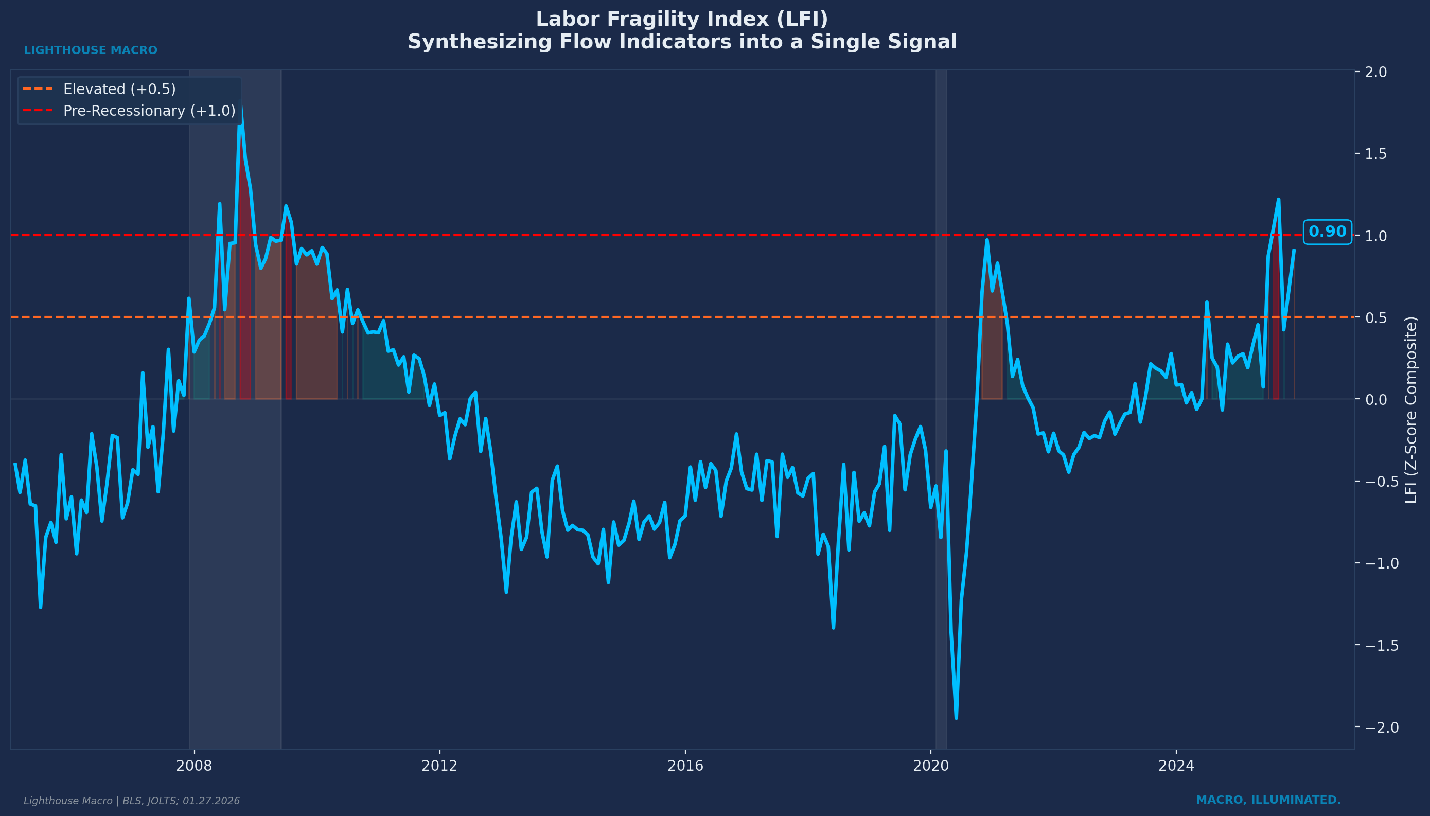
Where do our composites stand? The Labor Pulse Index (LPI) currently reads approximately -0.4, placing us in the “softening” regime where fragility is developing and cyclical exposure should be reduced. The Labor Fragility Index (LFI) sits near +0.9, elevated and approaching the pre-recessionary threshold of +1.0. These are not recession readings. But they are not expansion readings either. The labor market is in transition, and the direction is not encouraging.
The question is not whether the flows are deteriorating. They are. The question is whether stocks follow. History says they do.
The Framework in Practice
We are not in the business of calling recessions. We are in the business of understanding probabilities and positioning accordingly.
What the labor data tells us right now is that the economy’s engine is running cooler than headlines suggest. The transmission chain we described at the outset, labor into income into spending into credit into housing, is experiencing friction at the source.
Does that mean recession is imminent? Not necessarily. These configurations can persist. Companies can hoard labor for quarters while waiting for visibility to improve. Workers can stay put while hoping conditions stabilize.
But it does mean the margin for error has narrowed. When flows deteriorate and stocks have not yet caught up, you are in a fragile state. Any incremental shock, policy mistake, financial stress, or exogenous event will transmit faster through an economy that is already showing early strain.
That is the kind of information you can act on, whether you are running a portfolio, making business decisions, or simply trying to understand what is actually happening beneath the noise.
How to Track This Pillar
The core indicators we track monthly:
JOLTS Quits Rate. The truth serum. Watch for sustained readings below 2.0%. This is the single most important flow indicator.
JOLTS Hires and Layoffs. Track both rates. The gap between them reveals whether we are in hiring freeze or firing wave territory.
Temporary Help Services Employment. The canary. Year-over-year contraction is the signal. Anything below negative 3% sustained starts flashing red.
Long-Term Unemployed Share. Calculate this as workers unemployed 27+ weeks divided by total unemployed. Rising share confirms flow deterioration is translating into structural damage.
State Labor Market Diffusion. Percentage of states with rising unemployment over a three-month window. Sustained readings above 50% signal systemic stress, not idiosyncratic weakness.
Industry Employment Diffusion. Same concept, different cut. What percentage of industries are adding jobs versus shedding them. We track both one-month and three-month diffusion. When the majority of industries contract simultaneously, breadth has broken.
Sector Quits Diffusion. Not just the aggregate quits rate, but how many sectors are seeing quits decline. Weakness concentrated in one or two sectors is rotation. Weakness across eight or ten sectors is regime change.
Cohort Analysis by Firm Size. Small businesses (under 50 employees) hire and fire first. Large firms (500+ employees) move later but with more momentum. When small business employment peaks and rolls over while large firms still expand, that divergence is an early warning. The small guys see it first.
Cohort Analysis by Demographics. Prime-age workers (25-54) are the core. But younger workers (16-24) and older workers (55+) behave differently across the cycle. Youth employment is more volatile, turning sooner. We watch for peak-to-trough timing across cohorts to understand cycle phase.
Atlanta Fed Wage Growth Tracker. Median wage growth for job switchers versus job stayers. The premium collapse reveals what workers actually believe about their options. When the job-hopper premium drops below 0.5 percentage points, that is a late-cycle signal. When it goes negative, as it has in recent readings, that has historically only occurred around recessions.
Initial Jobless Claims. Weekly data, four-week moving average. This is our high-frequency pulse check. Sustained break above 250k confirms what monthly data suggested.
Continued Claims. How many workers remain on unemployment benefits week after week. Rising continued claims while initial claims stay flat means duration is extending. People are filing but not finding work quickly.
The release schedule: JOLTS arrives monthly with a 40-day lag, so November data drops in early January. Employment Situation (payrolls, unemployment, demographics) releases first Friday of each month. Jobless claims report weekly every Thursday morning. Wage tracker updates monthly.
We do not wait for the data to tell us what happened. We use the data to understand what is happening now and what is likely to happen next. Flows before stocks. Breadth alongside direction. Turns over levels.
Invalidation Criteria
Every thesis needs an exit door. Here is what would make us wrong about labor market fragility.
The bearish labor thesis is invalidated if we see three consecutive months of:
Quits Rate rising above 2.1%. Workers regaining confidence, chasing better opportunities again.
Hires Rate rising above 3.8%. Companies competing for talent, not just holding pattern.
Long-Term Unemployed Share dropping below 20%. Quick reabsorption of job seekers, no structural scarring.
Temp Help Employment YoY turning positive. Companies adding flexible labor, signaling confidence in demand.
Initial Claims four-week average dropping below 200k sustained. No layoff wave materializing.
If we see sustained improvement across these measures, the late-cycle stress signal is wrong. We rotate from defensive to cyclical and add risk. Framework drives positioning, but the framework can be wrong. Data determines outcome.
The Bottom Line
The labor market does not move in a straight line from expansion to contraction. It gives you signals. The question is whether you are watching the right ones.
We watch flows before stocks. We measure breadth alongside direction. We track the turns, not just the levels. And we remain humble about timing while staying confident about framework.
Labor is not a sector. It is the economy itself, measured in real time. There is no production without workers. No consumption without income. No credit cycle without employment.
The key insight remains: flows vs. stocks. Flows move first because workers and employers at the margin sense changes before they show up in aggregate data. Stocks lag because they are the cumulative result of many individual decisions.
When quits decline, workers are seeing something management has not admitted. When temp help contracts, employers are cutting the most flexible labor first. These are not forecasts of recession. They are the recession beginning, six to twelve months before NBER makes it official.
Current state: quits at 2.0% and oscillating near threshold. Temp help contracting for two years. Hiring frozen while layoffs stay low. Duration extending. Breadth widening. Premium collapsed. LPI at -0.4 (softening). LFI at +0.9 (elevated fragility).
The flows are flashing. The stocks are sleeping. One of them is wrong.
This is how we analyze the labor market.
Bob Sheehan, CFA, CMT
Founder & CIO, Lighthouse Macro
This is the first in a 12-part series on the Lighthouse Macro framework. Next up: Pillar 2 (Prices).
this was such a great read! concise and practical at the same time
i have one question regarding the first graphic (labor transmission chain): between steps 2 and 3, what impact do you think the k shaped economy has on labor market issues showing up in spending? not talking about it not mattering at all, more thinking along the lines of longer delays. or any additional metrics one should monitor because of it?
This was a great analysis. I completely agree that the headline analysis does not inform someone about the health of the economy. Unemployment rate without the context of additional measures like labor participation, real income ex transfers, private sector hiring rate etc promotes false stability.