

Prices: The Transmission Belt
The Diagnostic Dozen: A Framework for Reading the Macro Cycle (2 of 12)

Inflation doesn’t negotiate.
GDP can disappoint and the Fed shrugs. Employment can soften and they wait for confirmation. But if inflation stays elevated, the Fed stays restrictive. There is no discretion here. Inflation is the only macro variable that directly controls the policy rate, and the policy rate controls everything else.
The transmission chain runs in one direction:
Prices → Fed Policy → Real Rates → Financial Conditions → Asset Prices → Growth → Employment
Get the inflation call right, and you’ve triangulated the Fed’s reaction function. Miss it, and you’re trading narratives about “transitory” nonsense while the Fed tells you exactly what it’s going to do.
This is why prices sit at the center of the monetary transmission mechanism. Not because inflation is one indicator among many, but because it is the binding constraint. Understanding inflation composition means understanding what the Fed can and cannot do.
The Core Insight: Composition Over Level
Here is the conceptual unlock that separates useful analysis from headline-watching.
Inflation data splits into three fundamentally different economies, each with different drivers, different transmission speeds, and different implications for policy.
Goods are globally traded, supply-chain responsive, and volatile. When goods inflate, it’s fast. When they deflate, it’s fast. Goods inflation is the shock absorber of the CPI basket.
Services are locally produced, wage-driven, and structurally sticky. You can’t offshore a haircut. Labor costs are 60-70% of service sector expenses, and wages don’t deflate without unemployment rising substantially. Services inflation is the structural floor.
Shelter is the lagging anchor. Measured via lease renewals and owners’ equivalent rent, it represents 34% of the CPI basket but operates on a 12-18 month lag relative to market conditions. It distorts the headline in both directions.
Why does this matter? Because a headline reading of 2.7% tells you nothing about the underlying regime. A uniform 2.7% is structurally different from +1.4% goods + 3.0% services averaging to 2.7%. The first is symmetric disinflation. The second is bifurcation with a structural wage floor preventing the last mile. Fed policy responds to composition, not averages.
The pattern repeats across every cycle since 1980: goods are the shock absorber, services are the structural floor, shelter is the lagging confirmation. In 2008, goods deflated violently while services stayed positive until unemployment hit 10%. In 2021-2023, goods peaked 13 months before services. Composition tells you where you’re going. The headline tells you where you’ve been.
What to Watch and Why
We approach inflation analysis through three lenses.
Leading indicators move first. Producer prices signal what manufacturers are paying before those costs reach consumers. Market rents signal where CPI shelter will be 12 months from today. The dollar signals where goods prices are heading.
Persistence indicators reveal whether inflation pressure is broad-based or concentrated. The Atlanta Fed’s sticky CPI separates components that change infrequently from those that change rapidly. The Dallas Fed’s trimmed mean strips the most extreme price changes to reveal the underlying trend.
Confirming indicators validate what the leading data suggested. Core PCE is the Fed’s actual target. Services ex-shelter (supercore) is the wage-driven core the Fed watches most closely.
The transmission speed hierarchy matters: goods respond in months, services adjust over quarters, shelter takes over a year. That lag between “goods are fixed” and “services are still stuck” is where consensus gets trapped every cycle.
Direction changes often matter more than levels. The 3-month annualized rate compared to the 12-month rate reveals momentum. When 3M runs below 12M, the trend is improving. When it runs above, pressure is building. Watch the slope, not just the spot.
The Indicators That Matter
The Gap That Matters: CPI vs Core PCE
The Fed doesn’t target CPI. It targets Core PCE. This distinction is not academic. It’s mechanical.
CPI uses fixed weights based on what people bought last year. PCE uses chain-weighted spending based on what people are buying now. PCE also captures a broader set of expenditures, including employer-provided healthcare. The practical result: PCE tends to run 0.3-0.5 percentage points below CPI because it accounts for substitution effects. When beef gets expensive, people buy chicken. CPI misses that behavioral shift. PCE captures it.
Shelter is 34% of CPI but only 18% of PCE. This weight difference means CPI overstates the shelter problem relative to what the Fed actually watches. When shelter normalizes, CPI will drop faster than PCE, and the gap between “headline victory” and “Fed reality” will temporarily widen. Track Core PCE if you want to know what the Fed is thinking.
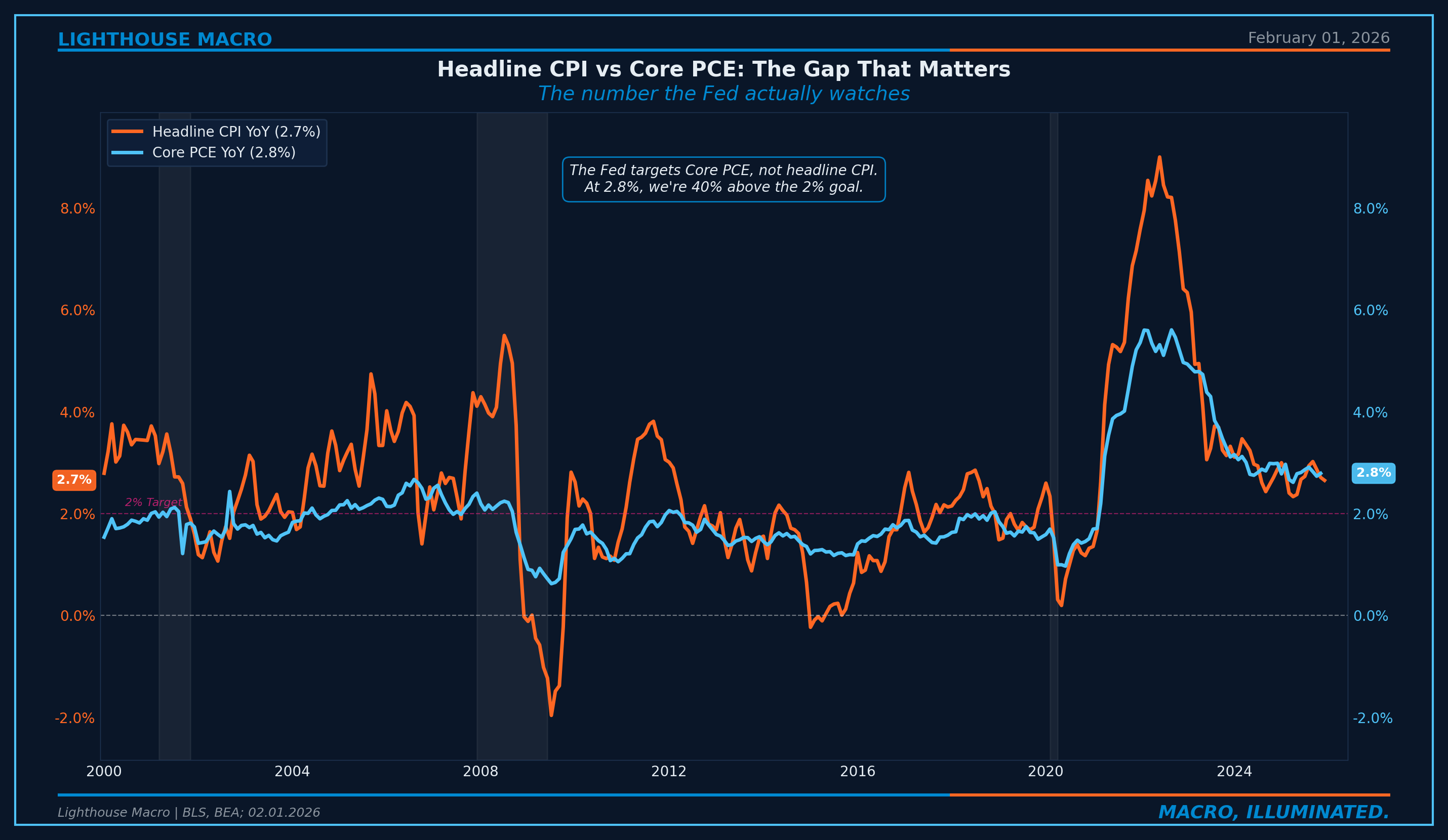
Figure 2: Headline CPI vs. Core PCE. The Fed watches Core PCE, and it’s still meaningfully above target.
The Great Divergence: Goods vs Services
Goods inflation is volatile and self-correcting. Services inflation is sticky and persistent. This divergence defines the current phase of the cycle.
Why goods self-correct: globally integrated markets with elastic supply. When demand fades, inventory clears, supply chains heal, the dollar compresses import prices. Why services persist: local markets with inelastic supply. The primary input is labor, and labor costs don’t adjust downward without unemployment rising.
The 2021-2023 episode confirmed this. The Global Supply Chain Pressure Index normalized by mid-2022, yet core inflation persisted through 2023. If supply disruptions were the root cause, inflation would have collapsed when supply healed. It didn’t. Demand was doing the heavy lifting.
The goods-services spread tracks the cycle. When goods deflate while services stay elevated, headline improvement masks structural stickiness. Does convergence happen through goods re-inflating (tariffs, dollar weakness) or services decelerating (labor cracking)? That distinction is the call.
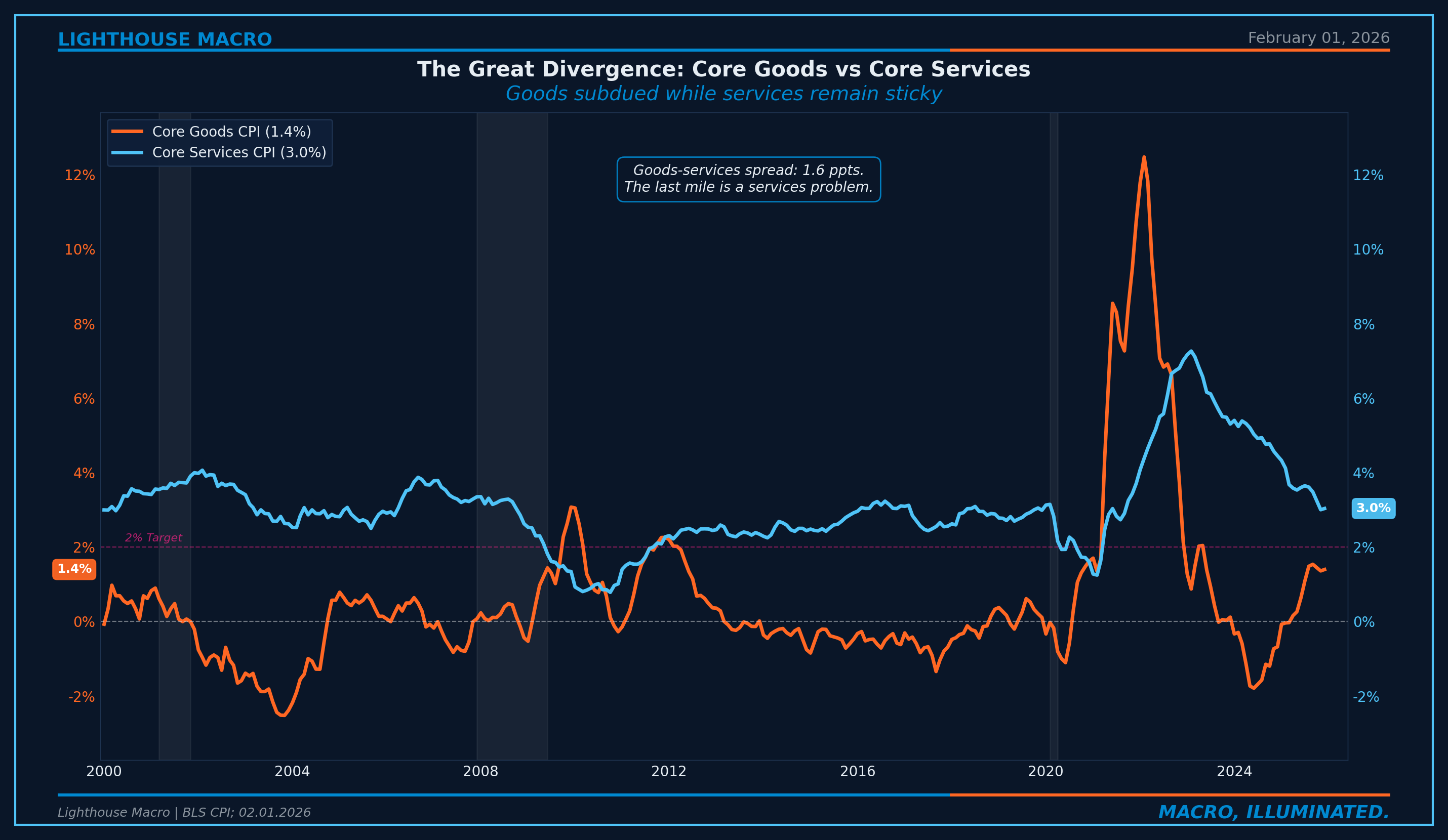
Figure 1: Core goods CPI vs. core services CPI. The divergence is the defining feature of the current inflation regime.
The Shelter Lag Trap
Shelter is 34% of the CPI basket. And it operates on a mechanical lag that distorts the headline in both directions.
The BLS measures shelter through surveys of existing leases, not new leases. When market rents spike, it takes 12-18 months for those increases to flow through the lease renewal cycle into CPI. We tested the lag against every turning point since 2015. Average: 12.7 months. The pattern is mechanical and predictable.
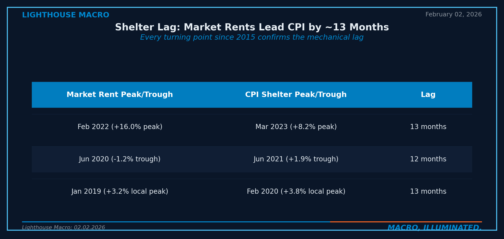
The trap: even after shelter normalizes, services ex-shelter remains sticky. Shelter was masking the problem, not causing it. When shelter cooperates, supercore becomes the binding constraint. And supercore is where the wage floor lives.
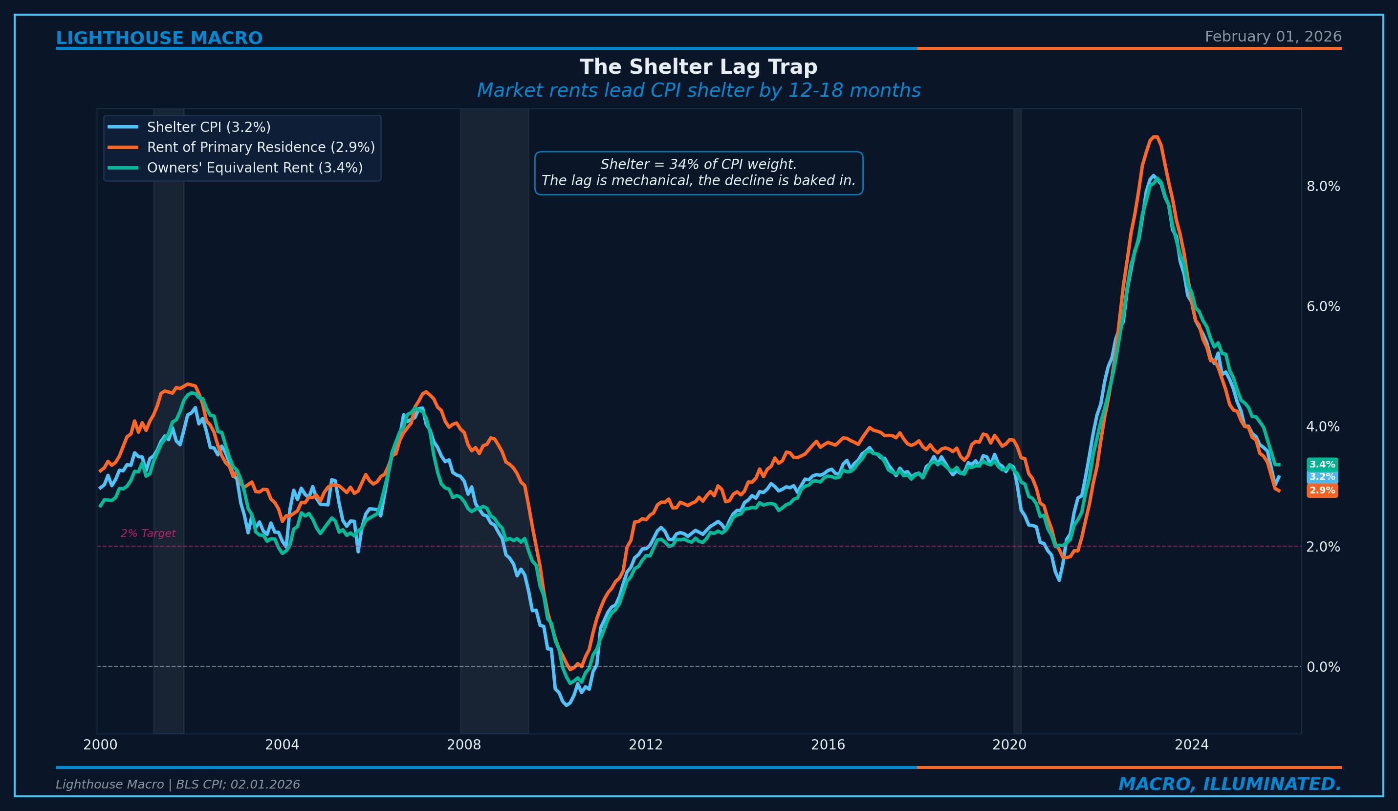
Figure 3: Shelter CPI, Rent of Primary Residence, and Owners’ Equivalent Rent. All three declining but remain above target.
Sticky vs Flexible: The Persistence Signal
The Atlanta Fed decomposes CPI into two categories. Flexible CPI includes items that change frequently: gasoline, food, airfares. Sticky CPI includes items that change infrequently: rent, insurance, medical care, education. These embed expectations and wage costs.
Sticky CPI is the best available predictor of future core inflation, with more than twice the predictive power of flexible CPI over a six-month horizon. What happens in flexible prices today flows into sticky prices roughly 12 months later.
Historically, sticky CPI has never broken below 3.0% without a recession. That threshold is the structural marker. Until it moves decisively lower, the last mile remains incomplete.
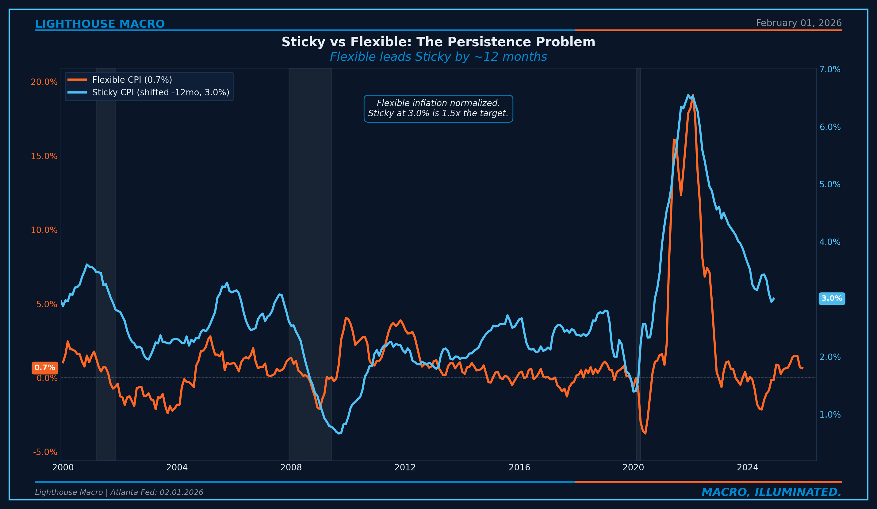
Figure 4: Sticky CPI vs. Flexible CPI (shifted 12 months). Flexible inflation leads sticky by roughly 12 months.
The Pipeline: PPI Leads CPI
Producer prices are the upstream signal. What manufacturers and service providers pay eventually passes through to consumers. PPI leads CPI by 3-6 months. When producers face cost increases, they absorb what they can, then pass the rest through. The lag reflects the adjustment process: inventory drawdowns, contract renegotiations, menu cost frictions.
The PPI-CPI spread is the directional signal. When PPI runs below CPI, producers are absorbing cost declines that haven’t yet reached consumers. That’s disinflationary pressure building in the pipeline. When PPI runs above CPI, inflationary pressure is coming. The spread tells you what’s in the pipe before it hits the consumer.
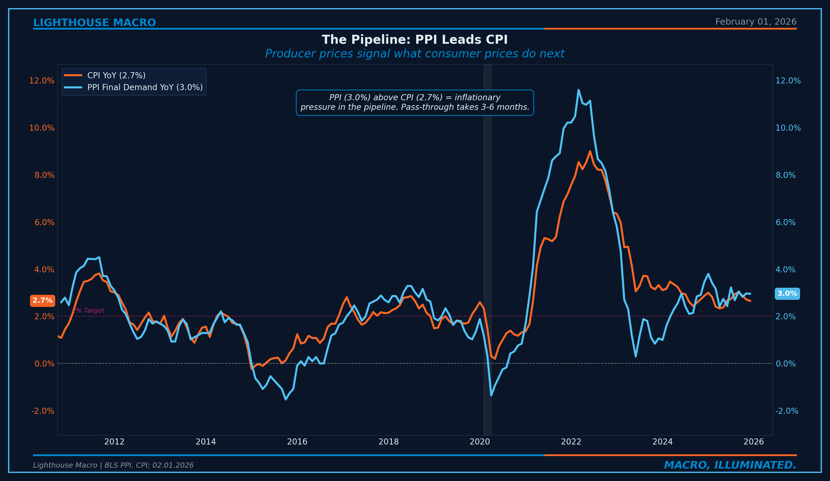
Figure 5: PPI Final Demand vs. CPI. Producer prices lead consumer prices by 3-6 months.
Inflation Expectations: The Anchoring Test
If businesses and consumers expect inflation to remain elevated, they price accordingly. The Fed’s credibility depends on keeping expectations anchored at 2%.
5Y5Y Forward captures the bond market’s view of where inflation will be 5-10 years from now. When it’s near 2.0%, the market trusts the Fed. Above 2.5%, trust is eroding. Above 3.0%, the Fed has lost the anchor.
UMich 1Y Expectations captures what households feel. Consumers don’t watch Core PCE. They watch grocery bills and insurance premiums. Consumer expectations can stay elevated even when professional expectations are calm. That gap reveals the bifurcation in lived experience.
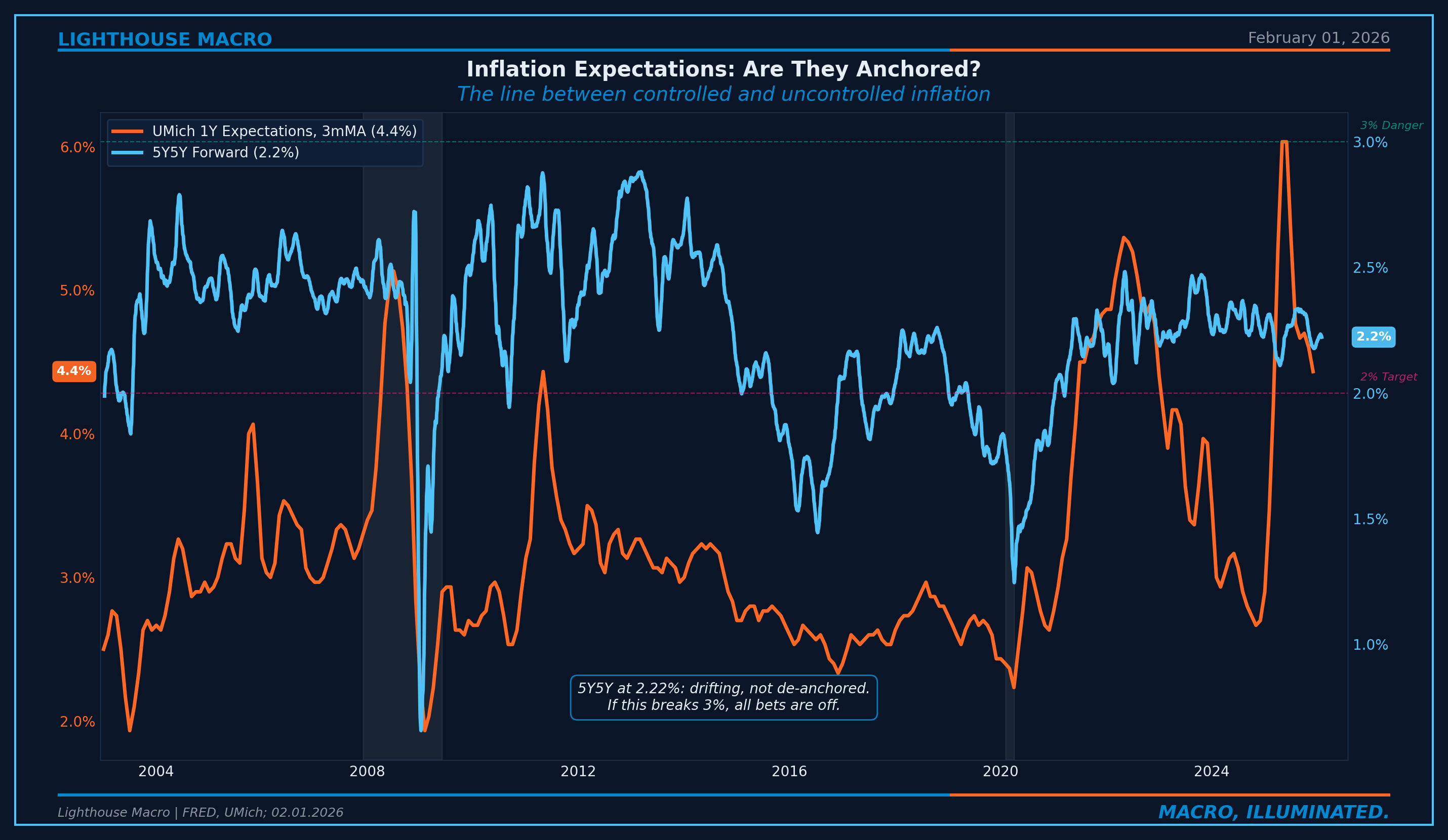
Figure 6: The 5-Year, 5-Year Forward Inflation Rate vs. University of Michigan 1-Year Consumer Expectations.
The Signal Beneath the Noise: Trimmed Mean
Standard inflation measures get distorted by outliers. Motor vehicle insurance surging 14%+ tells you nothing about the underlying trend, but because it’s roughly 3% of CPI, it contributes about 0.4 percentage points to headline.
The Dallas Fed Trimmed Mean PCE strips the most extreme price changes each month to reveal what’s actually happening underneath. It produces meaningfully lower forecast errors than headline CPI at predicting core PCE twelve months forward.
When the trimmed mean and sticky CPI agree, the signal is high-confidence. Track both. Trust the convergence.
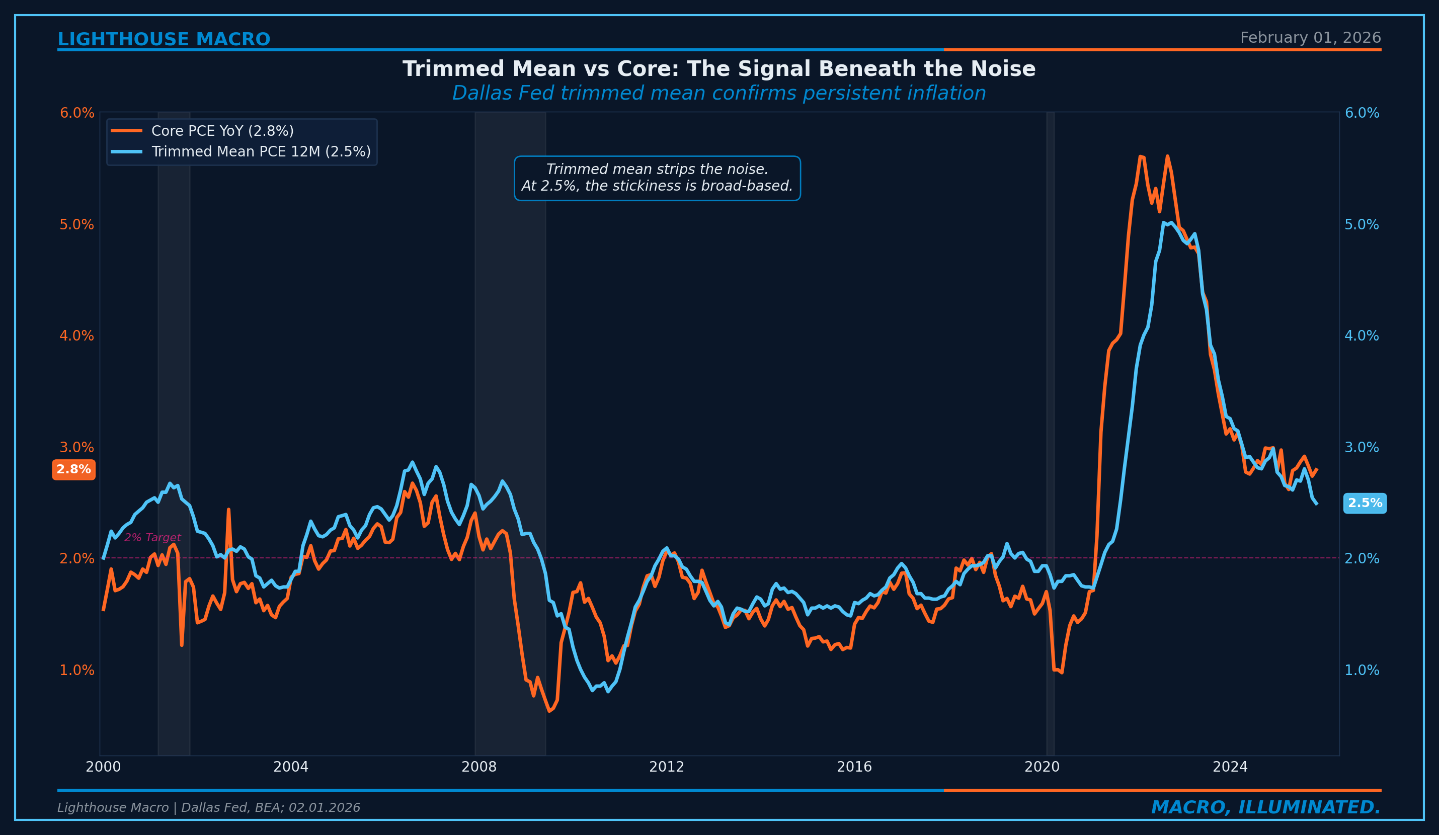
Figure 7: Dallas Fed Trimmed Mean PCE vs. Core PCE. The trimmed mean strips outlier noise and confirms the underlying trend.
The Spiral Check: Wages and Unit Labor Costs
The wage-price spiral is the inflation scenario that keeps central bankers awake. Workers demand higher wages because prices are rising. Businesses raise prices to cover higher labor costs. Repeat.
The Employment Cost Index is the gold standard for measuring labor cost pressure because it controls for compositional shifts. Average Hourly Earnings can fall just because the economy is adding more low-wage jobs. That looks like wage disinflation but it’s actually mix shift. ECI holds the job mix constant. If ECI is elevated, wage pressure is real.
Unit labor costs equal compensation growth minus productivity growth. At 3.5% compensation and 1.5% productivity, ULC runs at roughly 2.0%. That’s consistent with services inflation in the 2.5-3.0% range. Not crisis. Not target. Stuck.
The Phillips curve, dormant through the 2010s, has reasserted. At current unemployment near 4.4%, it suggests services inflation consistent with 3-4%, not 2%. For services inflation to reach 2%, unemployment likely needs to rise toward 4.5-5.0%. This is the narrow path the Fed is attempting to navigate.
From our labor framework (Pillar 1): the Labor Fragility Index is elevated and quits have fallen to the 2.0% threshold. If labor continues to soften, wage growth will decelerate, and that flows into services inflation with a 6-9 month lag. The pillars are connected through the wage channel.
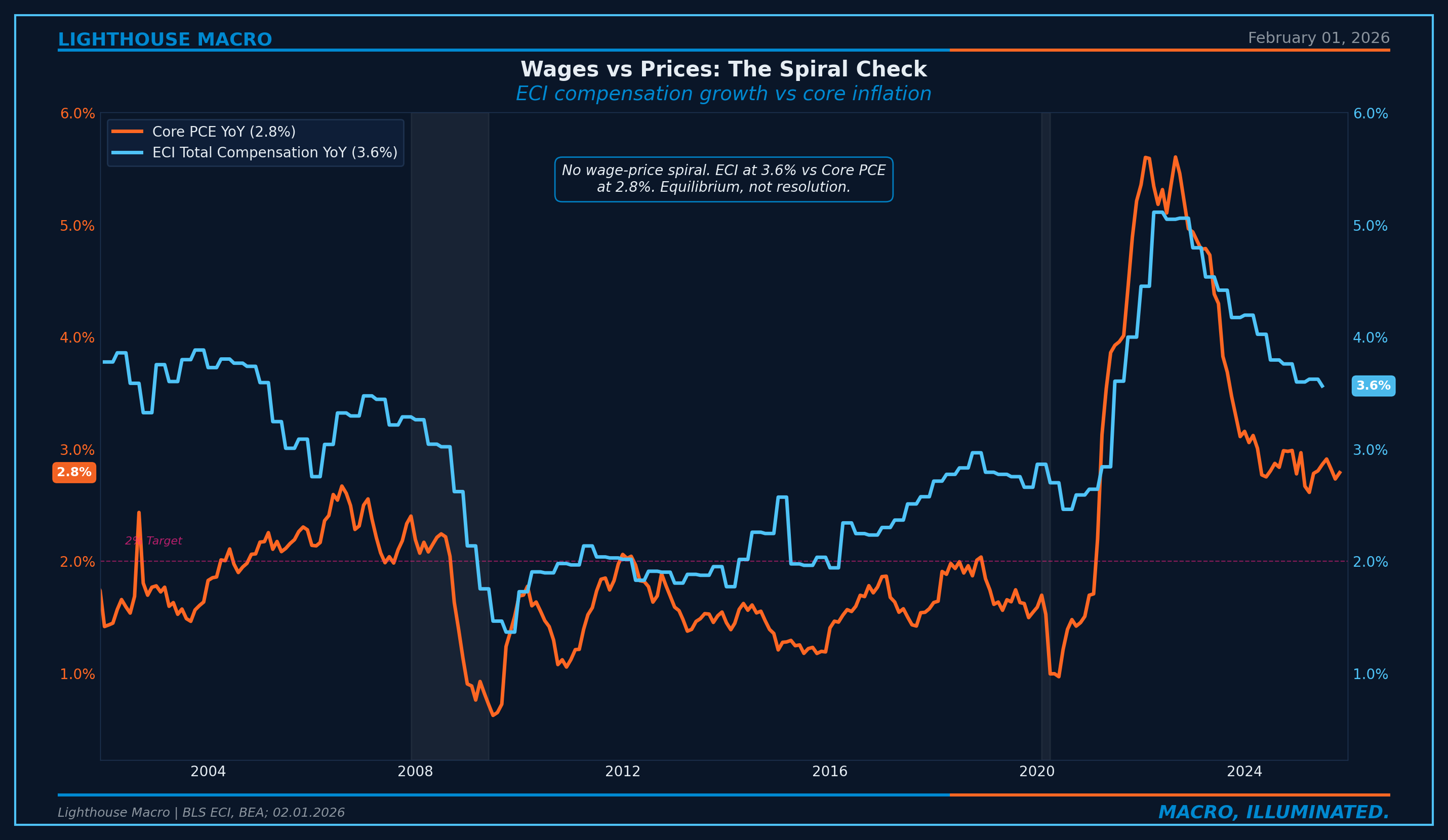
Figure 8: ECI Total Compensation vs. Core PCE. Wages above inflation means positive real wages but sticky services.
The Dollar Channel
The trade-weighted dollar is the mechanism behind goods price suppression. Dollar strength flows directly into goods prices with a 9-18 month lag. A 10% appreciation typically results in 1.0-1.5 percentage points of reduction in goods CPI.
The implication cuts both ways. If the dollar weakens in a rate-cutting cycle, goods inflation reaccelerates. The Fed’s own easing could reignite goods inflation, constraining how aggressively they can cut. There’s also a tariff channel: a broad 10% tariff could add 0.3-0.5 percentage points to headline CPI over 6-12 months.
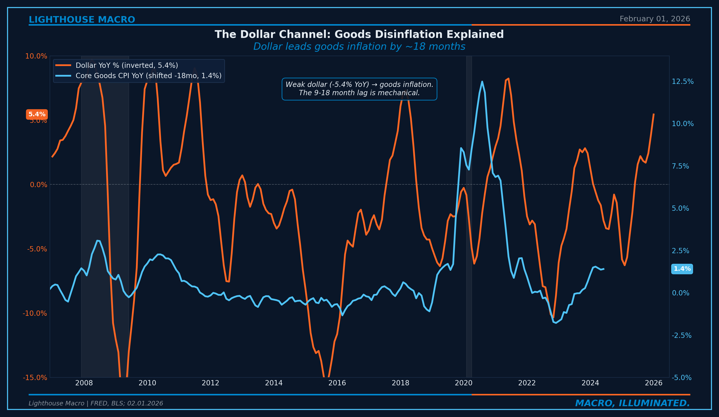
Figure 9: Trade-weighted dollar (inverted) vs. Core Goods CPI, shifted 18 months to show the lead relationship.
The Prices Composite Index
We synthesize the key inflation signals into a composite we call the Prices Composite Index (PCI). The purpose is regime classification: is the inflation environment one where the Fed has flexibility, or one where the Fed is constrained?
The PCI combines six components, each measured against a Fed-consistent target level:
Core PCE momentum (3-month annualized): The Fed’s primary target, highest weight
Services inflation trend: Wage-driven persistence
Shelter trajectory: Largest single CPI component, lagging but mechanical
Sticky price persistence: Atlanta Fed decomposition, predicts future core
Expectations anchoring (5Y5Y forward): The credibility gauge
Goods price level: Disinflationary force when negative
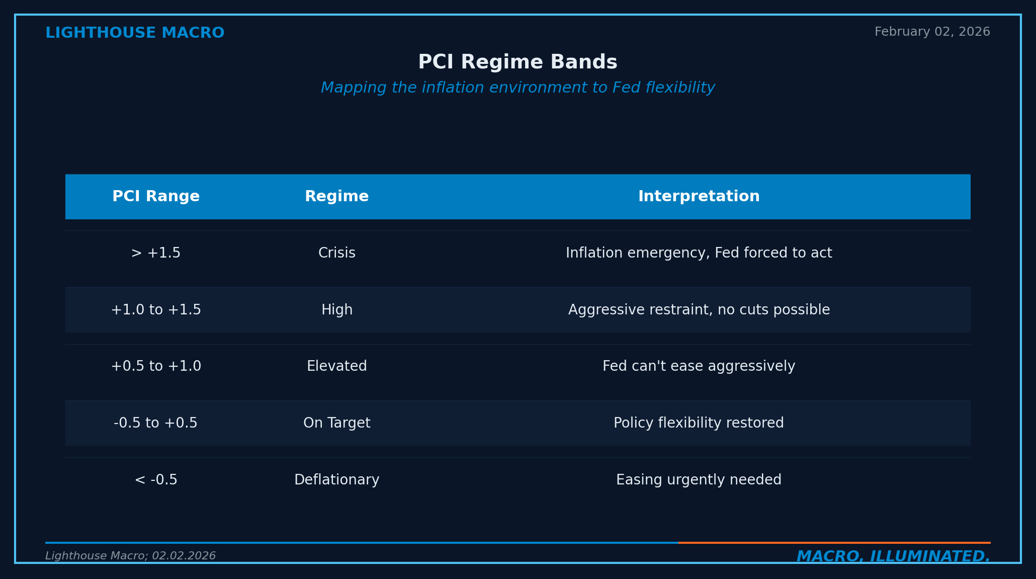
PCI above +0.5 means the Fed is constrained. PCI above +1.0 means no cuts possible. When multiple inflation indicators remain elevated simultaneously, the composite stays in restrictive territory, and the Fed stays boxed in.
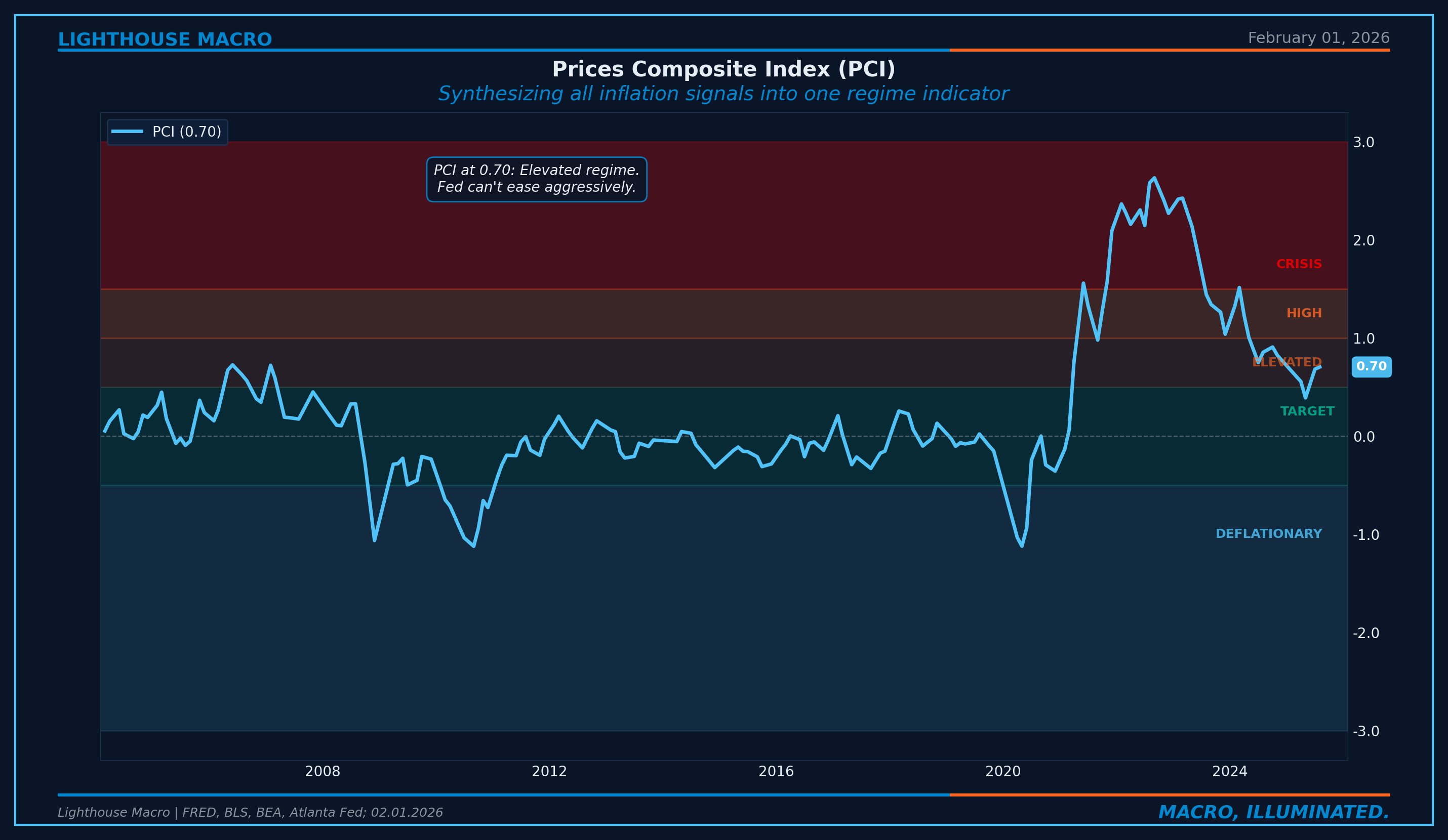
Figure 10: The Prices Composite Index (PCI). Regime bands show the inflation environment.
The Consensus Trap
Here is the pattern that repeats every cycle.
Surface narrative: “Inflation is beaten. Headline CPI has fallen from 9.1% to 2.7%. Soft landing achieved.”
What’s actually happening: Goods have normalized and are no longer pulling headline lower. Services remain elevated with a wage floor intact. Sticky CPI sits at 1.5x the target. The easy disinflation is done.
Consensus gets trapped by three biases.
Recency bias. Inflation fell from 9.1% to 2.7% in roughly two years. Extrapolating that pace suggests sub-2% soon. But the disinflation was driven almost entirely by goods reversal and energy normalization. Those forces are spent. The remaining improvement has to come from services, and services don’t deflate without labor market deterioration.
Headline focus. Media covers headline CPI. Markets trade headline CPI. The Fed watches core PCE. When headline and core diverge, consensus misses the Fed’s constraint.
Lag misunderstanding. As shelter continues to normalize, headline will improve. But the market will shift to watching services ex-shelter, which remains elevated. The goal post moves. When shelter finally cooperates, supercore becomes the binding constraint.
Where We Are Now
The surface metrics look constructive. Headline CPI at 2.7%, down from the 9.1% peak. Core goods at +1.4%, near flat. Core PCE 3-month annualized at 2.3%, trending in the right direction.
The persistence indicators tell a different story. Core PCE at 2.8%, still 40% above target. Sticky CPI at 3.0%, right at the threshold that historically requires recession to break. Trimmed Mean PCE at 2.5%, converging but still above target. ECI at 3.6%.
The pipeline has flipped. PPI at 3.0% now runs above CPI at 2.7%, suggesting inflationary pressure still in the pipe. Expectations remain bifurcated: 5Y5Y forward at 2.19% (well-anchored) while consumer expectations stay elevated.
The PCI currently sits in the Elevated regime. Shelter is unwinding. Goods have normalized. But services ex-shelter, sticky CPI, and wages remain elevated enough to keep the composite above the +0.5 threshold.
The headline may approach 2% eventually. The question is whether it gets there through genuine services moderation or through demand destruction.
How to Track This Pillar
Core PCE YoY. The Fed’s actual target. Sustained move below 2.5% signals the last mile is breaking. (Monthly, BEA, FRED: PCEPILFE)
Trimmed Mean PCE 12M. The cleanest trend signal. Convergence toward 2% confirms broad-based disinflation. (Monthly, Dallas Fed, FRED: PCETRIM12M159SFRBDAL)
Sticky CPI. The persistence gauge. Break below 3.0% historically requires recession. (Monthly, Atlanta Fed, FRED: CORESTICKM159SFRBATL)
Shelter CPI. The lagging anchor, 34% of headline. Compare to Zillow/Apartment List for the 12-month forward signal. (Monthly, BLS, FRED: CUSR0000SAH1)
PPI Final Demand. The upstream pipeline signal. PPI above CPI means pressure is coming. (Monthly, BLS, FRED: PPIFIS)
5Y5Y Forward Inflation. The expectations anchor. Above 2.5% is caution. Above 3.0% is alarm. (Daily, FRED: T5YIFR)
ECI Total Compensation. The gold standard wage measure. Deceleration below 3.0% is consistent with 2% inflation. (Quarterly, BLS, FRED: ECIALLCIV)
Release schedule: CPI mid-month (~13th), PCE end-of-month (~30th), PPI mid-month (typically one day before CPI). Use CPI for real-time signals, PCE for the Fed’s reaction function.
Invalidation Criteria
Every thesis needs an exit door.
Bull Case: If any three of the following trigger for three consecutive months, the elevated inflation regime ends:
Core PCE 3M annualized drops below 2.5%
Services ex-shelter drops below 3.0%
Sticky CPI drops below 3.0%
5Y5Y forward drops below 2.3%
PCI drops below +0.5
Bear Case: If any two of the following trigger, inflation is reaccelerating:
Core PCE 3M annualized exceeds 4.0%
Goods CPI accelerates above 3.0%
5Y5Y forward exceeds 2.75%
Services ex-shelter exceeds 4.5%
Framework drives positioning, but the framework can be wrong. Data determines outcome.
The Bottom Line
Inflation is not a number. It is a regime. And the regime has changed.
Pre-pandemic, 2.0% PCE was the equilibrium. That world required globalization tailwinds, subdued wages, and fiscal austerity. All three have reversed. Five structural forces, deglobalization, energy transition, demographics, housing underbuilding, and fiscal deficits, suggest a floor of 2.5-3.0%.
Watch composition, not the headline. Track the PCI regime bands. When PCI is above +0.5, the Fed is constrained. When sticky CPI is at or above 3.0%, the persistence problem hasn’t been solved. When services ex-shelter stays above 3.0%, the last mile is incomplete.
This is how we analyze inflation.
Bob Sheehan, CFA, CMT
Founder & CIO, Lighthouse Macro
This is the second in a 12-part series on the Lighthouse Macro framework. Next up: Pillar 3 (Growth) and the Second Derivative.