

Minus Twenty-Three
A Beacon, a Positioning Update, and a Chartbook in one. Free for 72 hours.

One number, a market that decided it meant nothing, and the full board laid out chart by chart. This edition is a Beacon, a Positioning Update, and a Chartbook in one: the fourteen charts that carry the argument, then a deeper look at how we actually build the portfolio, and finally the full board, three charts for each of the twelve pillars.
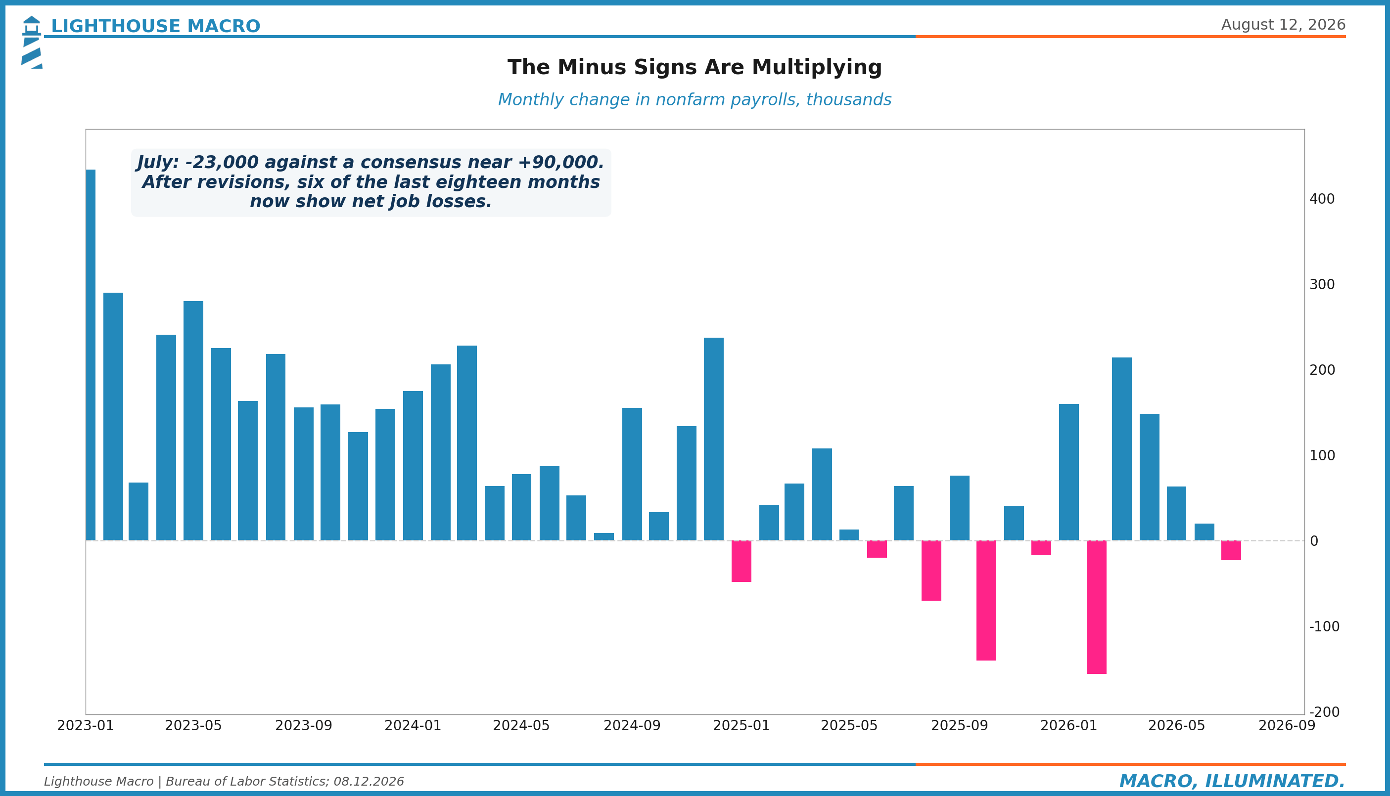
The last Horizon went out on August 4th with a dated watchlist and a set of scenarios with probabilities attached. Three days later the single most informative print on that list landed, and it landed hard. The United States economy shed 23,000 jobs in July against a consensus near +90,000, and revisions took another 103,000 out of May and June while nobody was looking. Job growth over the past year now averages 26,000 a month. After revisions, six of the last eighteen months show outright job losses.
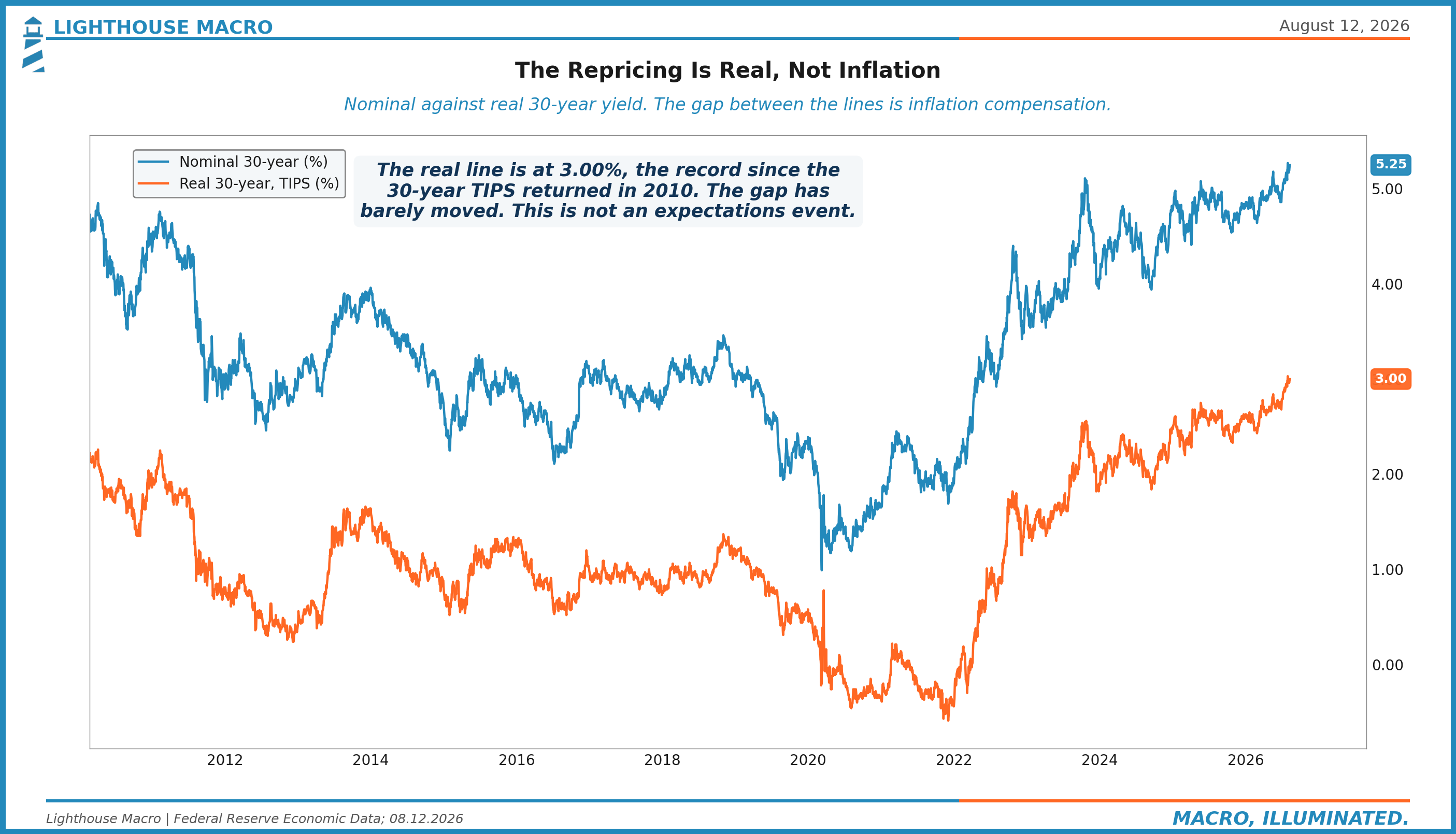
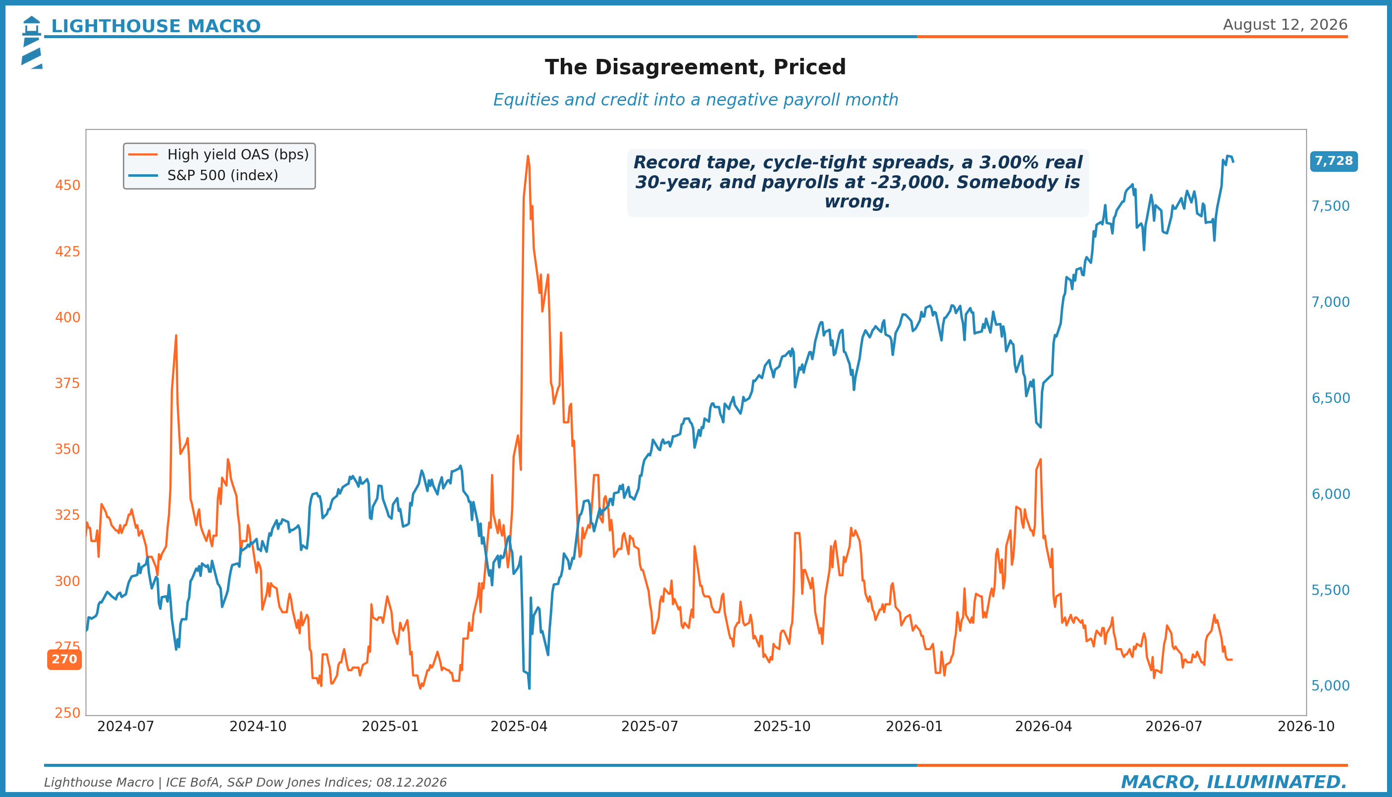
Here is what markets did with that information. Equities rallied. High yield spreads tightened, on the day of the print itself. The thirty-year barely moved, and by Monday the thirty-year real yield was back at 3.00 percent, touching the highest level in the history of the series. And the question the front end spent the week debating was not when the Fed will cut. It was whether a negative payroll print is enough to stop Kevin Warsh from hiking in September.
Read that paragraph again, because nothing about it is normal. In any cycle you have traded through, a hundred-thousand-plus miss into an outright negative print buys you a flight to quality, fifty basis points of cuts priced by lunch, and a credit market checking its collar. Last week it bought a party. There is a story that makes the party rational, the Street is leaning on it hard, and it has real economists and real math behind it. We spent the week testing that story against the one variable that can actually adjudicate it.
That test, and what it says about where the next mistake is priced, is this edition. So is the scoreboard on our own July map, kept honestly: one scenario we handicapped at 20 percent just happened, and our base case has so far gone the other way. So is something new we are adding to every edition going forward: our house asset allocation, with ranges, and the dated triggers that would move them. And so is the full board. Twelve pillars, three charts each, thirty-six charts, every one built from sourced data, because the relationships that decide the next six months only show up when you lay the whole thing out at once.
Before the paywall pitch, something owed. The first month of running a terminal and a research shop at the same time showed. Pharos went dark for stretches, and on the worst of them a paying subscriber noticed before we did. Publishing went quiet for a week when the calendar said it should not have. That is on us. We are a one-person operation building the plant while running it, and this month we learned the difference between doing the research and shipping it reliably. The fixes are real and already in: hardened pipelines, a watchdog that checks the terminal the way a subscriber would, and serving infrastructure that does not depend on one machine behaving. The research never stopped. The shipping did. That is fixed, and this edition is the receipt.
So this one, which would normally be paid top to bottom, is free for the next 72 hours. All of it: the full read, the allocation guidance, the book with the trades, the thirty-six chart board. Consider it the make-good, and consider it a preview of what the Watch actually gets. After Saturday it goes behind the paywall where editions like this normally live. Paid is $500 a year or $50 a month.
The Scoreboard First
We published a map on August 4th. Before we tell you what we think now, here is how that map has scored, because a research shop that only quotes its hits is an entertainment product.
"The labor freeze cracks and the Fed is forced." We gave it roughly 20 percent. The first half happened three days later, and faster than we allowed for. We wrote that a strong Friday print would weaken our labor read. Instead the print went negative. Score the direction for us and the sizing against us: we had the right scenario on the board and we had it underweighted.
"The long end is right and credit gets repriced." Our base case at roughly 45 percent. So far, wrong way. High yield went into the payroll week at 275 basis points and finished print day at 270. The repricing we expected has not started. It has un-started.
The anchor held, as we expected. The five-year five-year forward sits at 2.31 percent against our 2.45 alarm line. Whatever last week was, it was not an inflation-expectations event.
The 30-year real yield did not come back under 2.85. It closed Monday at 3.00. The July repricing was not an overshoot. It is a regime.
The second half of our 20 percent scenario, "and the Fed is forced," is the part that did not happen, and the fact that it did not happen is the strangest and most important thing on the board. We will get there.
The Anatomy of Minus Twenty-Three
Start with what actually happened in the report, because the headline number is the least interesting thing in it.
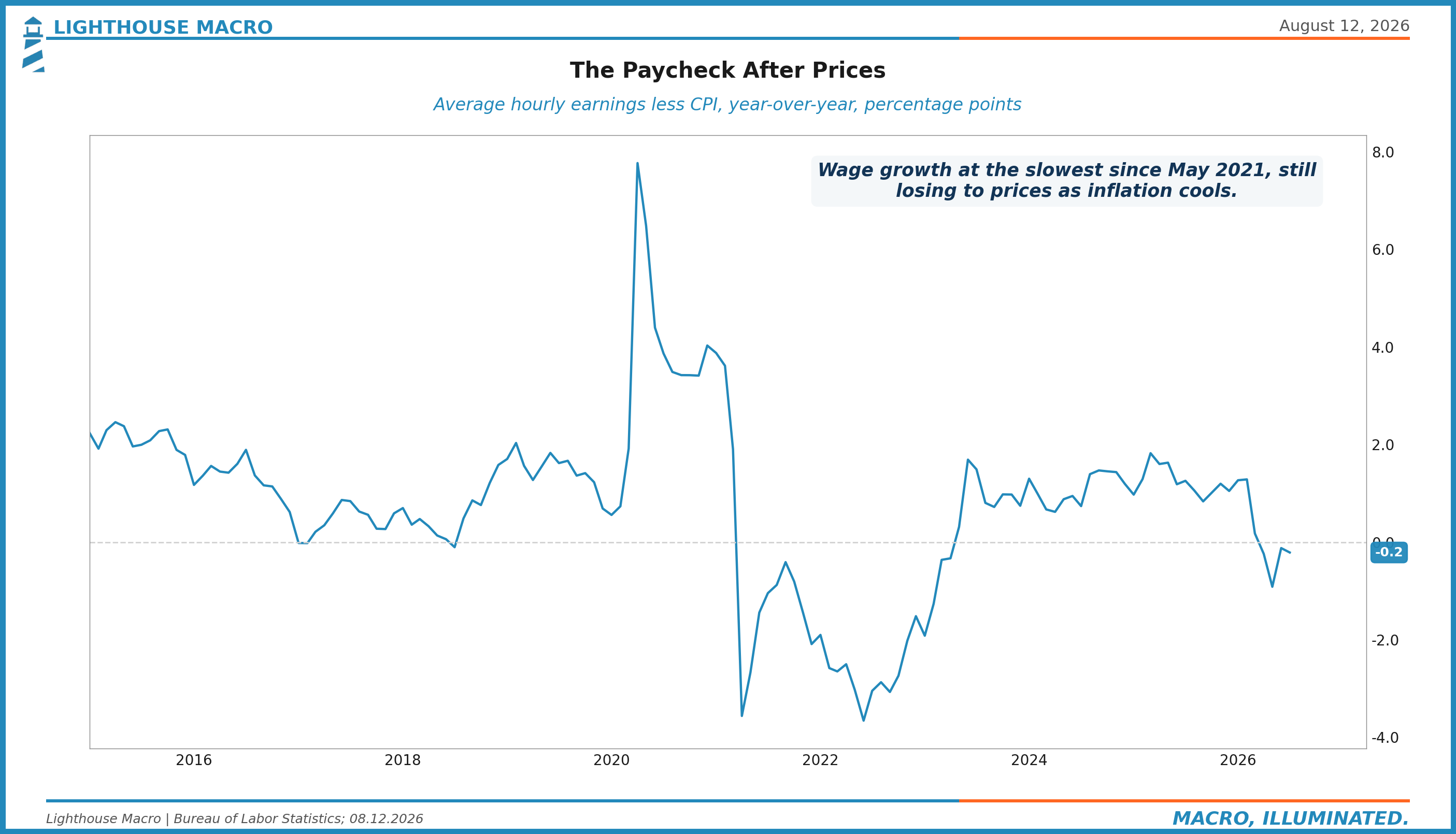
Payrolls fell 23,000. May and June were revised down by a combined 103,000, which means the labor market was weaker than anyone thought before July even happened. This was not supposed to be the story anymore: February went negative too, a strike helped explain it away, and the spring prints that followed looked like a genuine re-acceleration. Consensus penciled July at nearly +90,000 on exactly that logic. It missed by more than a hundred thousand. Average hourly earnings rose 3.2 percent over the year, the slowest since May 2021, and were close to flat on the month.
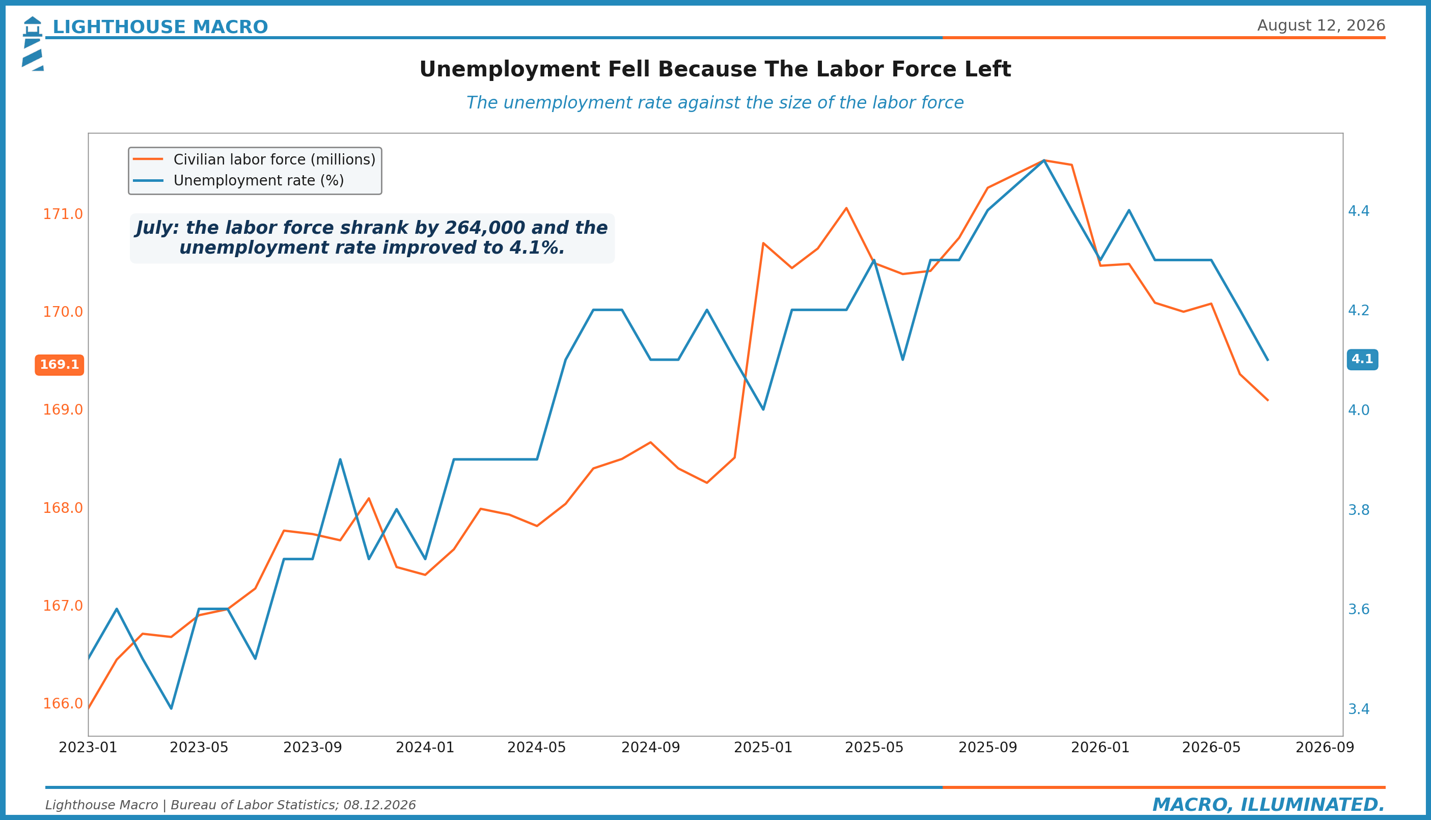
And the unemployment rate fell. From 4.2 to 4.1 percent.
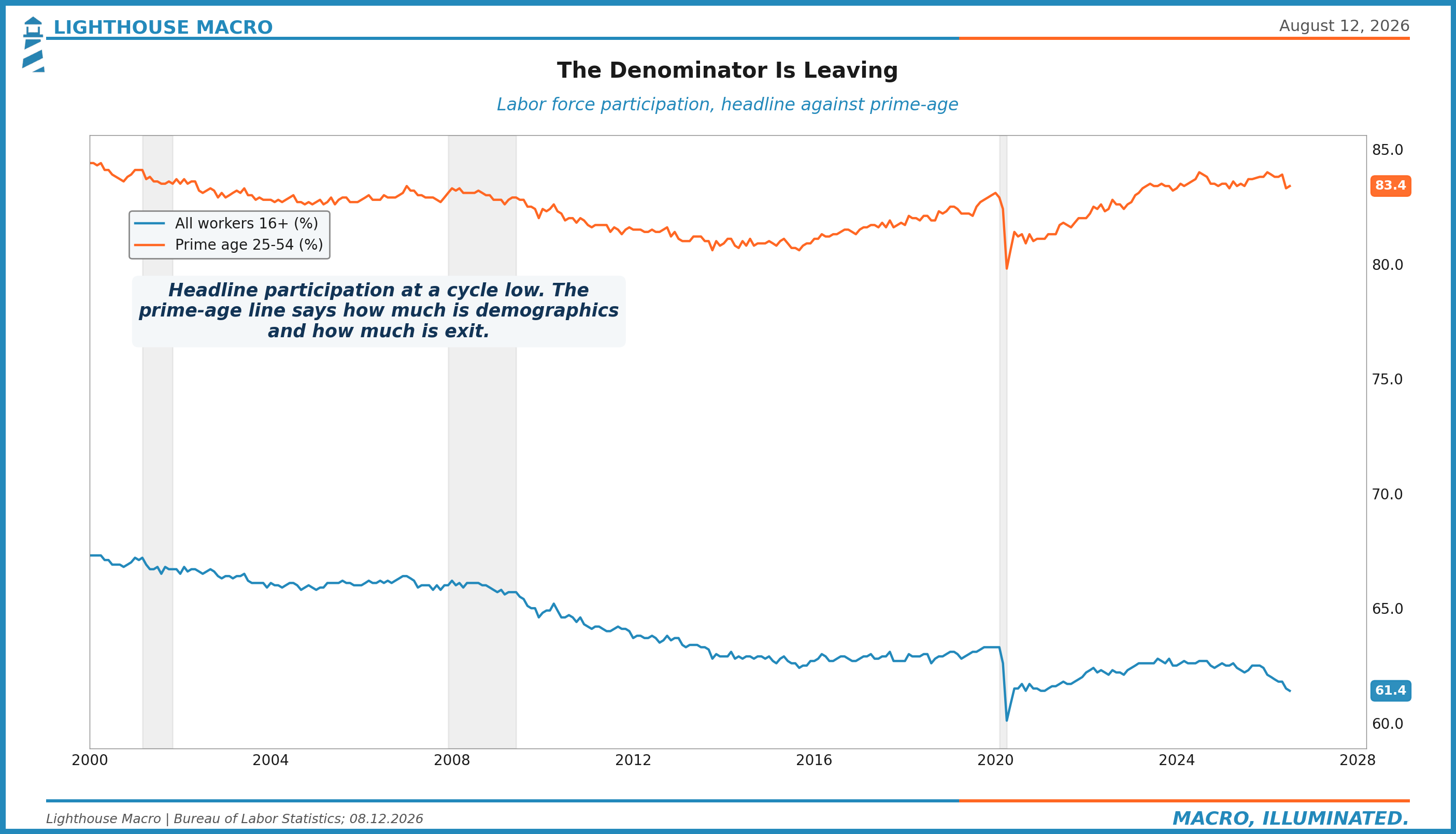
That last line is the whole report. The unemployment rate improved because the labor force shrank by 264,000 people in a single month, with participation slipping from 61.5 to 61.4 percent. The economy lost jobs and the share of the population unemployed went down anyway, because the denominator is leaving faster than the jobs are.
Stretch the frame back and it gets stranger. The unemployment rate peaked at 4.4 percent in February. Since then the economy has printed one soft month after another, shed jobs outright twice, and the unemployment rate fell anyway, five months running, to 4.1. Job losses have stopped raising unemployment in this economy. Hold that thought, because both the bulls and we agree on it, and we disagree completely about what it means.
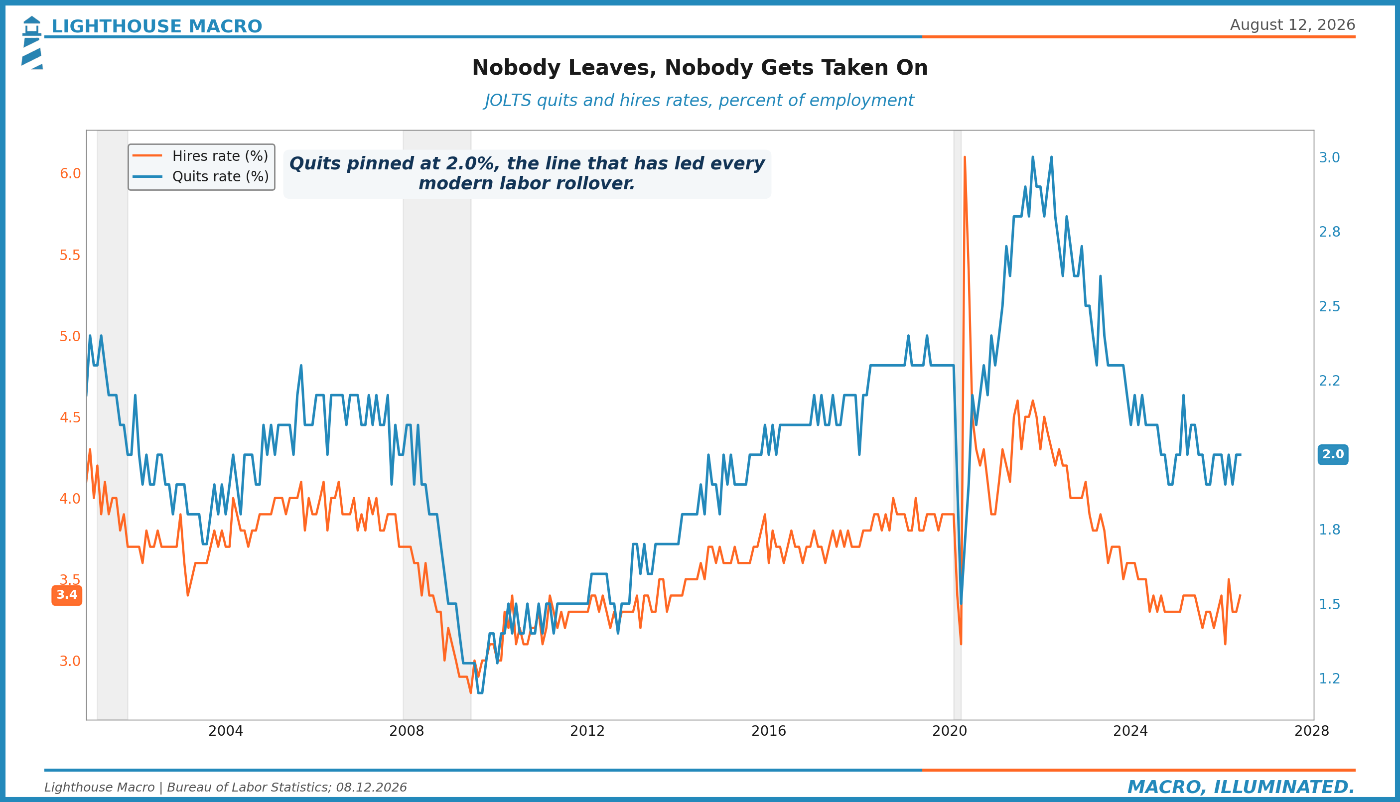
We have been describing this labor market as frozen since the spring. Quits at 2.0 percent, sitting exactly on the line that has marked the front edge of every modern labor rollover. Hires at 3.4 percent. Nobody leaving, nobody being taken on. The July report is what it looks like when a frozen market starts to crack: the flows stay frozen, the stock of jobs turns down, and the people on the outside stop being counted at all.
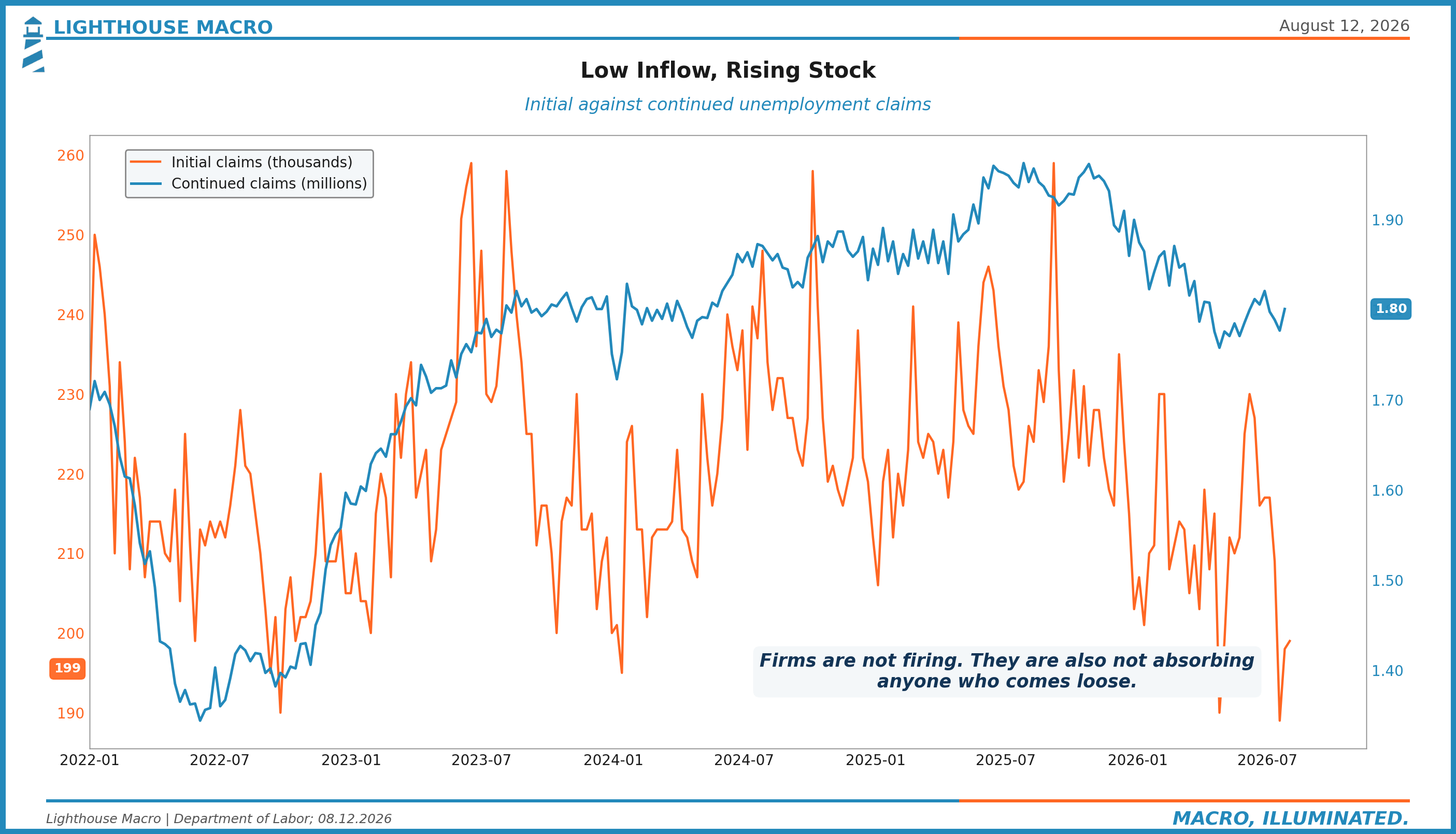
The claims data agrees, and it is worth being precise about how. Initial claims are running near 199,000, which is a firing rate close to historic lows relative to the size of the workforce. Continued claims sit around 1.8 million and have been grinding higher all year. Low inflow, rising stock. Firms are not shedding workers. They are simply not absorbing anyone who comes loose. That is why a negative payroll month produced no spike in claims, and why it will not need to for the damage to be real.
The Story the Market Bought
Now the other side, and we are going to give it its best form rather than a cartoon, because it is the most interesting macro argument on the Street right now and parts of it are simply true.
The argument is about breakeven payrolls, the number of monthly job gains needed to hold the unemployment rate steady. That number is a function of labor force growth. Immigration enforcement has swung net migration hard, the boomer retirement wave is peaking, and the labor force is now shrinking outright, July being the proof. Work from the Dallas Fed and the Kansas City Fed puts breakeven payrolls near zero, and by some estimates slightly below it, against roughly a quarter million per month at the 2023 peak.
If breakeven is zero, then minus 23,000 is not the recession klaxon your pattern memory says it is. It is a rounding error in a market where the supply of workers is falling as fast as the demand for them. Unemployment stable, wages fine, nothing to see. The economy simply needs fewer hires to stay at full employment than it used to, and every labor indicator has to be re-read against that lower bar. That is the story that let equities rally through a negative payroll print, and it is why the rate debate last week was about whether the Fed still might hike.
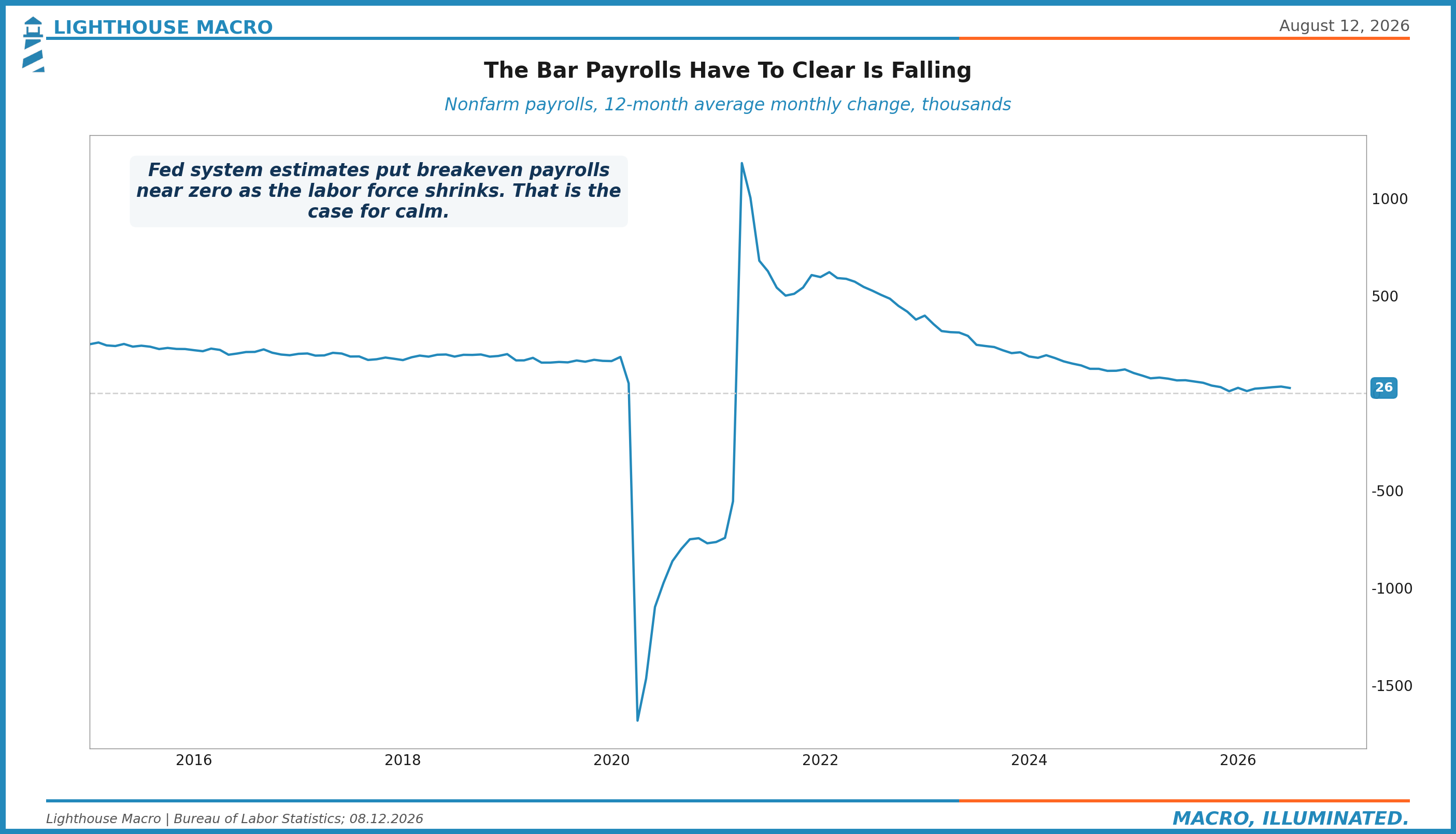
We want to say clearly: the supply half of this story is real. The labor force is genuinely shrinking, breakeven is genuinely near zero, and anyone still applying the 2015 rule of thumb that sub-100k payrolls means recession is using a broken ruler. We made a version of this point ourselves when the openings-per-unemployed ratio clawed back over one earlier this year.
The problem is what the story requires you to ignore.
The Adjudicator
When labor supply falls and labor demand holds, there is exactly one thing that must happen: the price of labor goes up. Scarce workers command wages. That is not a house view, it is the supply and demand diagram, and it is the entire mechanism by which a supply-constrained labor market stays benign. Fewer workers, well paid, fully employed.
So look at the price.
Average hourly earnings growth has decelerated to 3.2 percent, the slowest in over five years, and the month-over-month reading was close to flat. In January it was 3.7. The deceleration ran straight through the same five months in which the labor force was shrinking. The premium for switching jobs has collapsed to a few tenths over staying. Quits are pinned at 2.0 because workers can read their own market better than economists can, and they are reading it correctly: the reward for leaving is gone.
A labor market losing supply with demand intact produces accelerating wages and desperate employers. A labor market where wages are decelerating while the workforce shrinks is telling you demand is falling through the supply floor. The scarcity is real and the softness is real, and the wage line tells you which one is winning. Demand is winning. Downward.
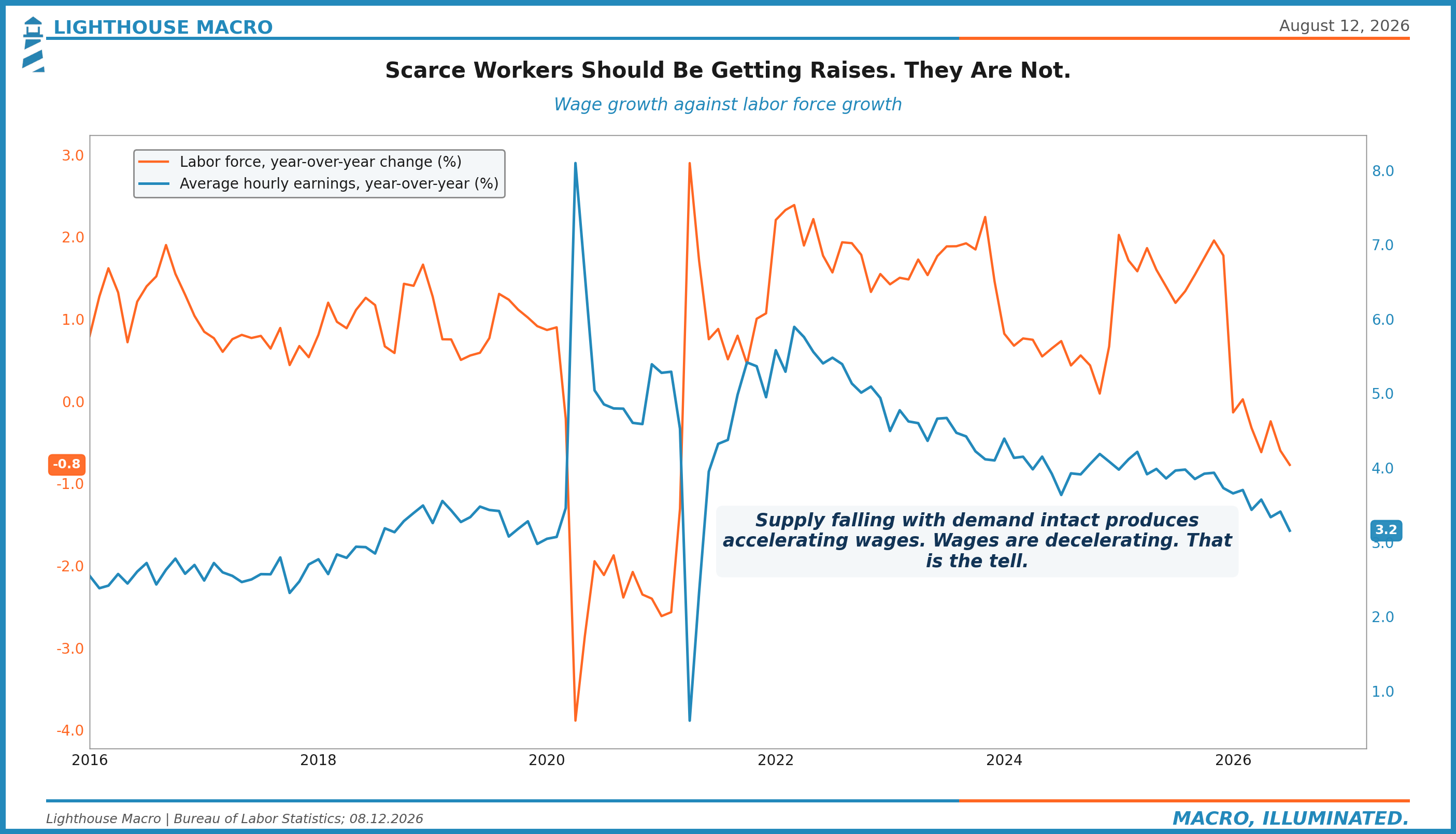
This is the distinction the party missed. The breakeven argument tells you the unemployment rate will be slow to rise, and that is true, and it also does not matter, because the unemployment rate was always the last thing to move. What the breakeven argument cannot do is turn falling labor demand into good news for the earnings, the spending, and the credit performance of the households attached to it. A worker who leaves the labor force stops being a statistic and keeps being a customer with no paycheck.
We wrote a piece in January called "Why Most Americans Don't Care About Your Market Call," and the two economies in it are about to have another disagreement. The market economy just got told that job losses no longer raise unemployment, and it heard: the number that scares the Fed is disarmed, nothing can hurt us. The household economy just got told the same thing, and it means: you can lose your job and not even show up in the statistics anymore. Both heard correctly.
The Party, Itemized
Here is what got priced in the five sessions after the print, and where we think the mistake is concentrated.
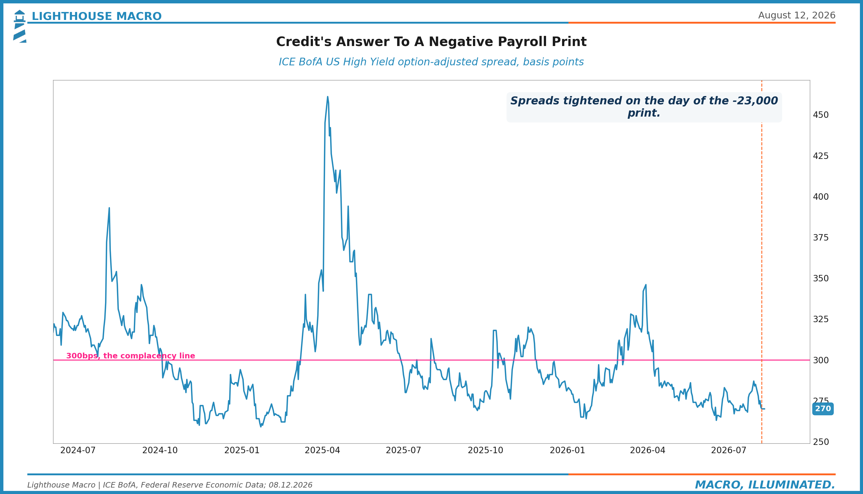
High yield spreads tightened to 270 basis points, through the level they held before the print and well inside the 300 line we treat as complacency. Investment grade sits near 78. To be clear about what that means: a negative payroll month made it cheaper for leveraged companies to borrow. Spreads are priced for an economy where labor demand is fine. The wage line says labor demand is the thing that is breaking.
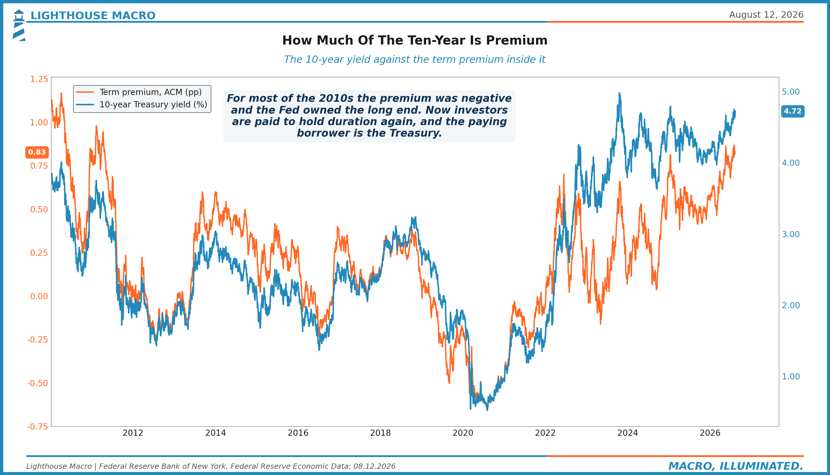
The long end did not buy the relief story either, which people keep failing to notice because they keep watching the front end. The thirty-year rallied three basis points on payrolls day and gave it back by Monday, closing at 5.25 percent with the real thirty-year at 3.00, back at the record it set in July. The market that funds the government for thirty years looked at a negative payroll print, considered what a weakening economy does to deficits already stressed, and charged more. Our August 4th argument is intact on this point: the long end has stopped trading the cycle and started pricing the borrower.
And the front end, the one place a rate response should have shown up, spent the week arguing about a hike. Futures pricing on a September hike fell from the mid-50s in percent terms to the low 40s on the print. That is the tell worth framing: a negative payroll month moved hike odds by barely more than a coin-flip's edge and put essentially nothing behind cuts. Warsh has said there is only one target and it is 2 percent, three of his committee dissented in favor of a hike nine days before the labor market printed negative, and the market believes him. The reaction function you have traded against for twenty-five years, where labor weakness manufactures rate relief, is not there. We said the Fed put was gone on a podcast in June. Last week was the first controlled experiment of the Warsh era, and the put did not show.
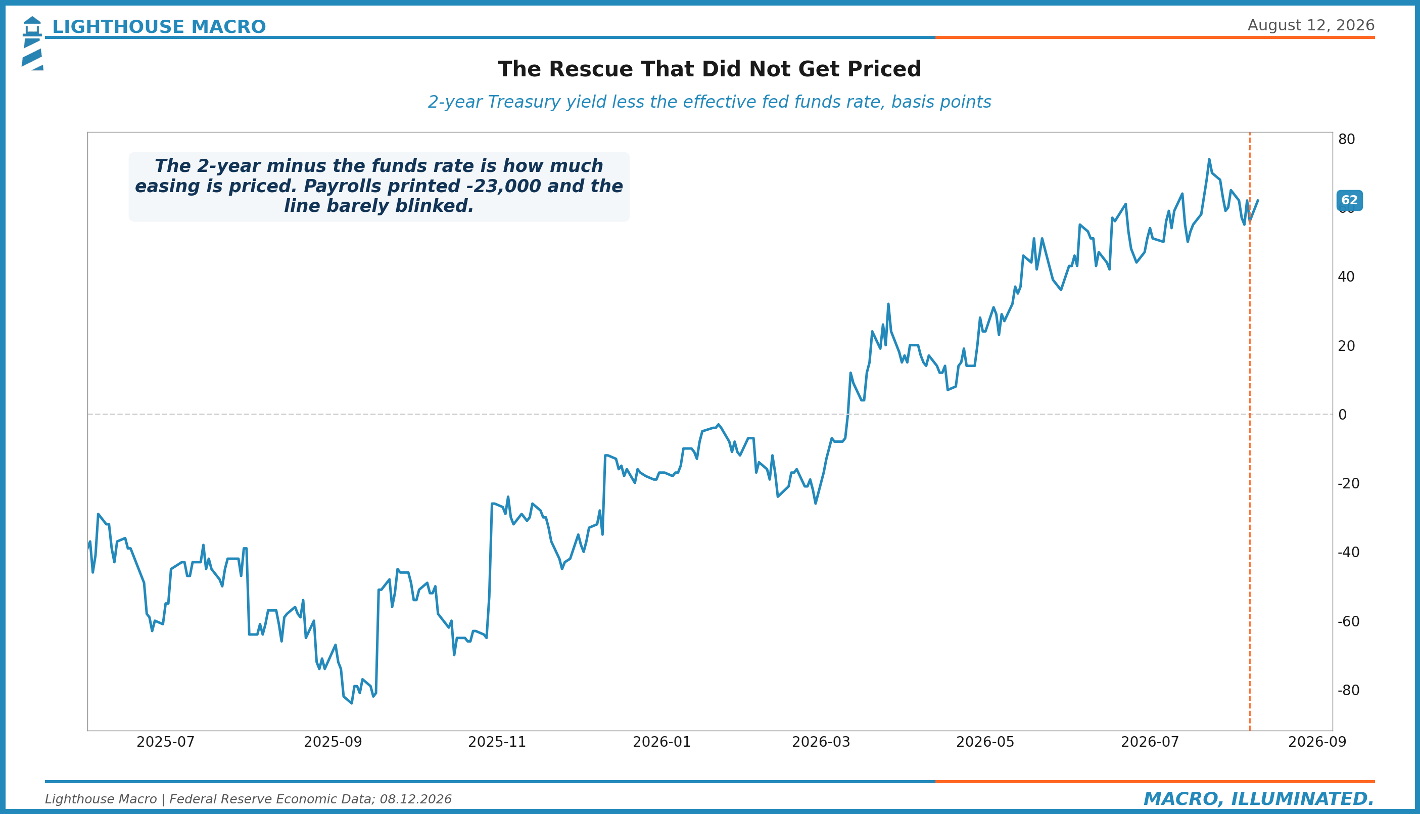
So itemize the party. Equities at records on a supply story that requires ignoring wages. Credit at cycle tights, priced for labor demand that just went negative. The long end at record real yields, refusing to price relief. The front end pricing no rescue because the rescuer says the target is 2 and means it. Every one of those markets is internally consistent. They are just not consistent with each other, and the wage line is the umpire that says which of them has it wrong. We think it is credit, more than ever, and we think the second most exposed asset is the equity that trades one floor above it.
This Morning's Print
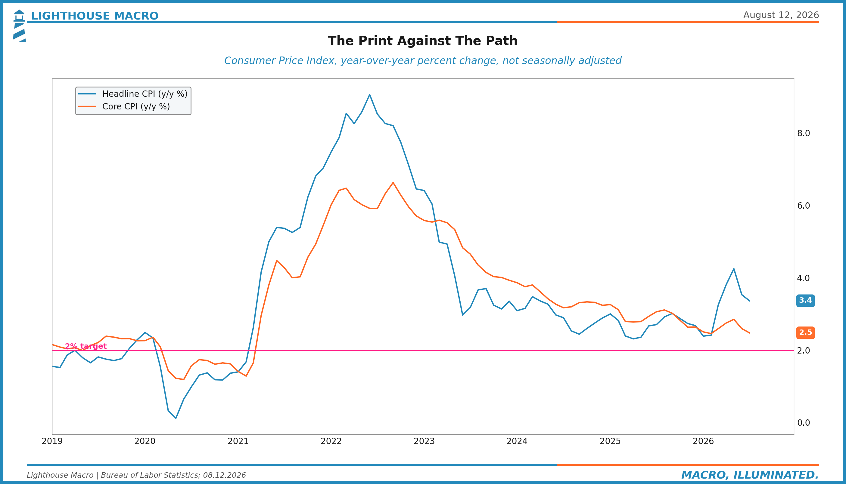
The July Consumer Price Index landed while this edition was being finished, and it landed exactly on consensus. Headline inflation rose 0.1 percent on the month and decelerated to 3.4 percent over the year, from 3.5 in June. Core came in at 2.5 percent, from 2.6. No drama, no surprise, and in this particular tape no drama is itself information.
Two readings matter for the argument above. First, an on-consensus, decelerating inflation print three days after a negative payroll month starves the September hike case of its last argument. The debate that was still running at meaningful odds last week now has neither the labor data nor the inflation data on its side, and what remains is a hold, which is precisely the reaction function we described: not easing, just not moving. Second, and less comfortably for the household side of the ledger, wage growth at 3.2 percent against headline inflation at 3.4 means the average paycheck is still losing to prices even as inflation cools. Disinflation with decelerating wages is not relief. It is the squeeze continuing in slow motion, and it is why the two economies keep reading the same numbers differently.
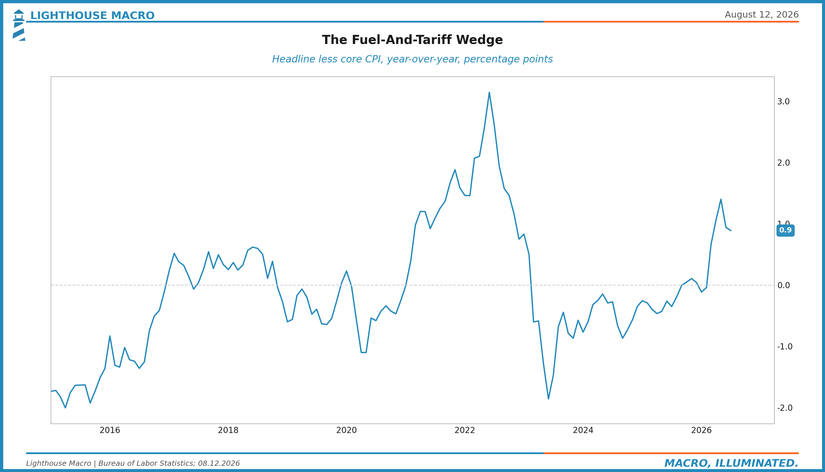
One caveat we owe from our own watchlist. The Horizon argued the August inflation data would underwhelm the disinflation consensus because pump prices have not fallen the way the pass-through math implies. July does not test that call. The August print does, and the fuel wedge chart below is the tracker we will score it against next month.
What Would Change Our Mind
Strong views, weakly held, and here are the breakers, dated where possible.
Wages re-accelerate. Two consecutive months of average hourly earnings at 0.35 percent monthly or better would say labor demand is holding through the supply shrink and the benign version of the breakeven story is the right one. We would take the credit view down materially.
Quits decisively above 2.0 percent with hires following. The freeze thawing in the flows, not in a survey. September 1 JOLTS.
High yield through 300 and widening. Not a breaker, the opposite: the confirmation that the repricing has started. Position sizing waits on it.
The labor force stabilizes. If participation holds 61.4 and the labor force posts two positive months, July's exit was noise and the denominator panic was ours.
The September FOMC. If the committee cuts, or Warsh materially softens, the reaction function we described above is wrong and everything priced against it needs re-marking. We do not expect it. That is what makes it a real test.
The House View
New standing section. From this edition forward, every Beacon carries our asset allocation guidance alongside the analysis, with ranges and the dated triggers that would move them. Worldview without a portfolio is a tweet.
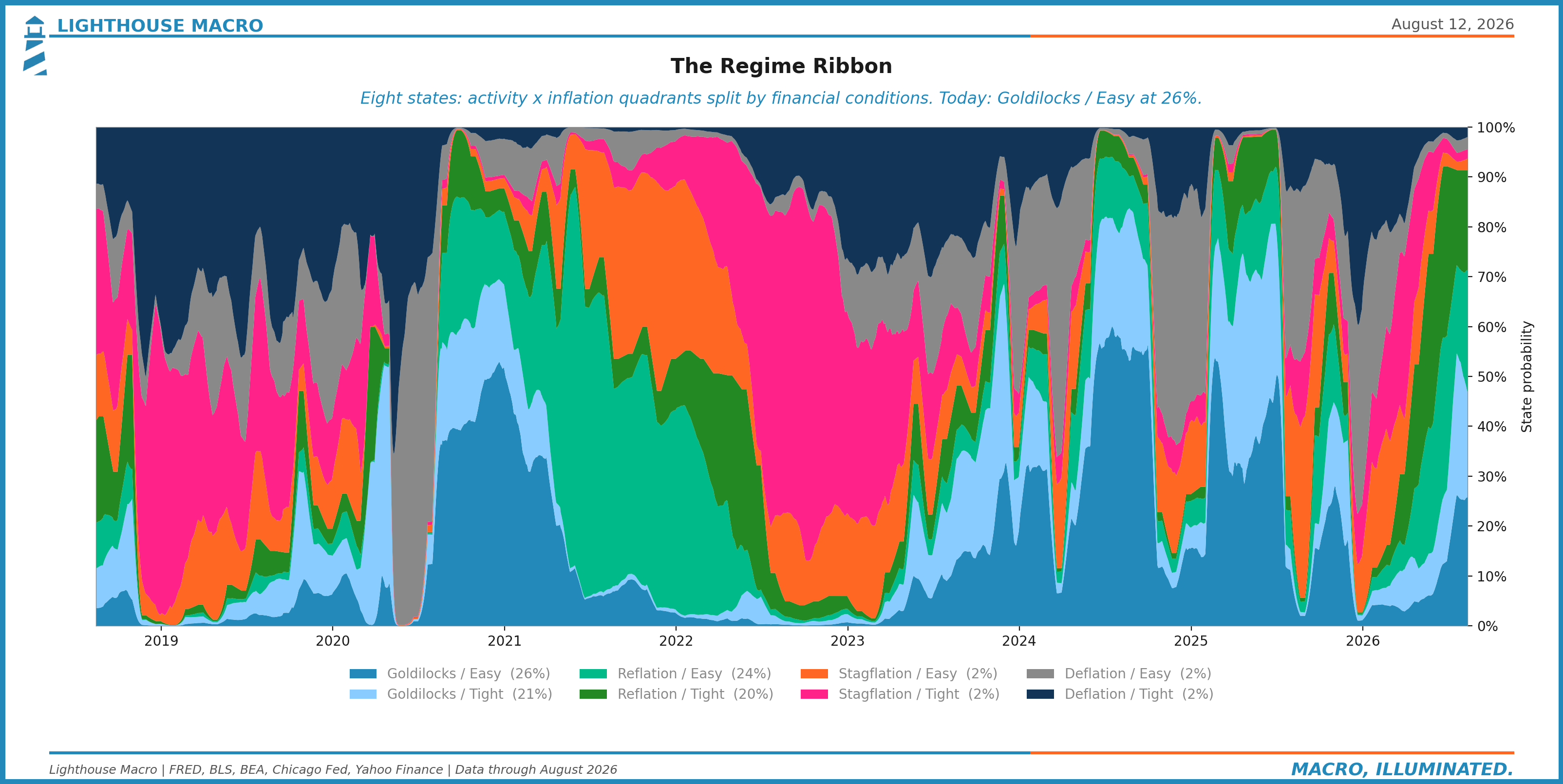
Our regime work nets out neutral. Not benign: neutral, the way a scale reads zero when two heavy things balance. Growth measures are genuinely strong, the market structure underneath equities is genuinely healthy, and against that sit a cracking labor market, a fatigued consumer, a frozen housing channel, and a fiscal position being repriced in real time at the long end. Neutral regime, deteriorating mix.
Here is that regime work drawn as one picture. Eight states from the four dials we run: growth, inflation, credit, liquidity.
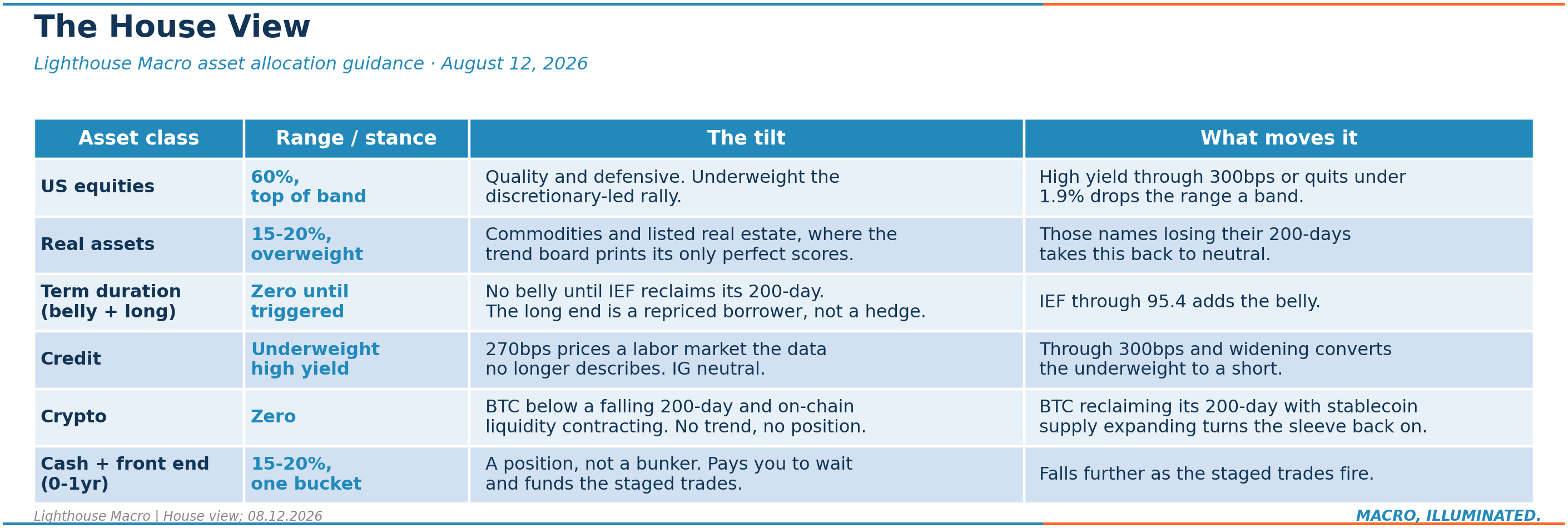
The ranges we are working from, for a benchmark-aware multi-asset mandate:
What moves us. High yield through 300: equity range drops a band and the credit underweight becomes a short view expressed properly. Quits under 1.9 with claims momentum turning: same move, faster. Wages re-accelerating two months running: we lift the credit underweight and add cyclicality. A Fed cut without labor stabilization: we extend duration but not credit, that is the stagflationary fork. Crypto stays at zero until Bitcoin reclaims its 200-day with stablecoin supply expanding, both checkable on any terminal. Each of these is a dated trigger, and we will score them in this section every edition, the same way we scored the Horizon above.
The Book
The live book is auditable in real time on PiTrade, every fill timestamped, and we are going to talk about it the way we would want any manager to talk to us: by marking it honestly and then doing something about it.
Going into today the book ran seven positions at near-equal weight: healthcare (XLV, up 7 percent on the position and at a fresh 52-week high this week), quality large caps (QUAL, up 3.5 percent), agribusiness (MOO, flat), China internet (KWEB), a broad crypto index (BITW), wheat (WEAT), and a front-end cash position (SGOV). That book has protected capital and it has not kept up with a tape that ran to records, and the reason is not mysterious. The names that are working were being diluted by one that violates our own exit rules outright and several that were never going to carry a rally.
So today we are concentrating, in public. BITW goes: 20 percent below a falling 200-day, more than 50 percent off its high, and our own liquidity work on the crypto complex reads contracting. Agribusiness goes: above trend, doing nothing, and conviction is a scarce resource we are done spending there. Wheat goes into strength: a relative laggard sitting under resistance on a declining 50-day, and this morning's premarket bounce is exactly the exit you take on your own schedule rather than the market's. And China internet goes last. We drafted a version of this section that kept it as a named exception on an early-stage turn, then applied the book's first rule instead: it trades below a falling 200-day, and a book built on gates does not get to carry exceptions in the same edition where it preaches about them. Every seat now belongs to something passing its tests.
The enforcement, in one table.
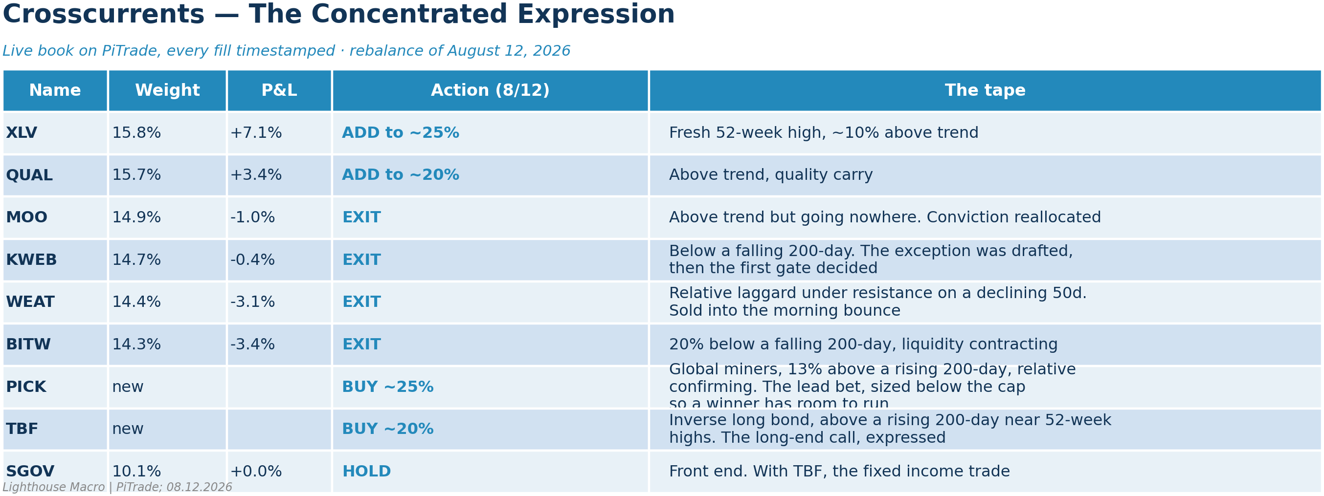
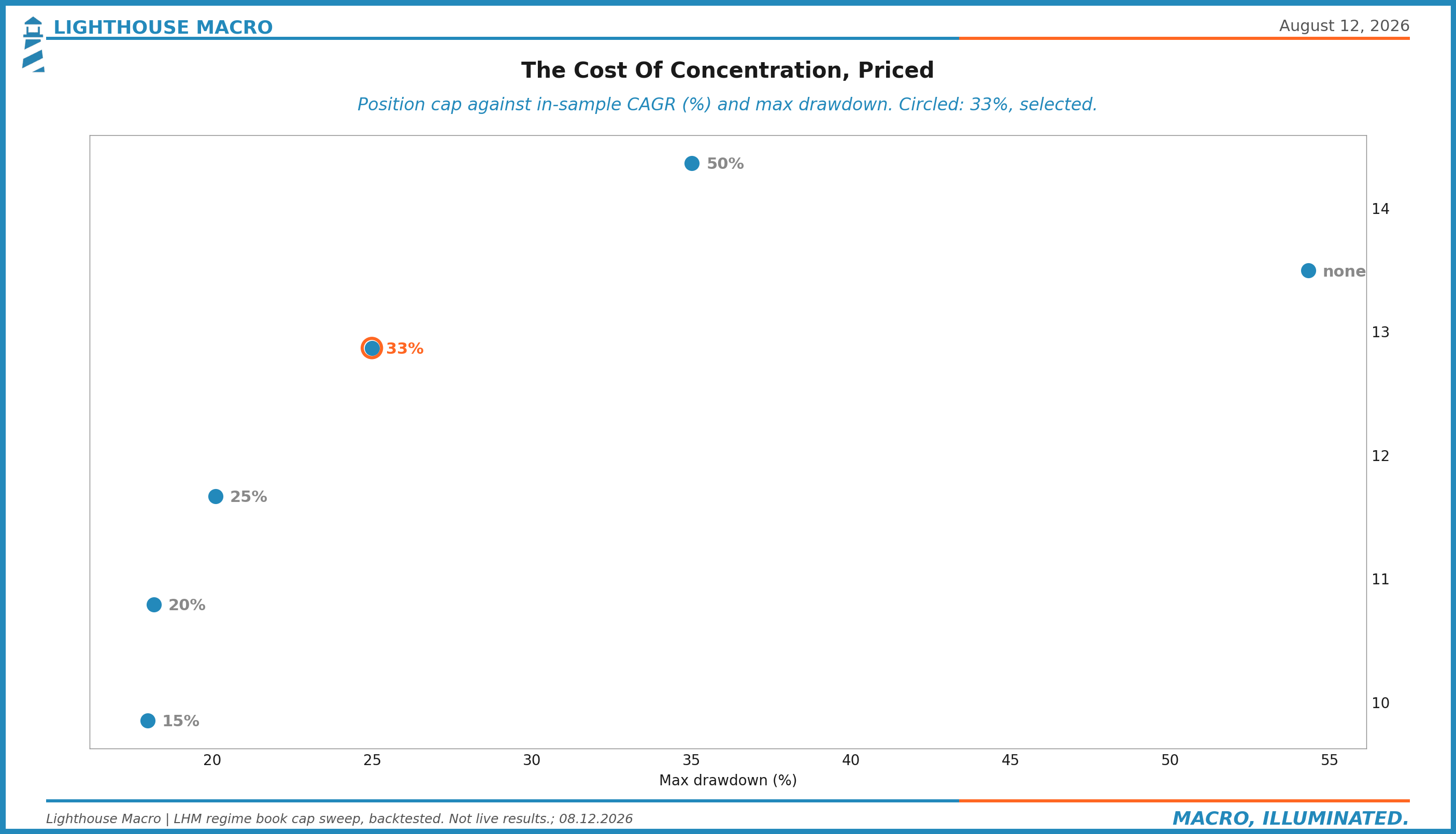
Where it concentrates. The freed capital goes to conviction, sized to leave room. Global miners lead (PICK, roughly 25 percent), the equity expression of the one sleeve printing perfect scores on the trend board: 13 percent above a rising 200-day with relative strength against the index confirming, six percent off its high. Twenty-five and not thirty, deliberately: positions enter below the 33 percent cap so a winner has room to compound into it before the sizing rules wake up. Healthcare builds to 25, the purest expression of the defensive rotation and at a fresh 52-week high this week. The long-bond short comes in at roughly 20 (TBF), above its own rising 200-day near 52-week highs, this edition's spine expressed as a position rather than an absence at a carry cost near a point and a half a year. Quality builds to 20 and the front end holds near 10. The result is a five-position book: the miners and healthcare as the lead bets, the long-bond short, quality, and the front end paid to wait.
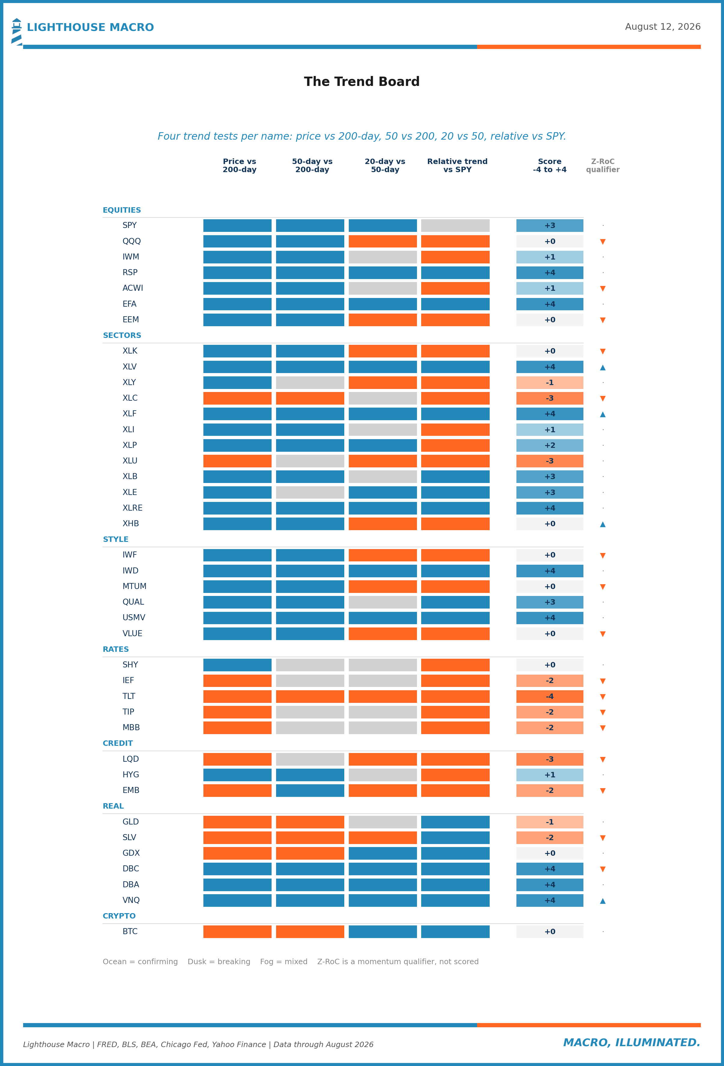
The board below is the machine that runs those gates, four trend tests per name across forty names: price against the 200-day, the 50-day against the 200-day, the 20-day against the 50-day, and relative trend against the S&P. Read the columns and today's book writes itself. Healthcare, financials, real estate, equal-weight and low-vol all print perfect +4 scores, quality sits at +3, the QQQ and the momentum factor read flat, every name on the rates panel is negative with the long bond at -4, and investment grade prints -3 while high yield's own tape hangs at +1 with spreads still at 270. The credit market's price is complacent and its trend column is thinner than the tape above it. We publish this board so you can check our trades against our tests.
And this is the machine's own report card, shown rather than described: the backtested program at the sizing rules we actually run, the stop search that settled the exits, and the cost of concentration, priced. One thing to hold while reading it: this panel is the pure-quant version, the framework running itself with no judgment applied. The live book is that framework plus discretion, which is the whole design. The machine is in one of its slumps right now, a stretch the live book has not ridden nearly as hard, because judgment is allowed to say not today. The machine sets the gates and the floor. The judgment exists to beat it, and if over time it does not, you should fire us and keep the machine.
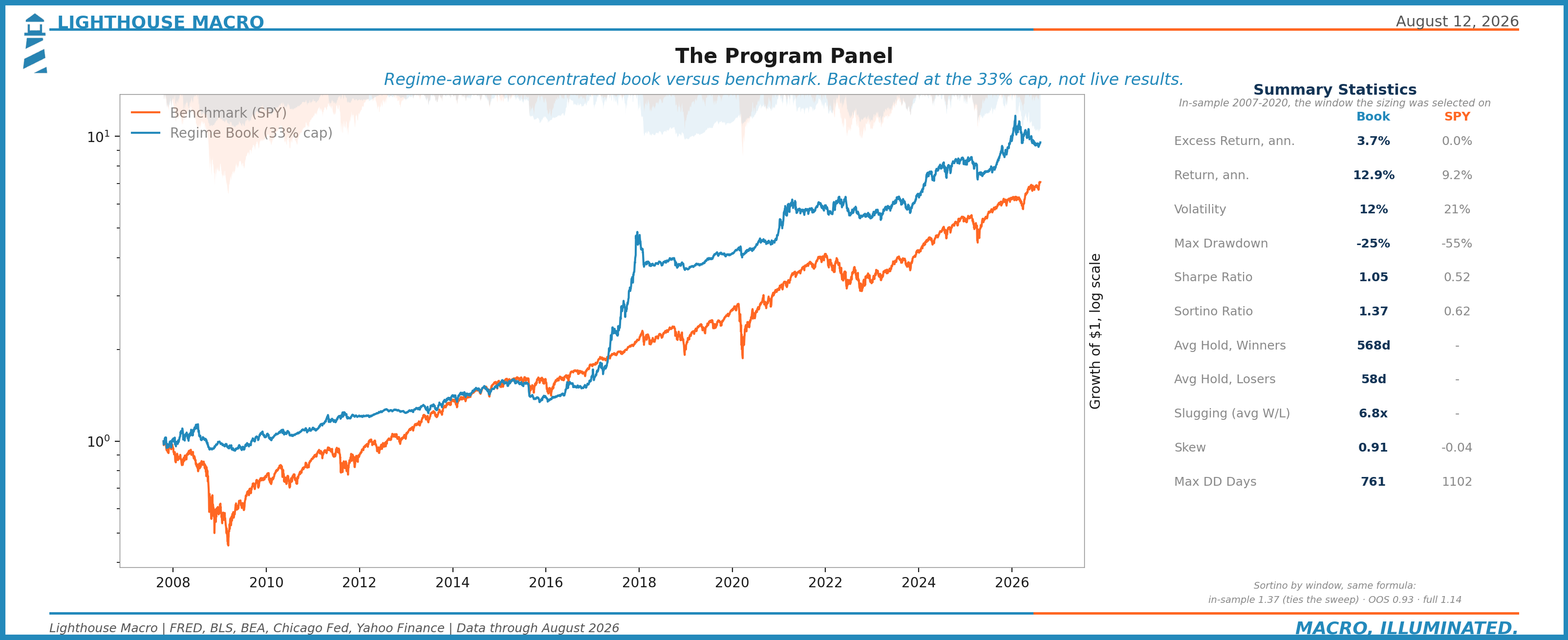
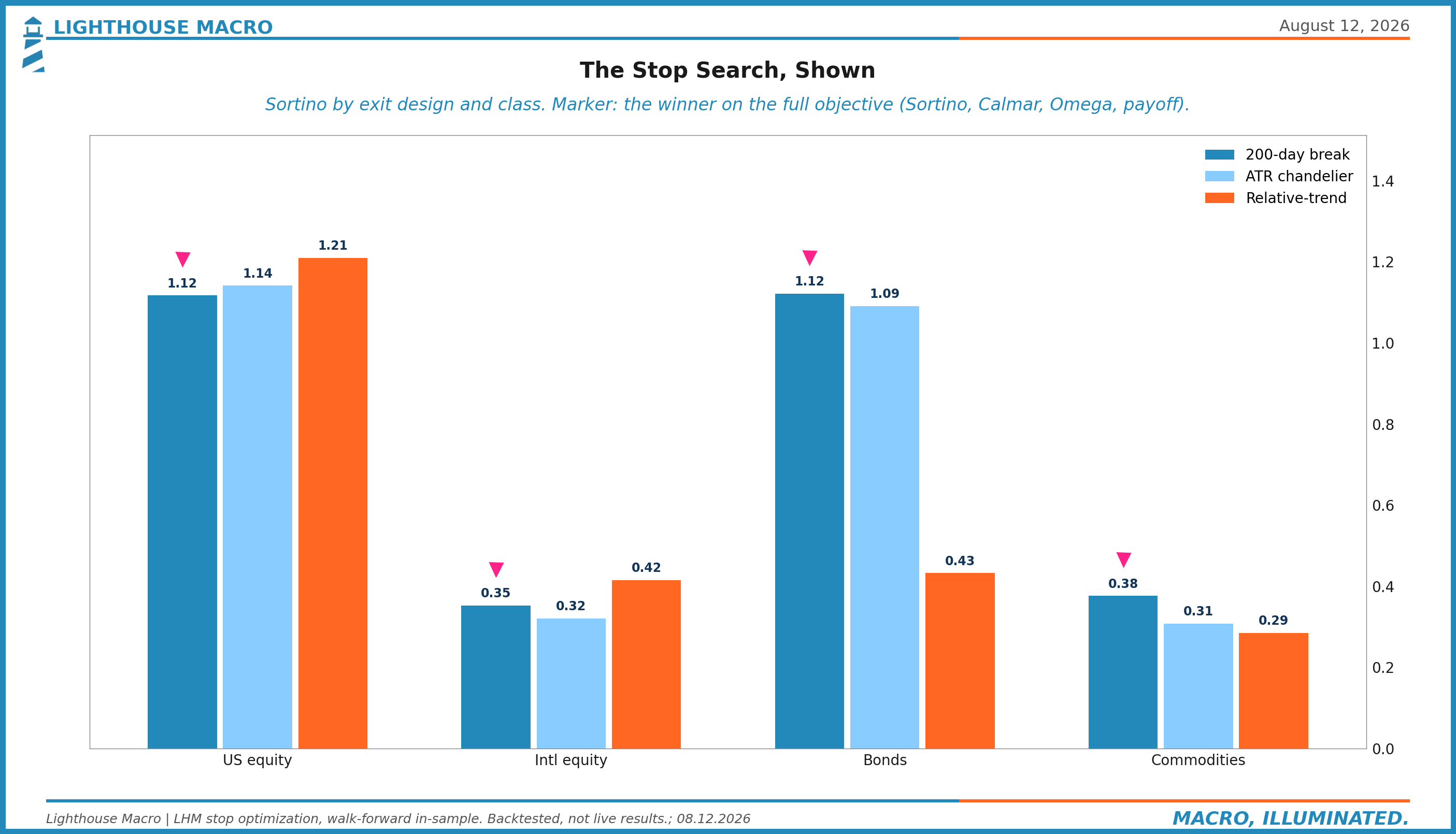
A word on exits, because they are not vibes. We test three exit designs per asset class, the trend break, a volatility ratchet, and a relative-trend break, in a walk-forward search, and the trend break with a 2 percent buffer has won every asset class we run. When the tested answer is the boring one, you take the boring one. What the discipline buys is time asymmetry: across the backtest the average winner is held about a year and a half and finishes near +39 percent, while the average loser is cut inside two months at about minus 6. Winners get ten times the leash, which is the entire point. Selling wheat above its trend is the other kind of exit, a capital decision rather than a stop, made while the market was offering a bid.
What is staged, with triggers. One trade stays armed but not live: short high yield (margin capability is live on the book) if spreads break 300 basis points and keep widening. At 270 the asymmetry is obvious, but shorting credit is negative carry, and paying away a seven percent yield to be early is how right ideas lose money. And one trigger now does double duty: IEF reclaiming its 200-day near 95.4 covers the long-bond short and buys the belly in the same move. When duration turns for real, we stop being short it and start owning it. Until then, seven-to-ten-year Treasuries below a falling trend near 52-week lows are the market agreeing with our argument.
This section will never quote account size. What it shows is positions, reasoning, and discipline, timestamped, auditable, and scored when they close. Today it also shows what enforcement looks like.
The Chartbook
Twelve pillars. Three charts each. Every chart built from sourced public data, every one framed as a relationship rather than a level, because a series on its own tells you what happened and only the relationships tell you what it means. This is the full board we run the firm on, laid out in the order we scan it.
1. Labor
The source code, and the pillar that broke first.
Chart 1. Quits lead, unemployment follows. The truth serum sits at 2.0 percent, on the line that has led every modern rollover.
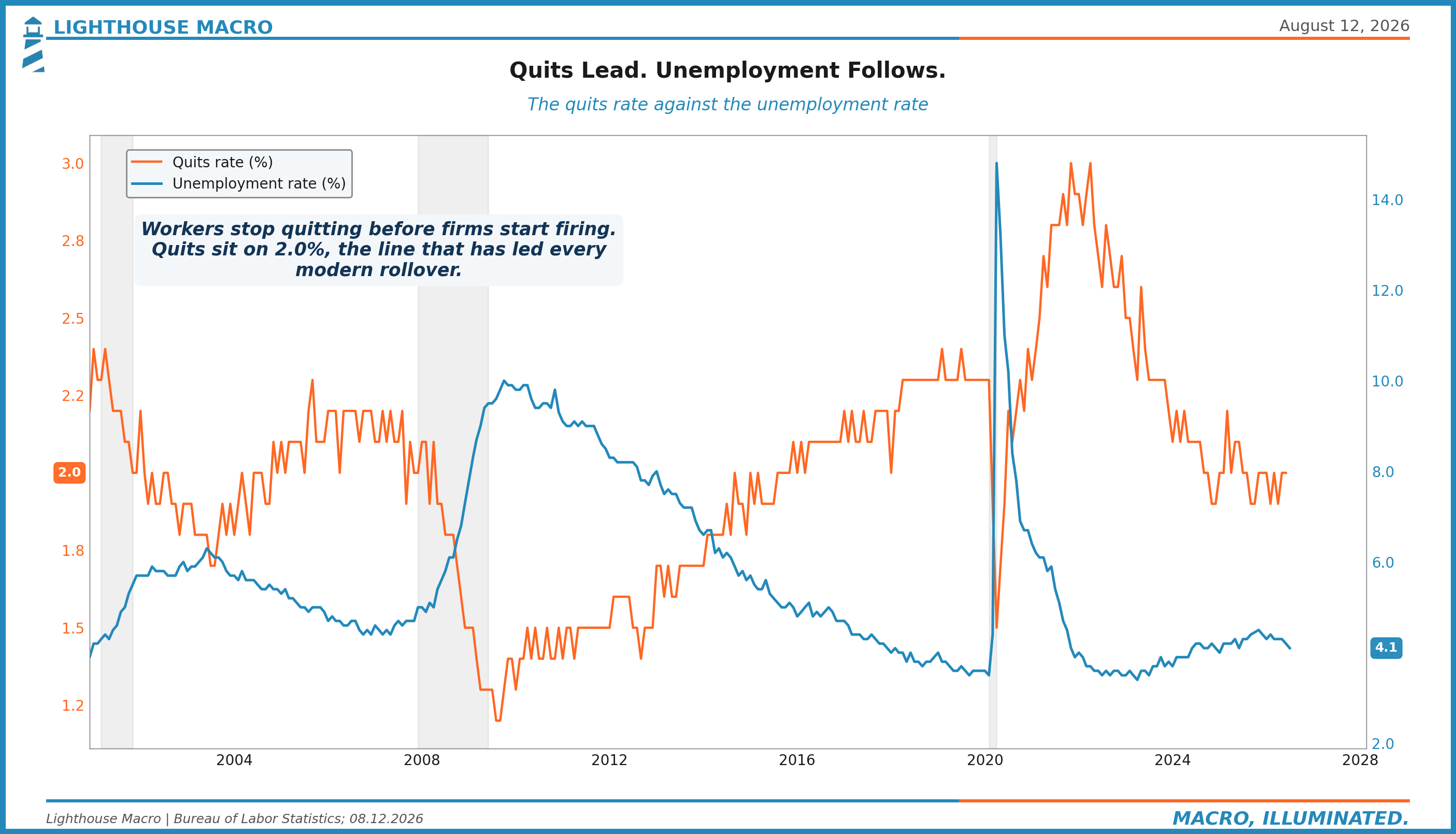
Chart 2. Payroll growth year over year, decelerating for two years and now through zero on the month.
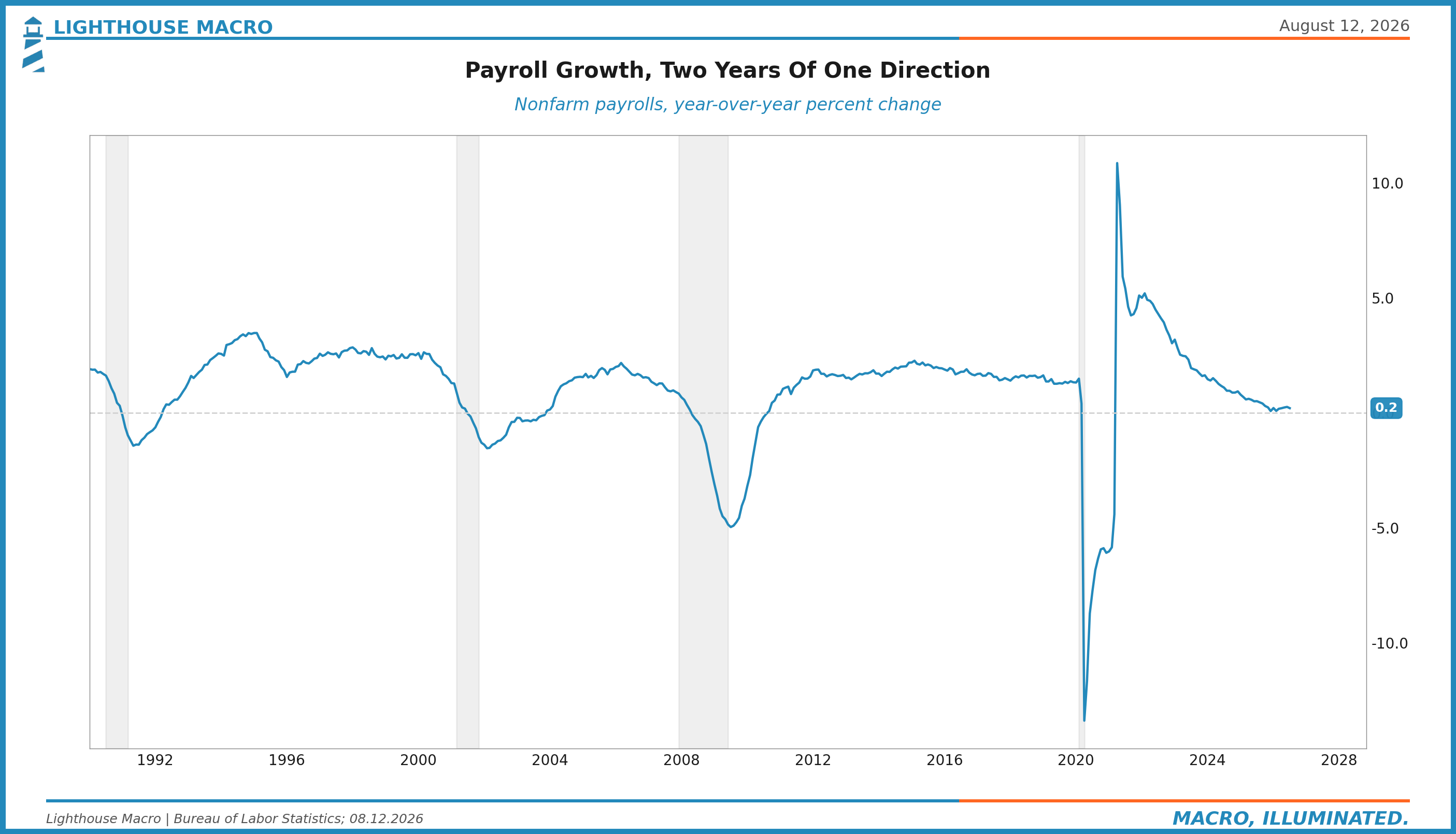
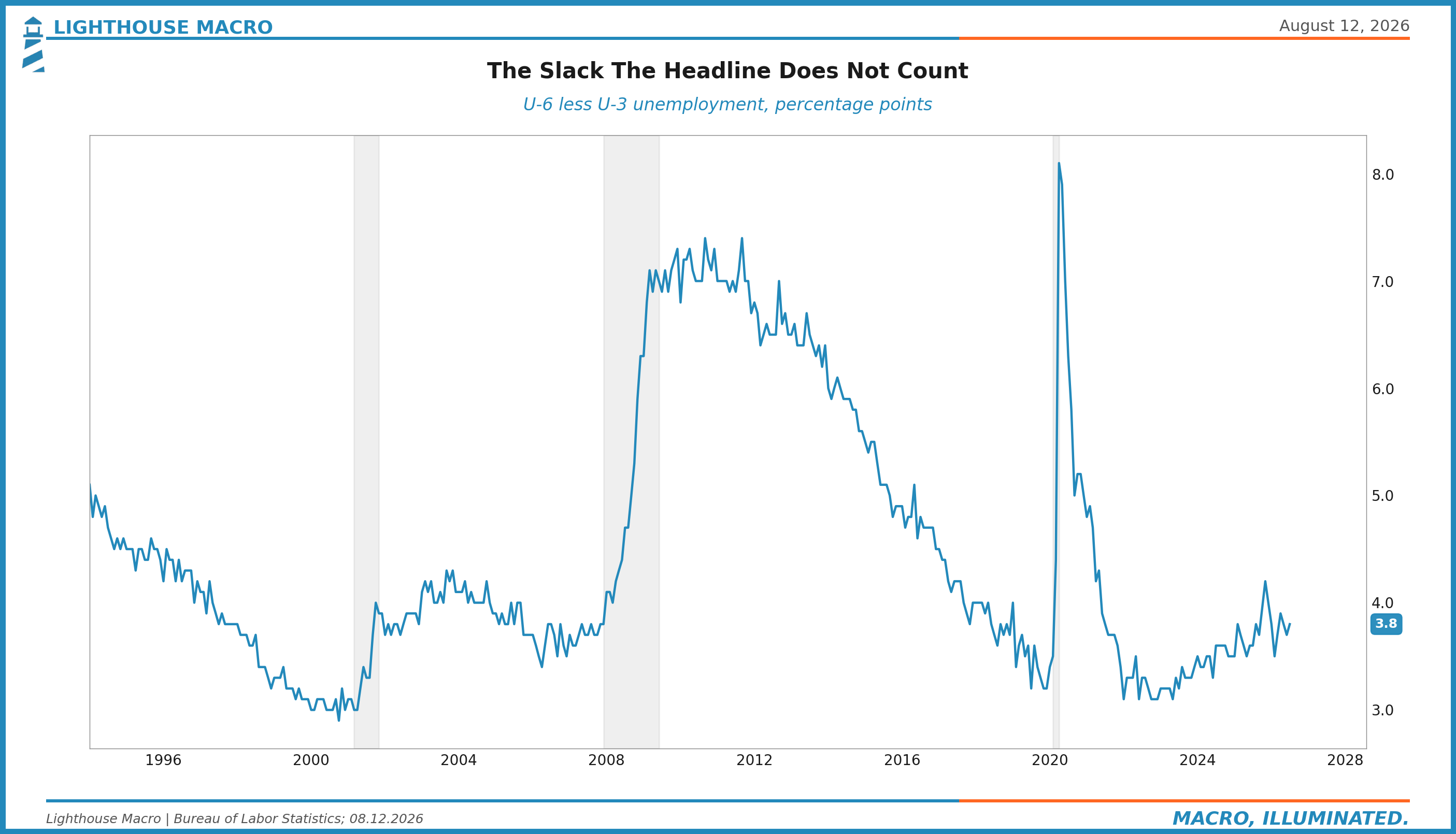
Chart 3. U-6 minus U-3, the hidden-slack gap, holding near 3.8 points while the headline flatters.
2. Prices
On target at the core, noisy at the pump, and the wedge is the story.
Chart 4. Headline against core, with this morning's print.
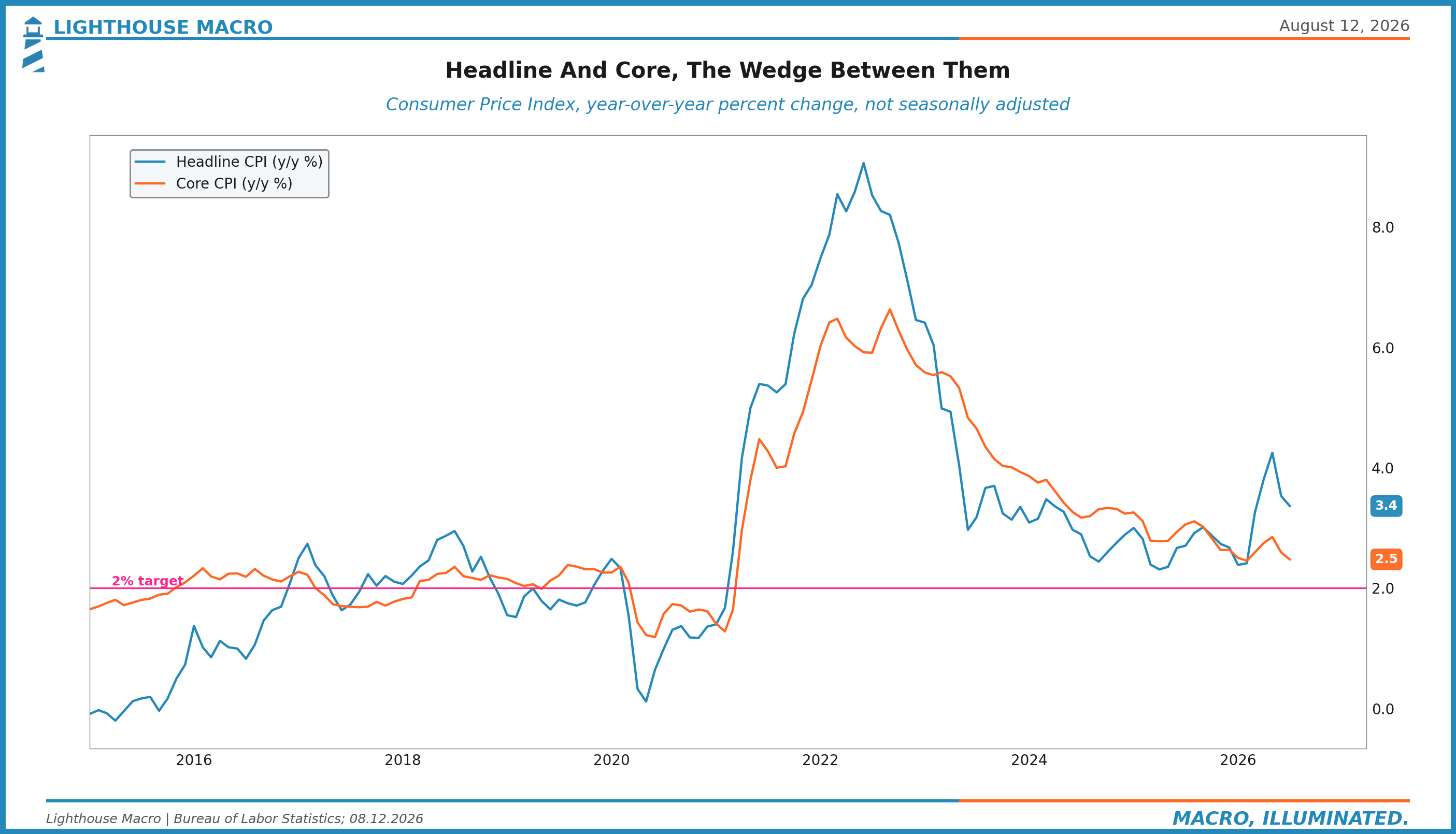
Chart 5. Sticky against flexible inflation, sticky shifted to show the lead. Flexible has normalized. Sticky is the persistence problem.
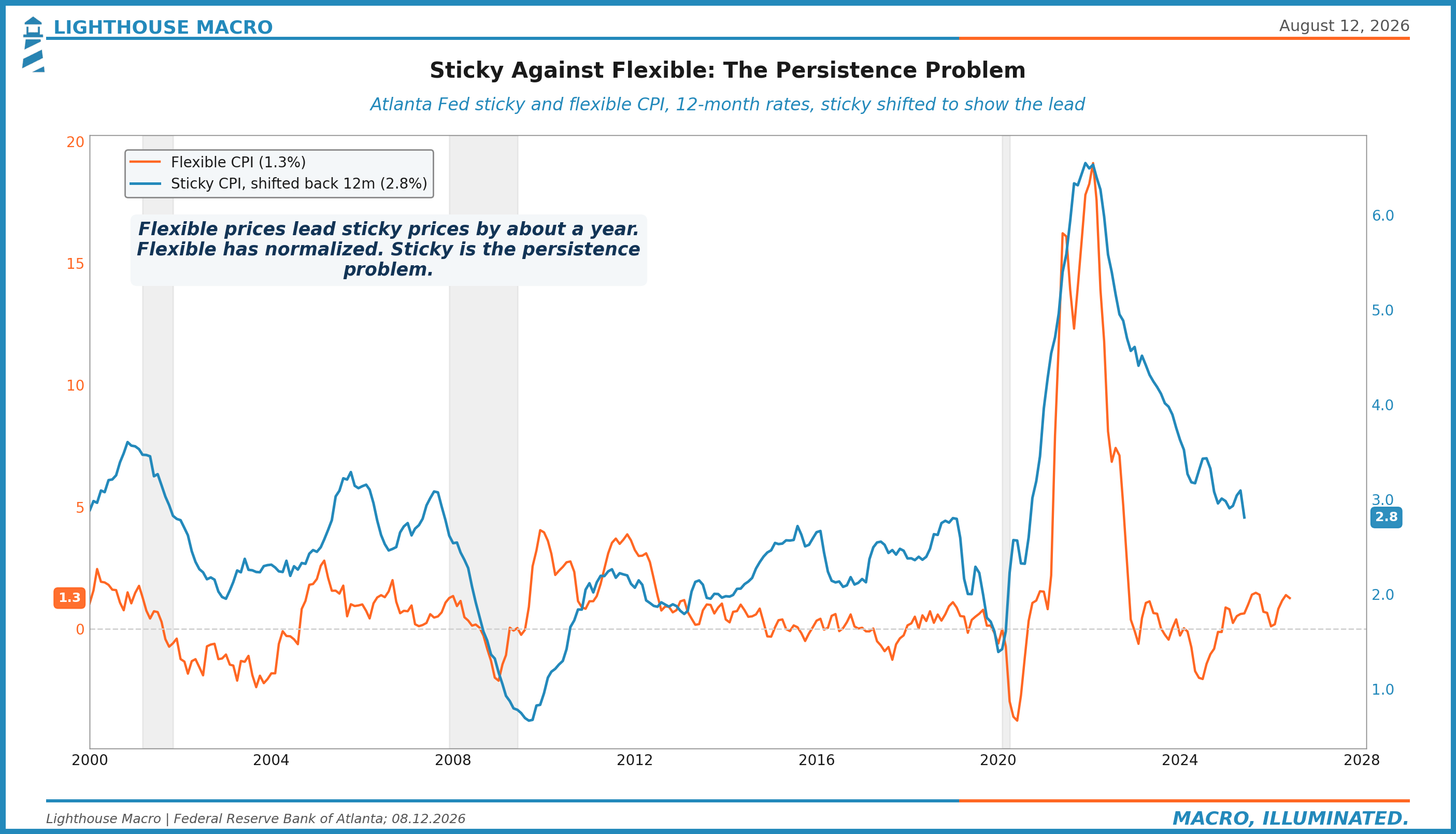
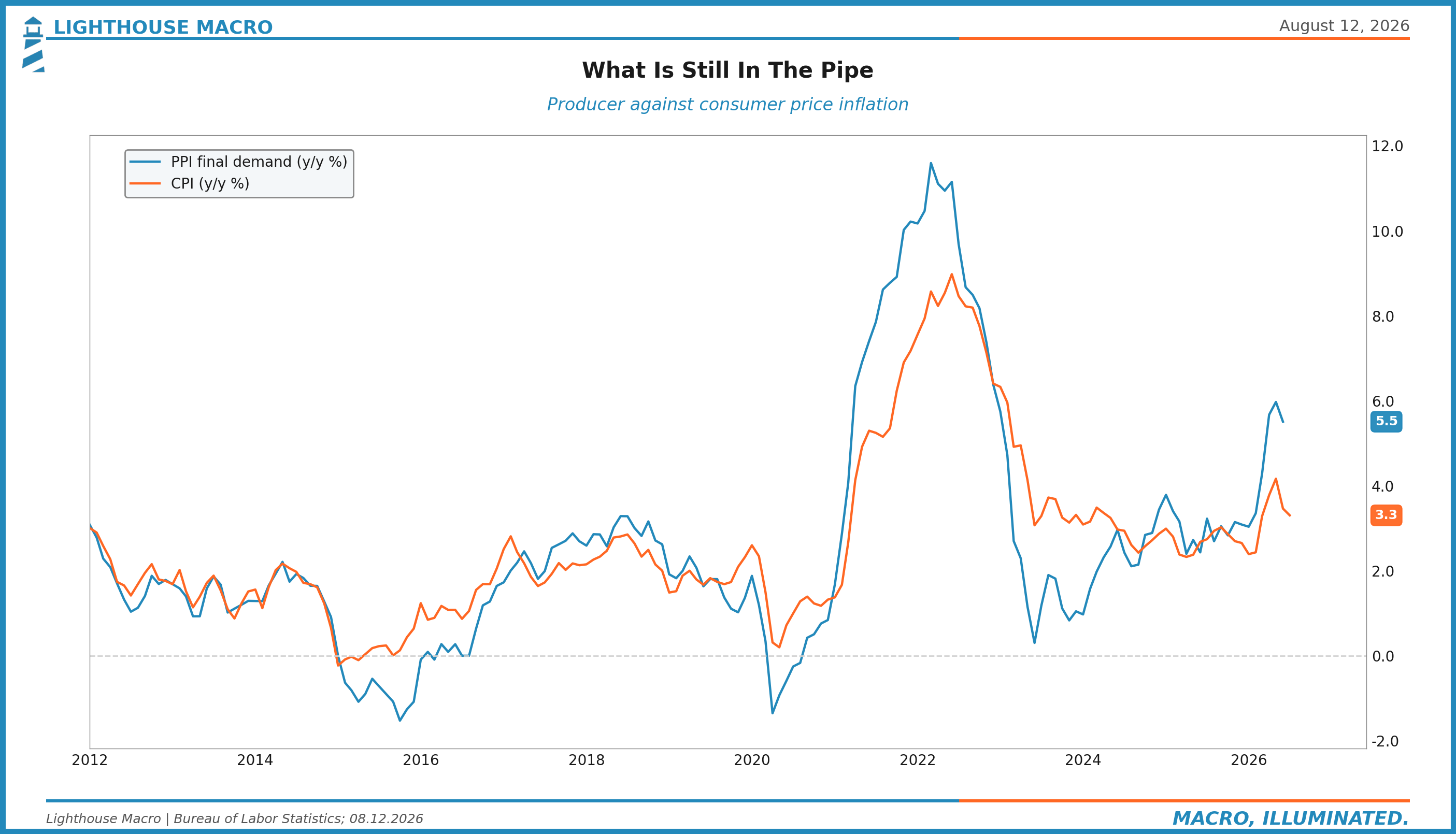
Chart 6. The pipeline: producer prices against consumer prices, and what is still working through.
3. Growth
Strong on paper, and the paper is mostly surveys.
Chart 7. Slack against momentum: capacity utilization against industrial production growth. The ISM's July surge to 55.6 says re-acceleration. The hard data says room, not strain.
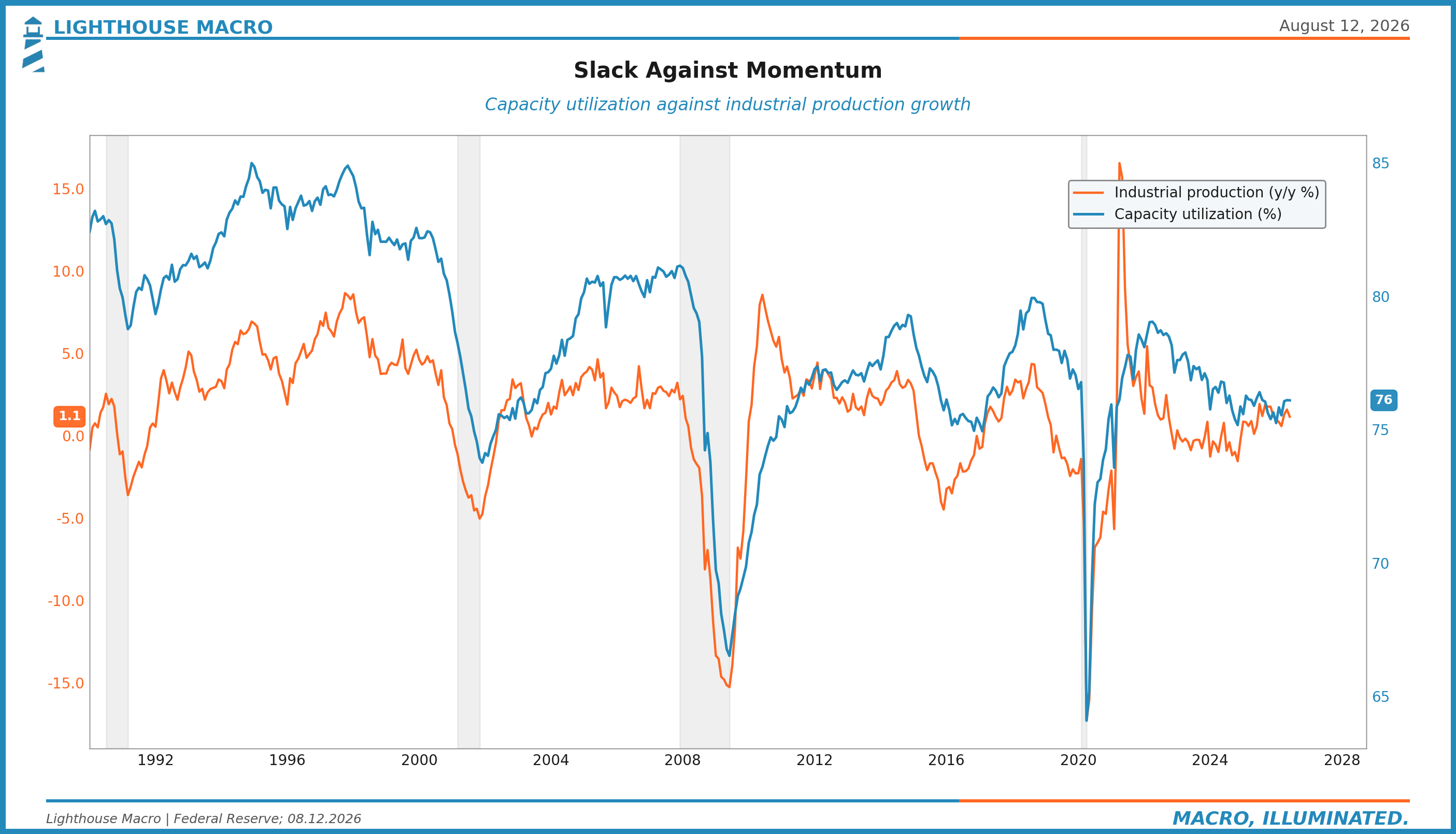
Chart 8. Industrial production with its second derivative shaded, the hard-data check on the survey story. Momentum breaks precede level declines.
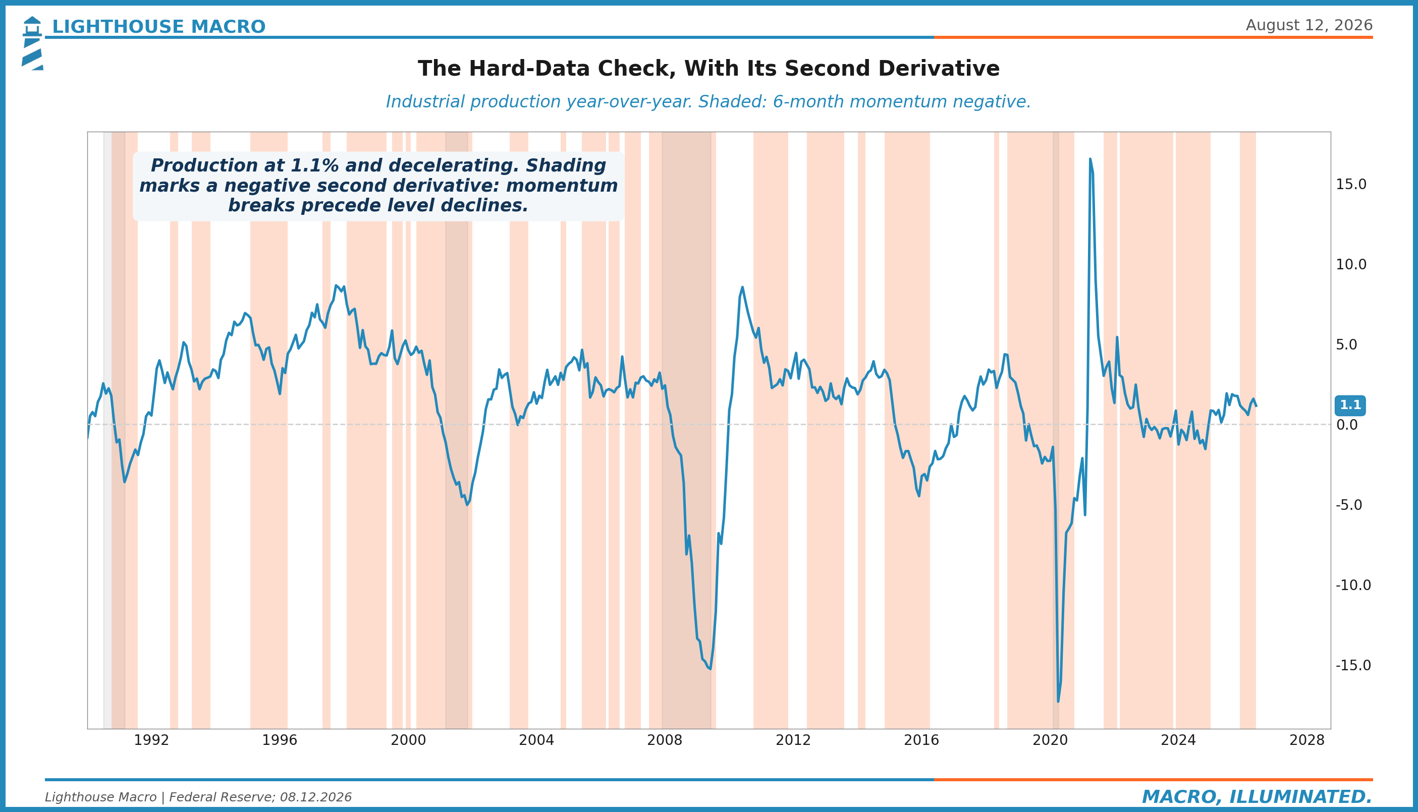
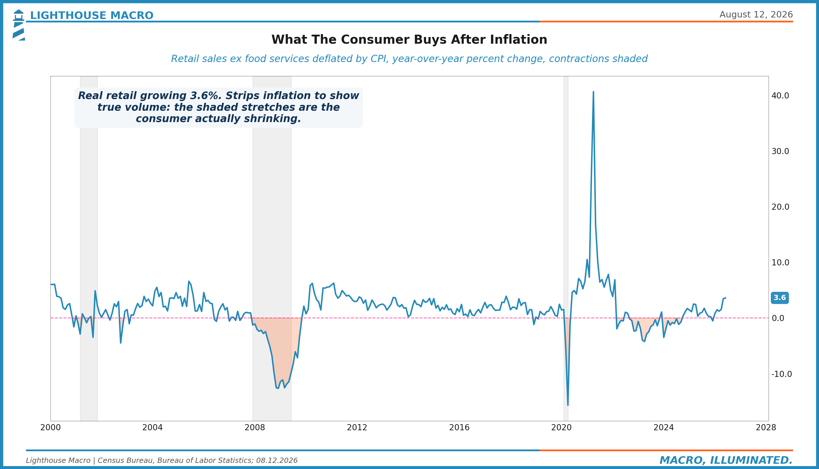
Chart 9. Real retail sales, deflated volume with contractions shaded: what the consumer buys after inflation.
4. Housing
Frozen equilibrium, priced like a luxury, performing like a stress test.
Chart 10. The 30-year mortgage against existing home sales, the freeze in one frame.
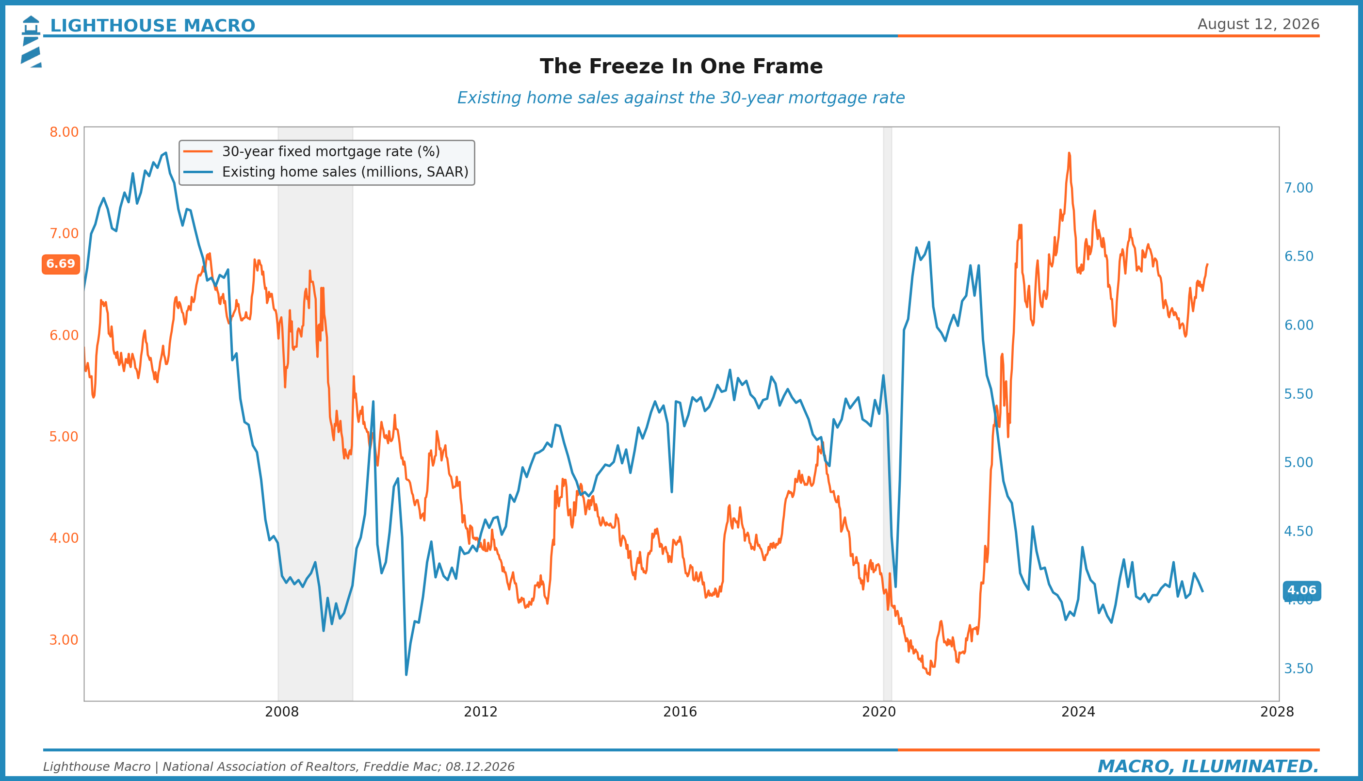
Chart 11. Starts and permits, what builders believe about the next year.
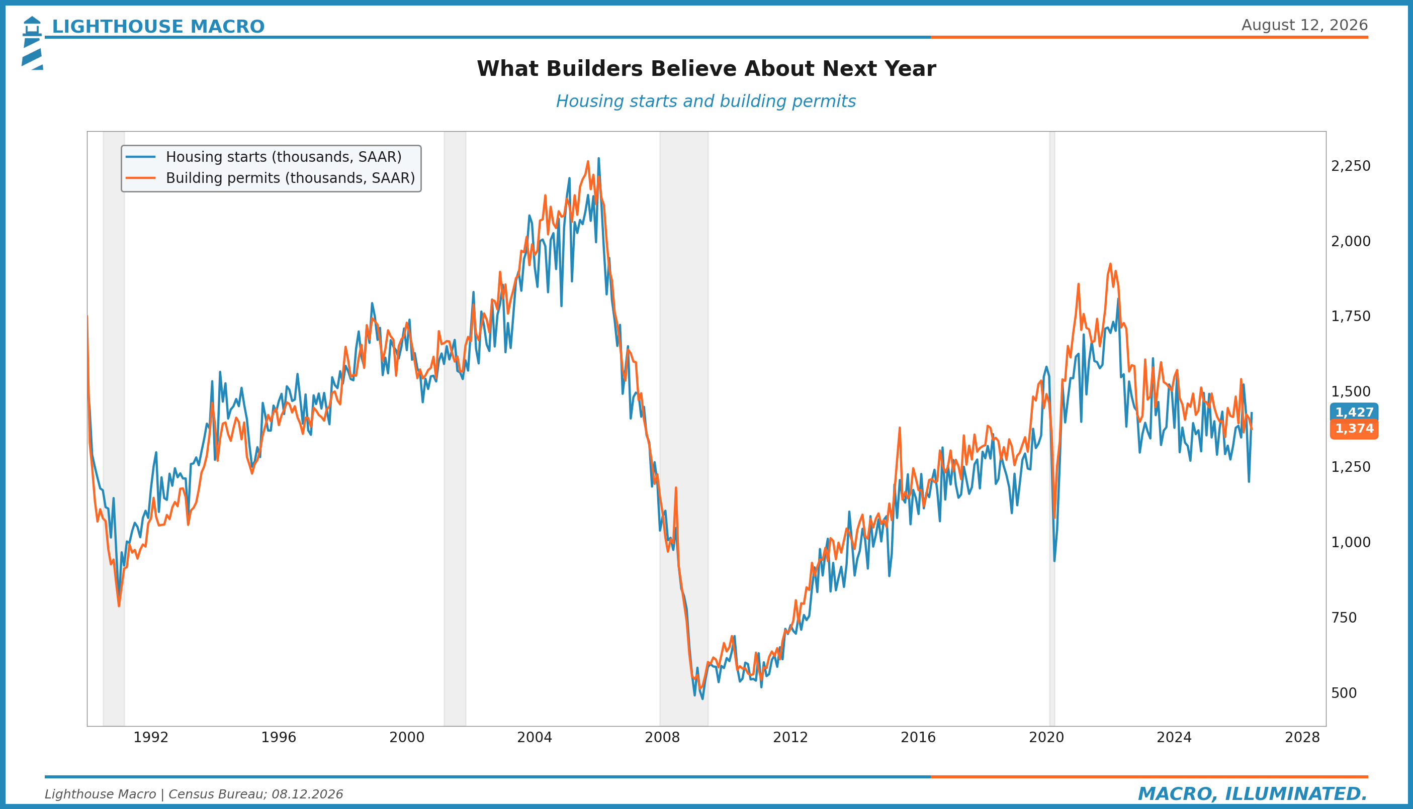
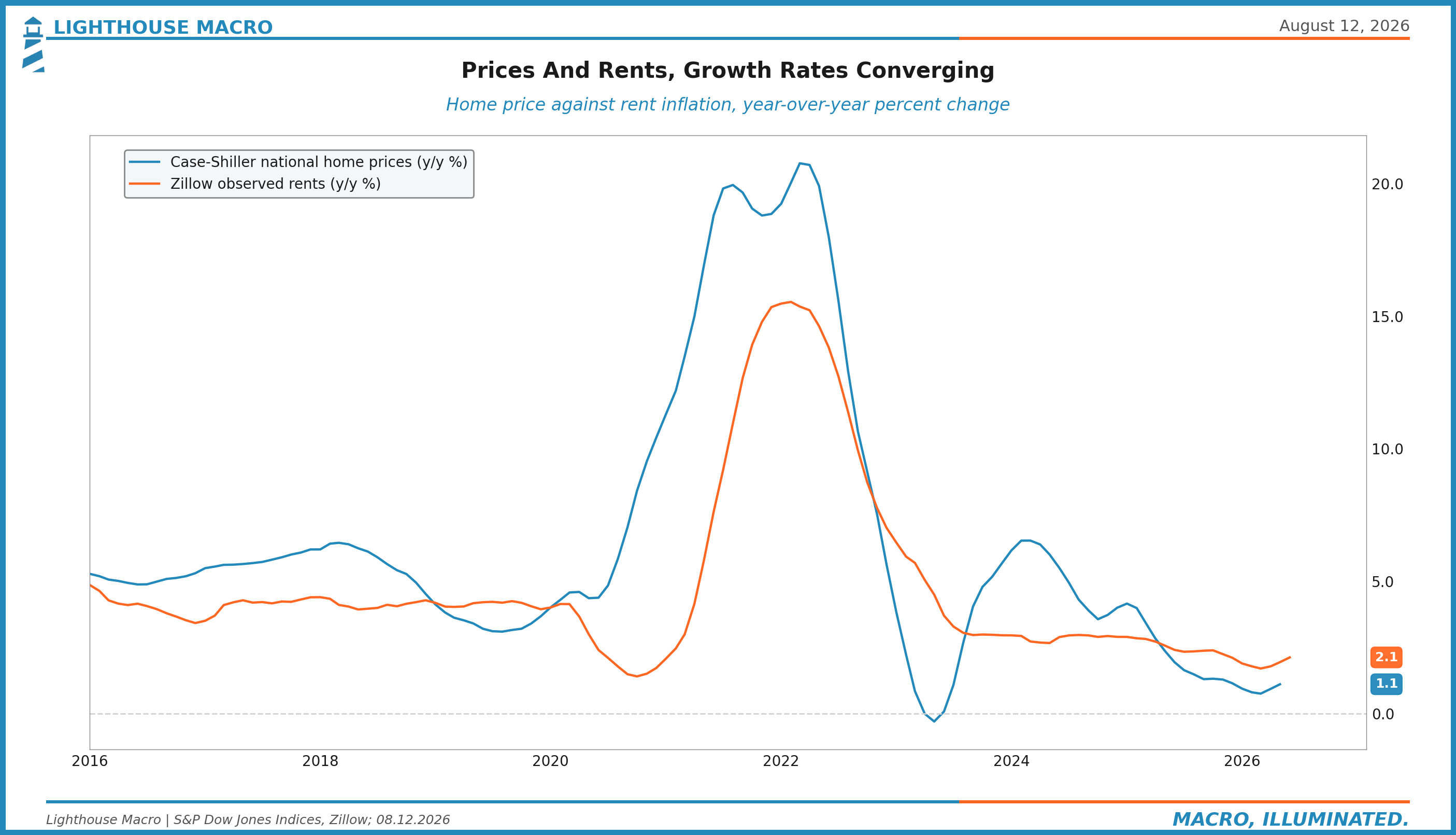
Chart 12. Home prices against rents, the ownership premium at extremes.
5. Consumer
Sixty-eight percent of GDP, spending through a shrinking cushion.
Chart 13. Real income against real spending, the gap that has to close one of two ways.
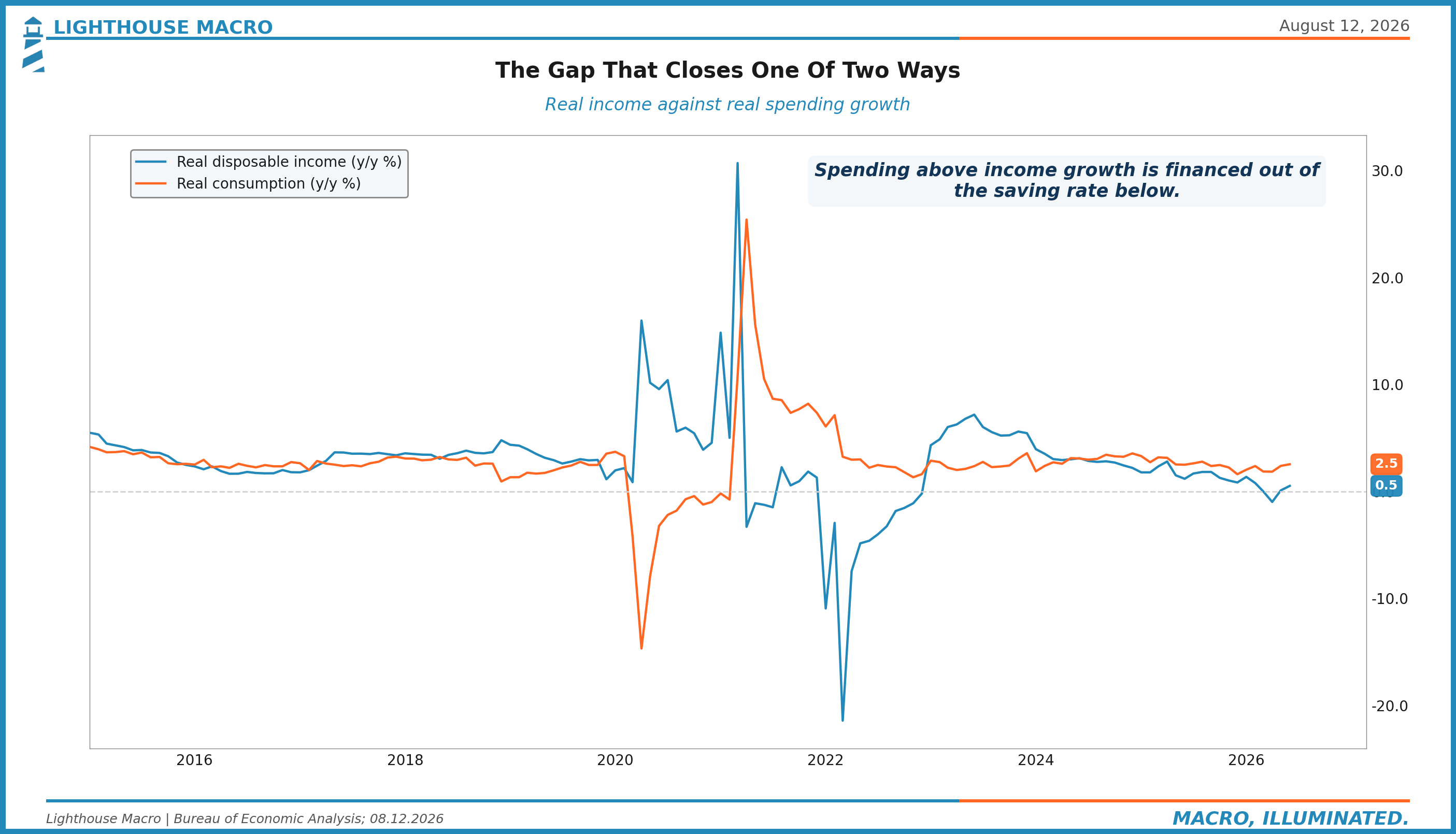
Chart 14. The income-spending growth gap against the saving rate. The cushion is being spent, not built.
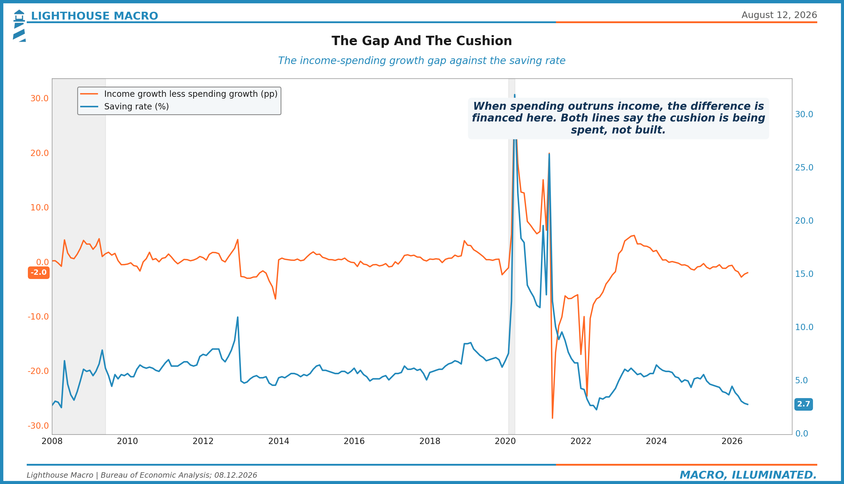
Chart 15. Card and mortgage delinquencies, quarterly and dated as such. The card line was at cycle highs before the labor crack.

6. Business
Capex is a forward commitment, and commitments are getting shorter.
Chart 16. Core capital goods orders against shipments. CEOs voting with their checkbooks, and the spread between the lines is the backlog.
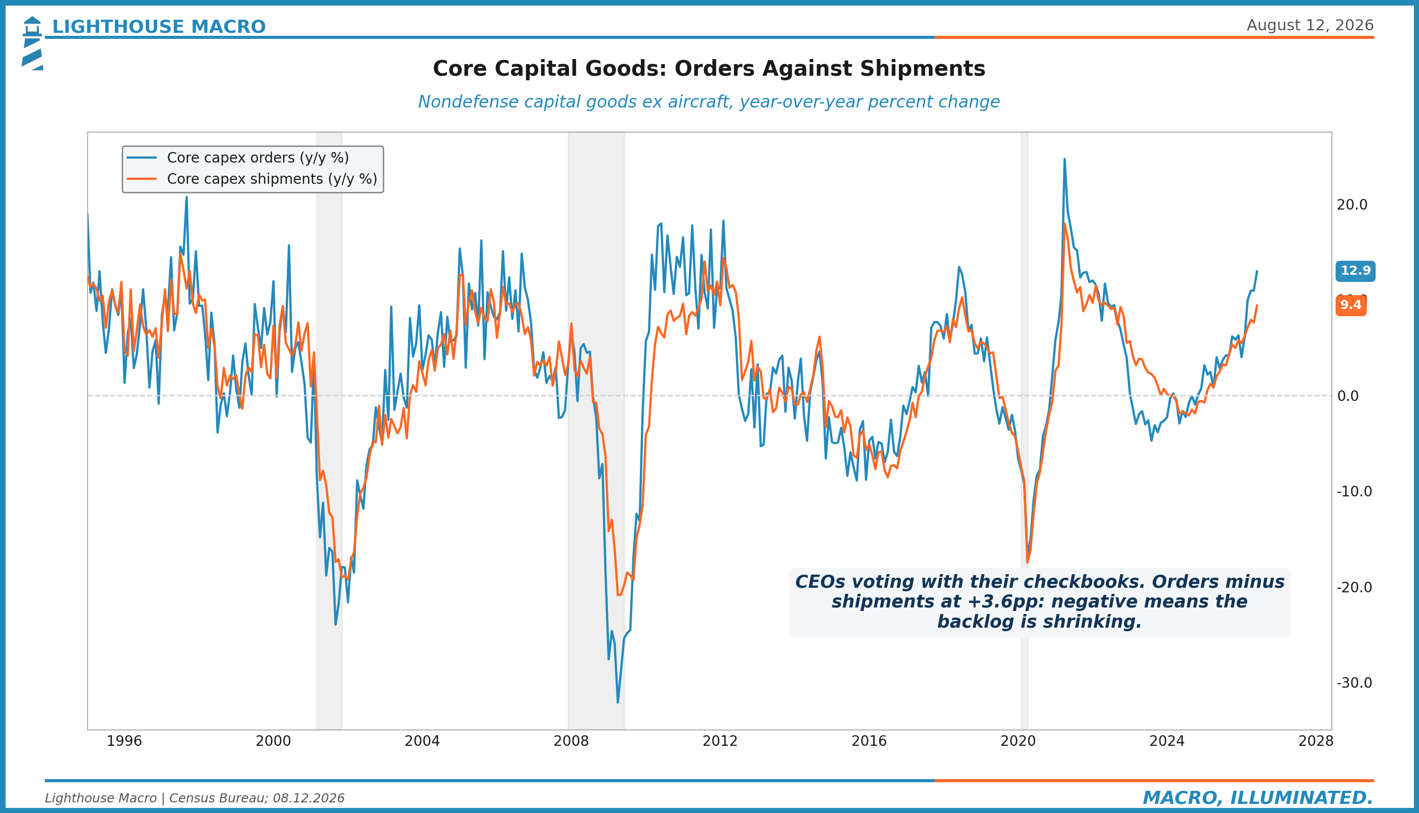
Chart 17. Inventory growth against the inventories-to-sales ratio. The mistake detector: overstock precedes liquidation.
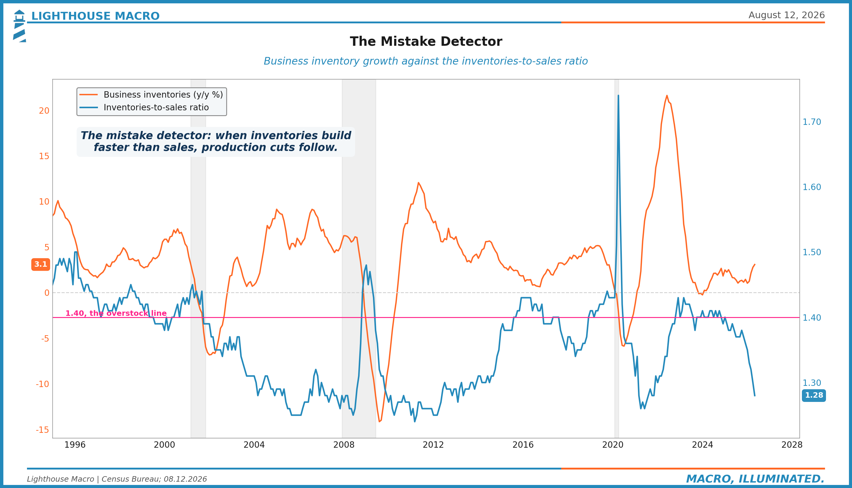
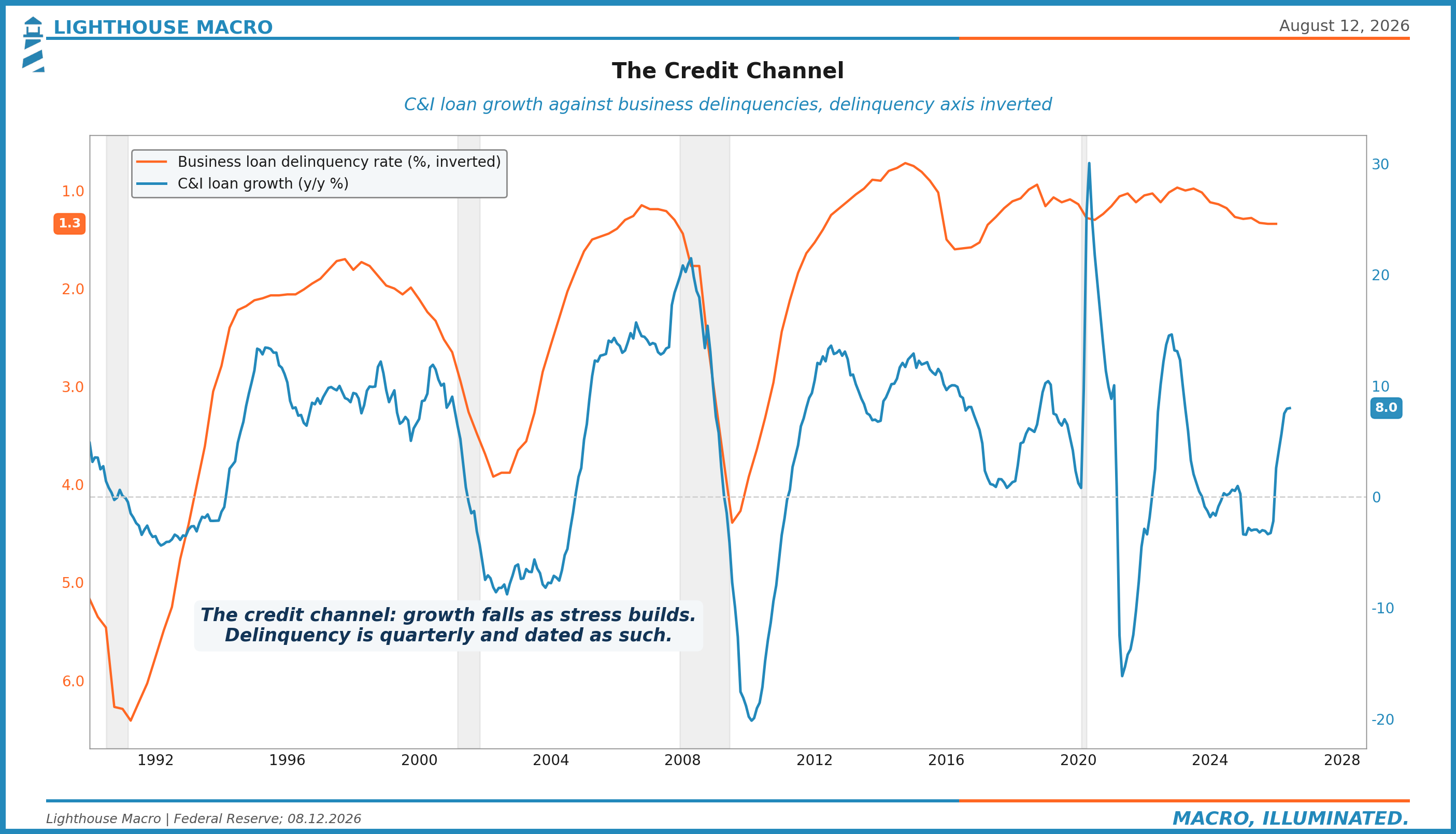
Chart 18. Loan growth against business delinquencies, the credit channel. Growth falls as stress builds.
7. Trade
The dollar is the rotation engine, and it has been quietly weakening.
Chart 19. The broad dollar, level and momentum.
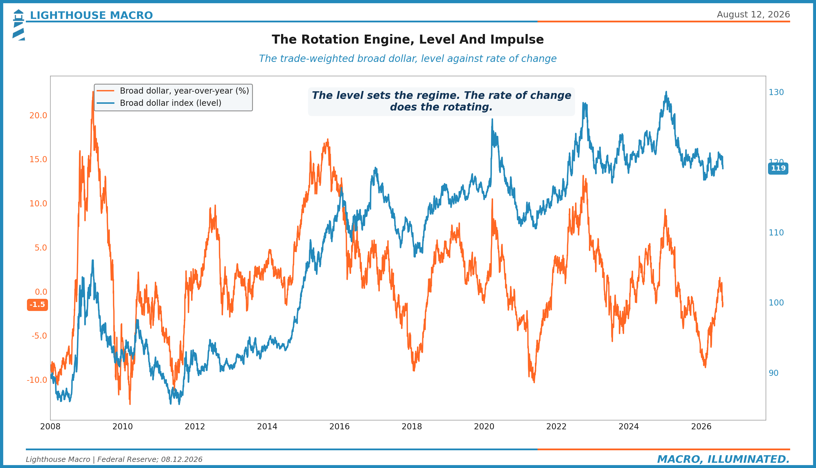
Chart 20. Import against export prices, the terms-of-trade squeeze.
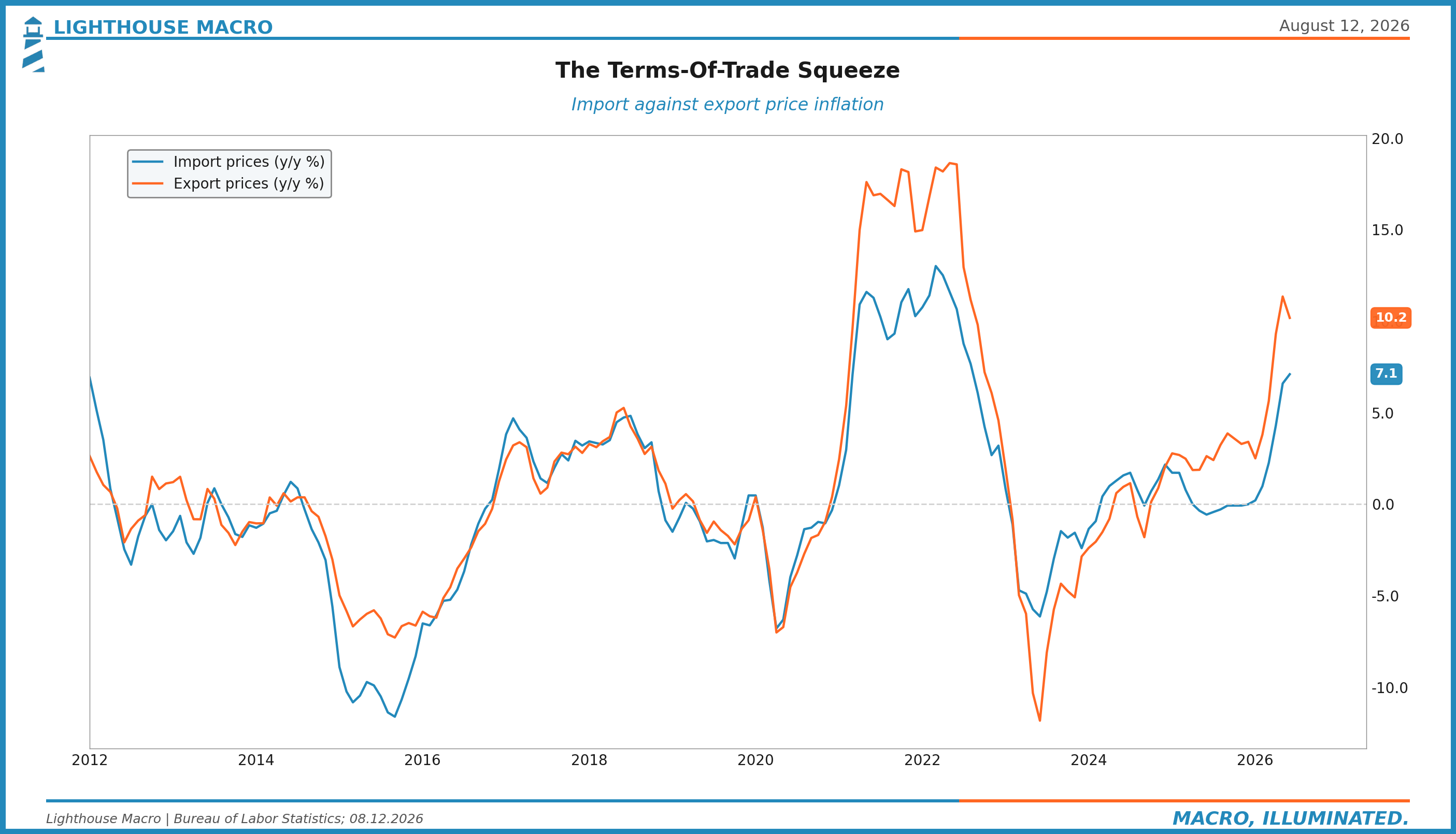
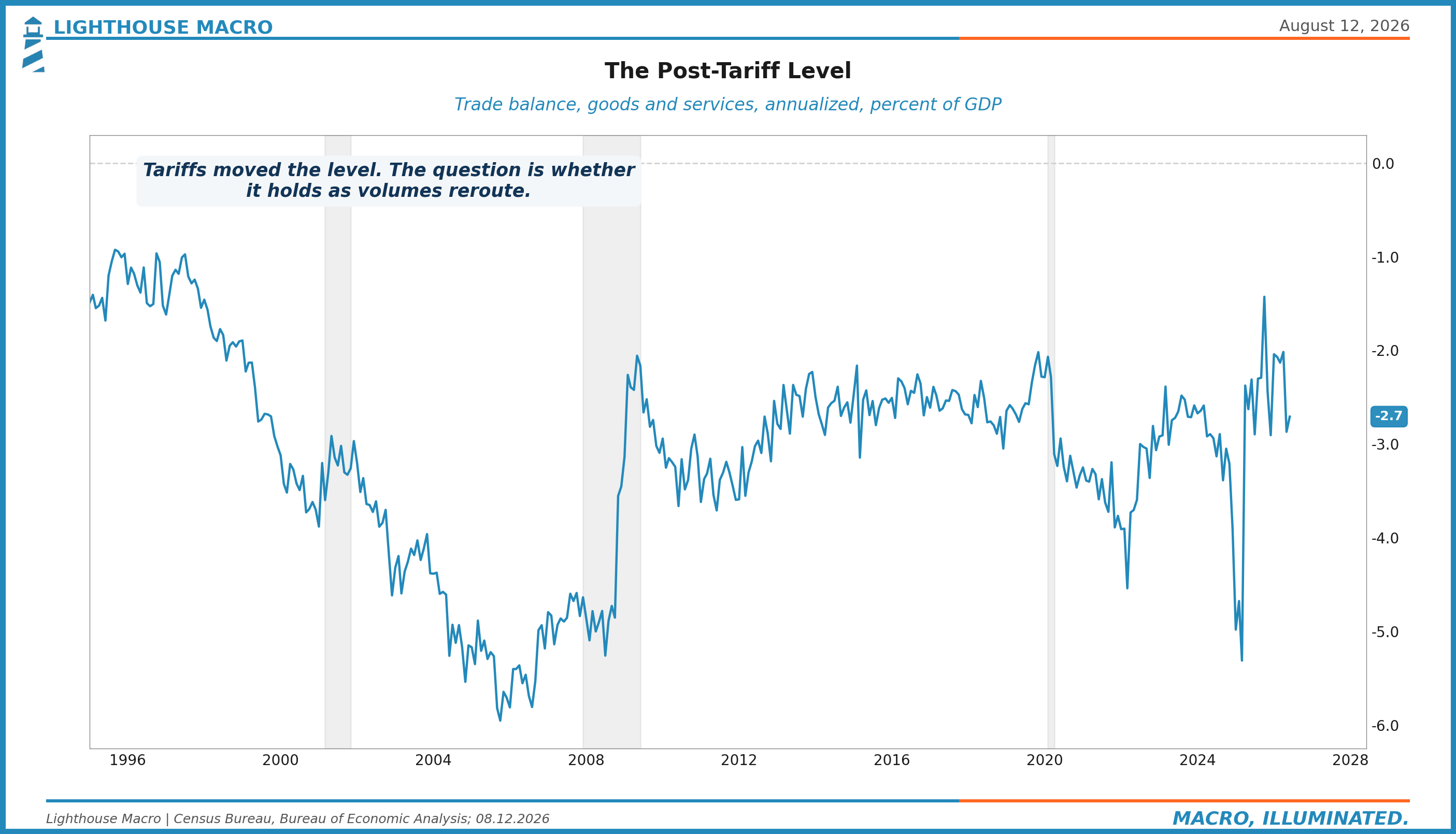
Chart 21. The trade balance as a share of GDP, post-tariff flows settling into a new level.
8. Government
The pillar the long end is repricing, and the only one flashing outright stress.
Chart 22. Net interest as a share of federal receipts, the line that explains the thirty-year.
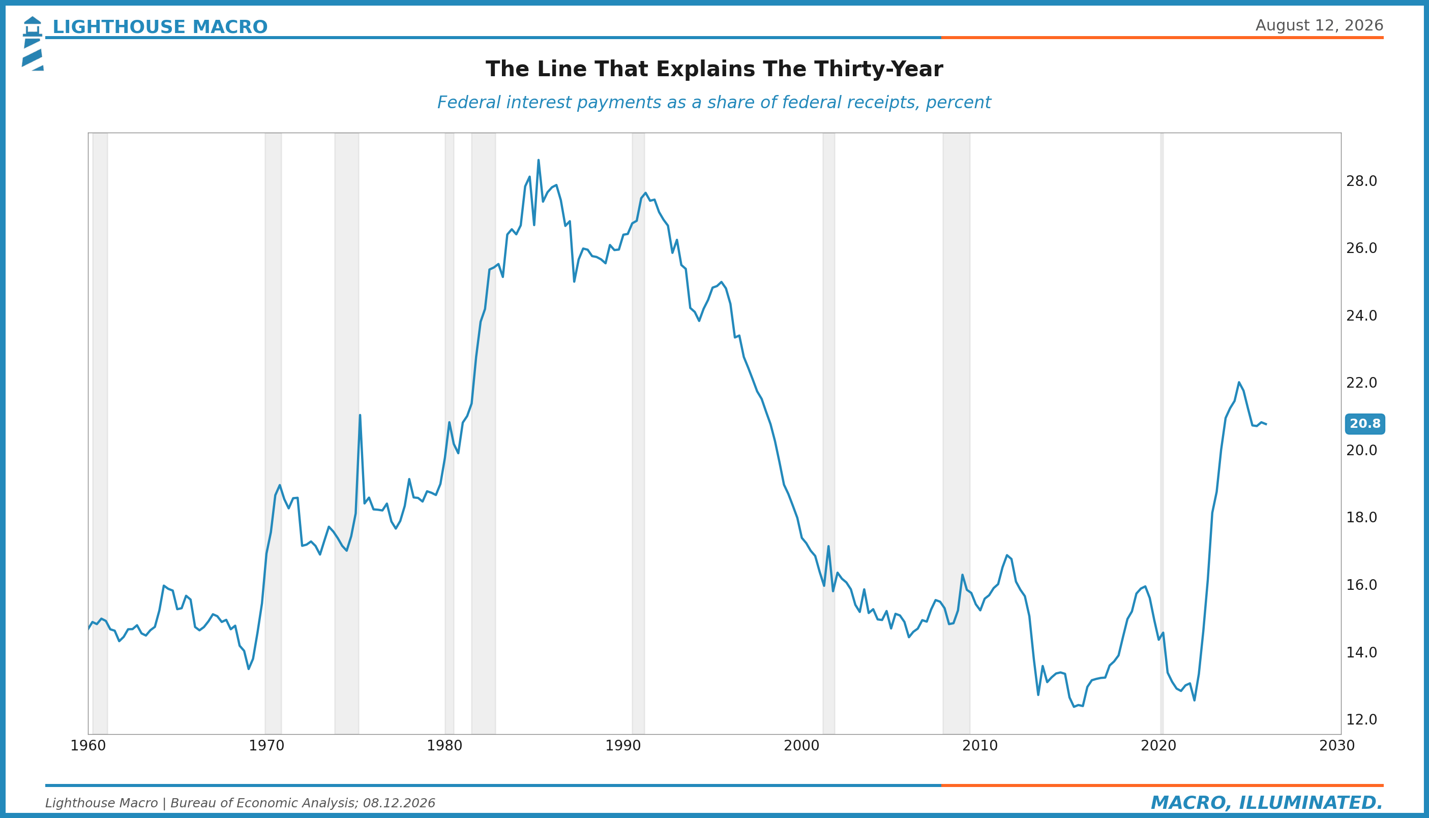
Chart 23. The deficit against unemployment: peacetime deficits at full employment, historically anomalous.
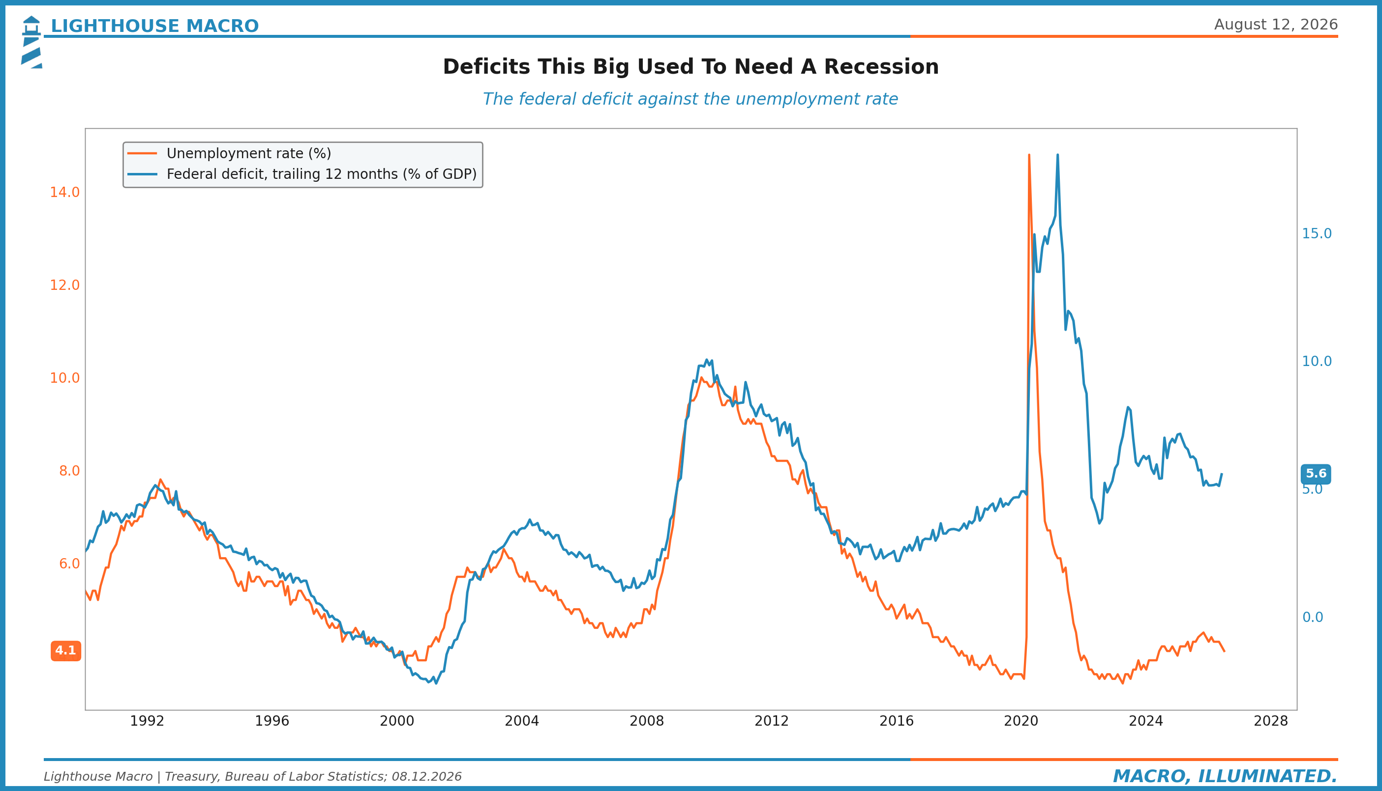
Chart 24. The 10-year yield against the term premium inside it. The premium is resurrected, and it is doing the tightening.
9. Financial
Spreads lead defaults. Right now spreads refuse to lead anything.
Chart 25. High yield spreads, the full history, with 270 marked against the 300 complacency line.
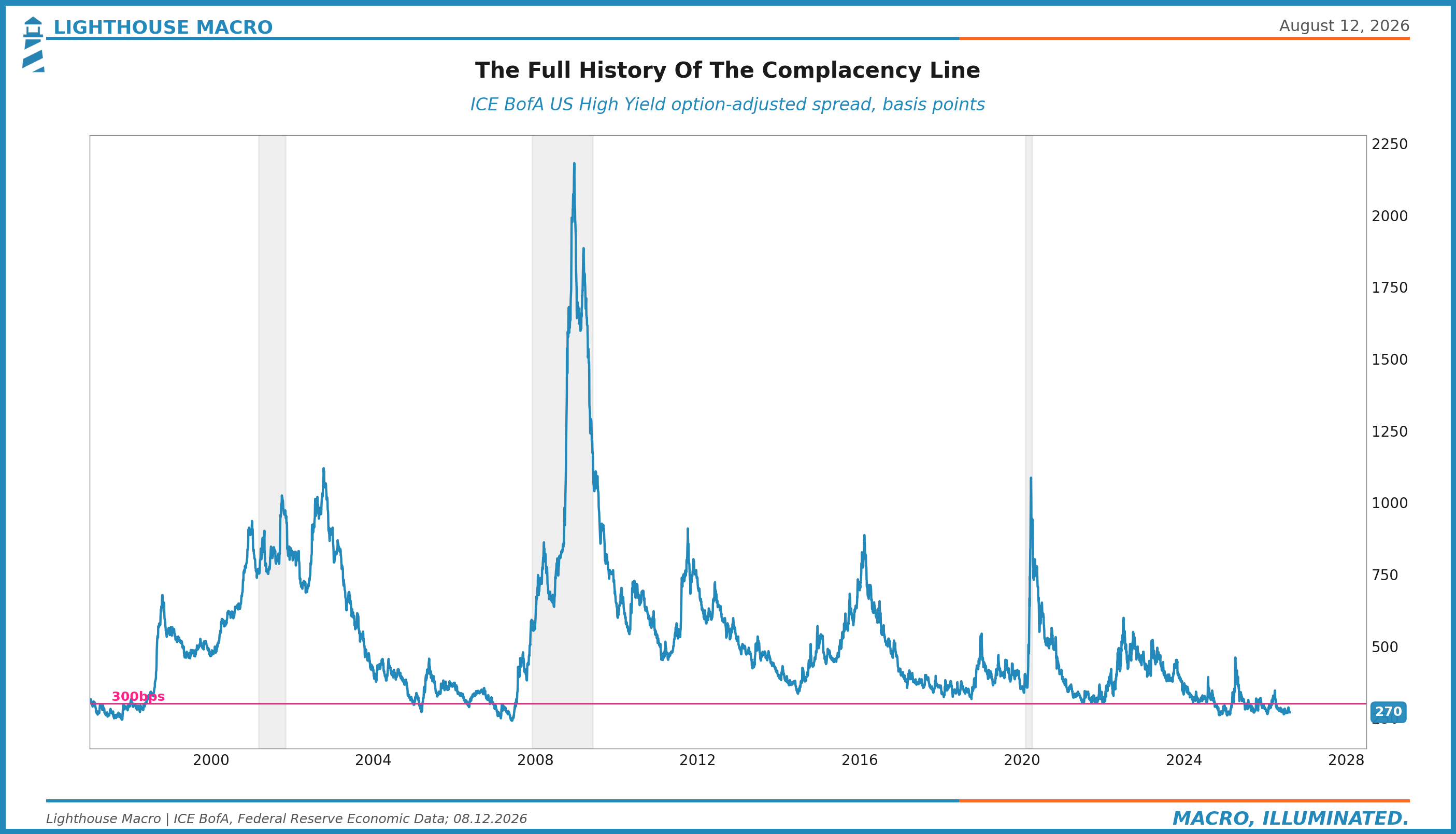
Chart 26. High yield against the quits rate: the credit market and the labor market, disagreeing at scale.
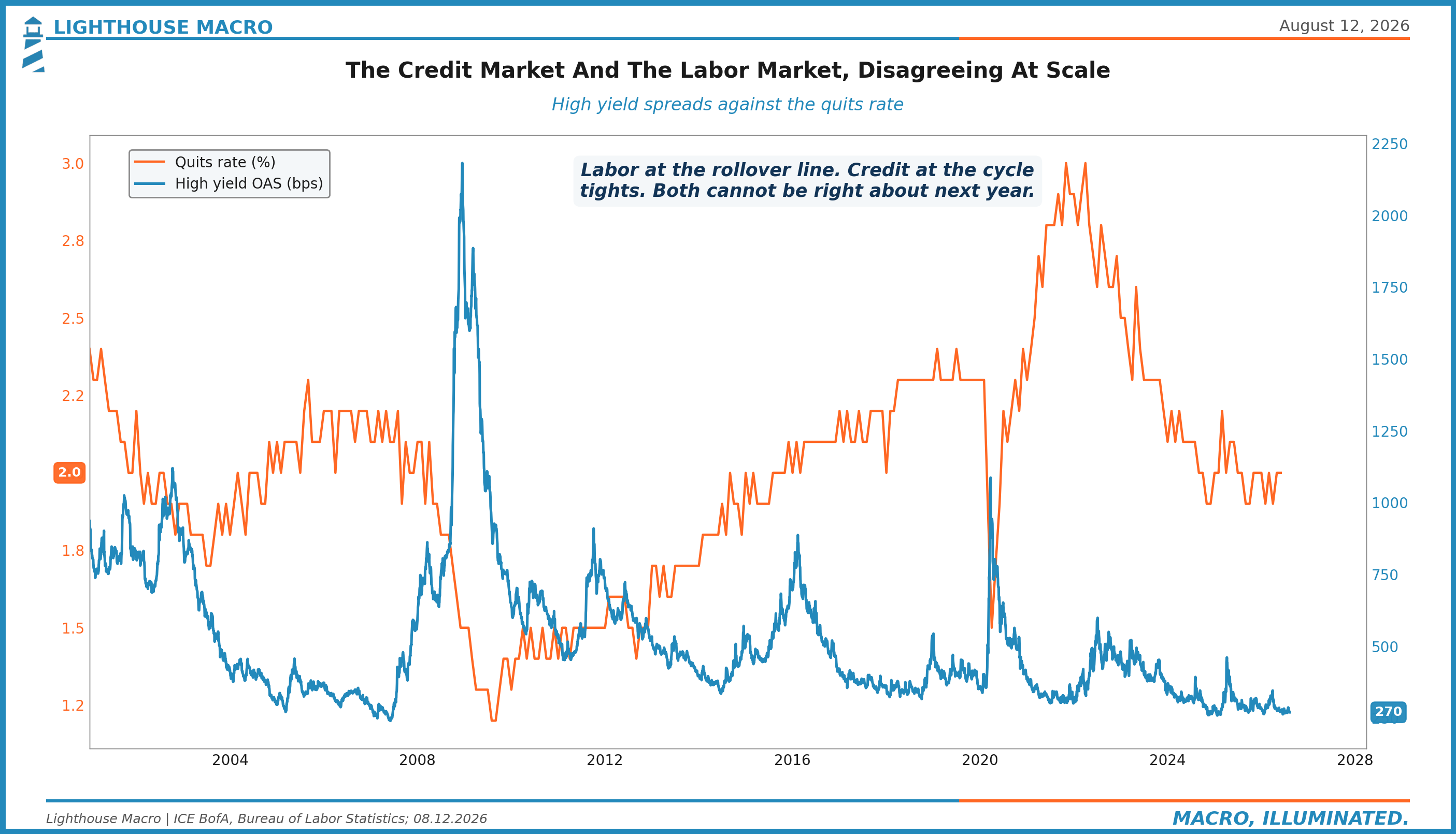
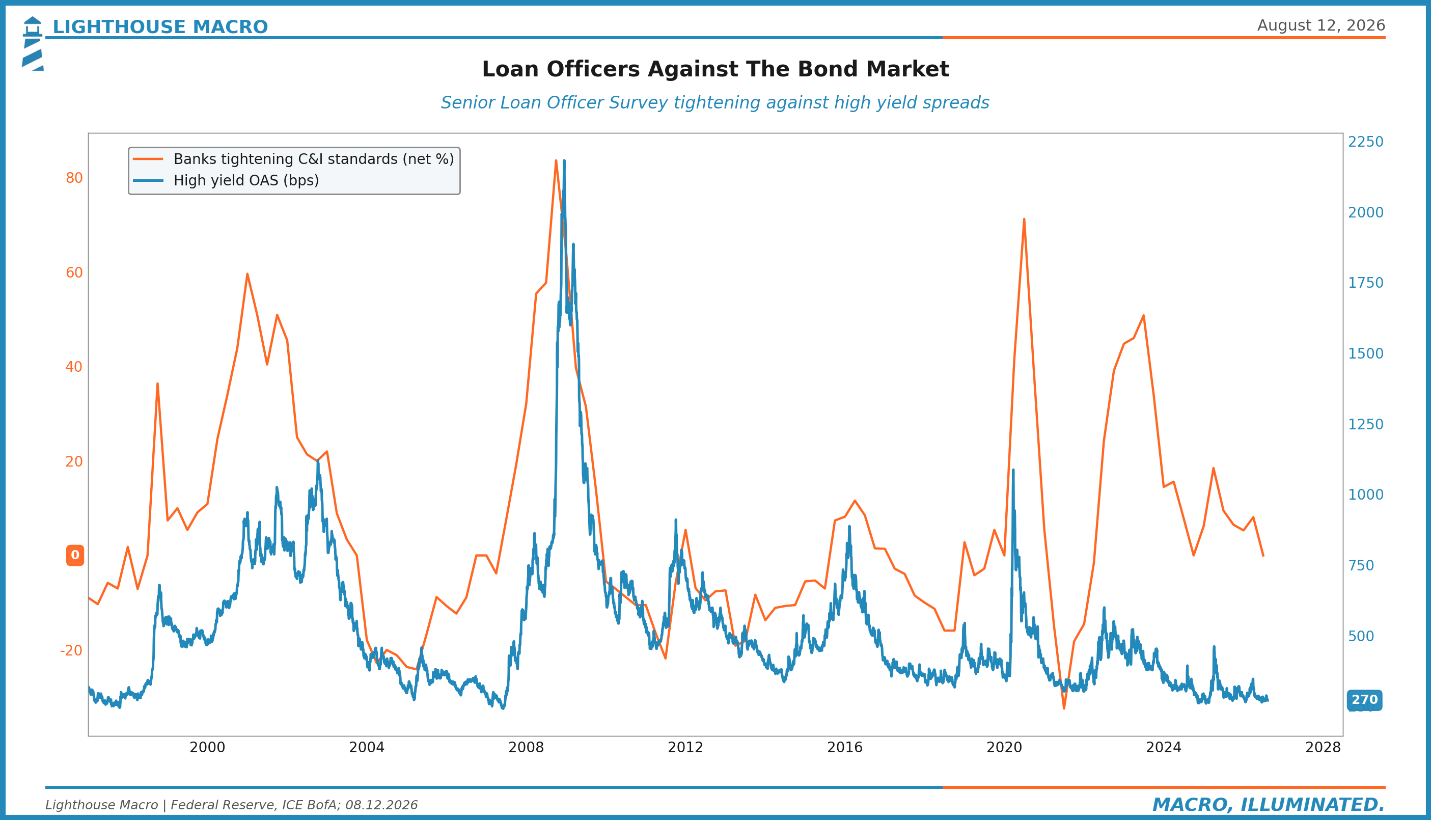
Chart 27. Lending standards against spreads: loan officers tightening while the market prices ease.
10. Plumbing
The pipes decide how fast everything else transmits.
Chart 28. The policy corridor: where the funding rates actually trade inside the Fed's bands.
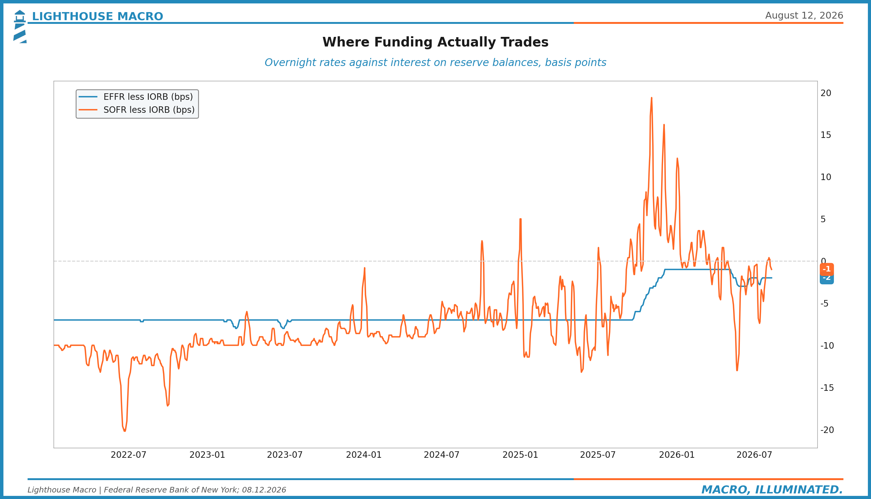
Chart 29. The Fed balance sheet against the Treasury's cash account, the two big levers of system liquidity.
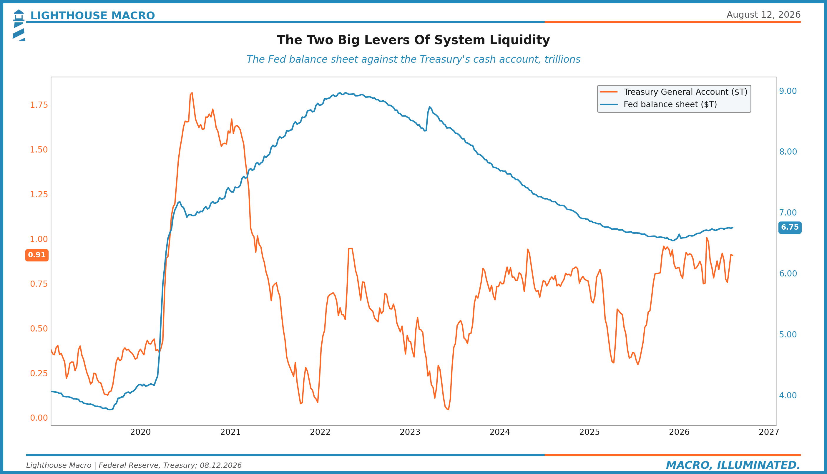
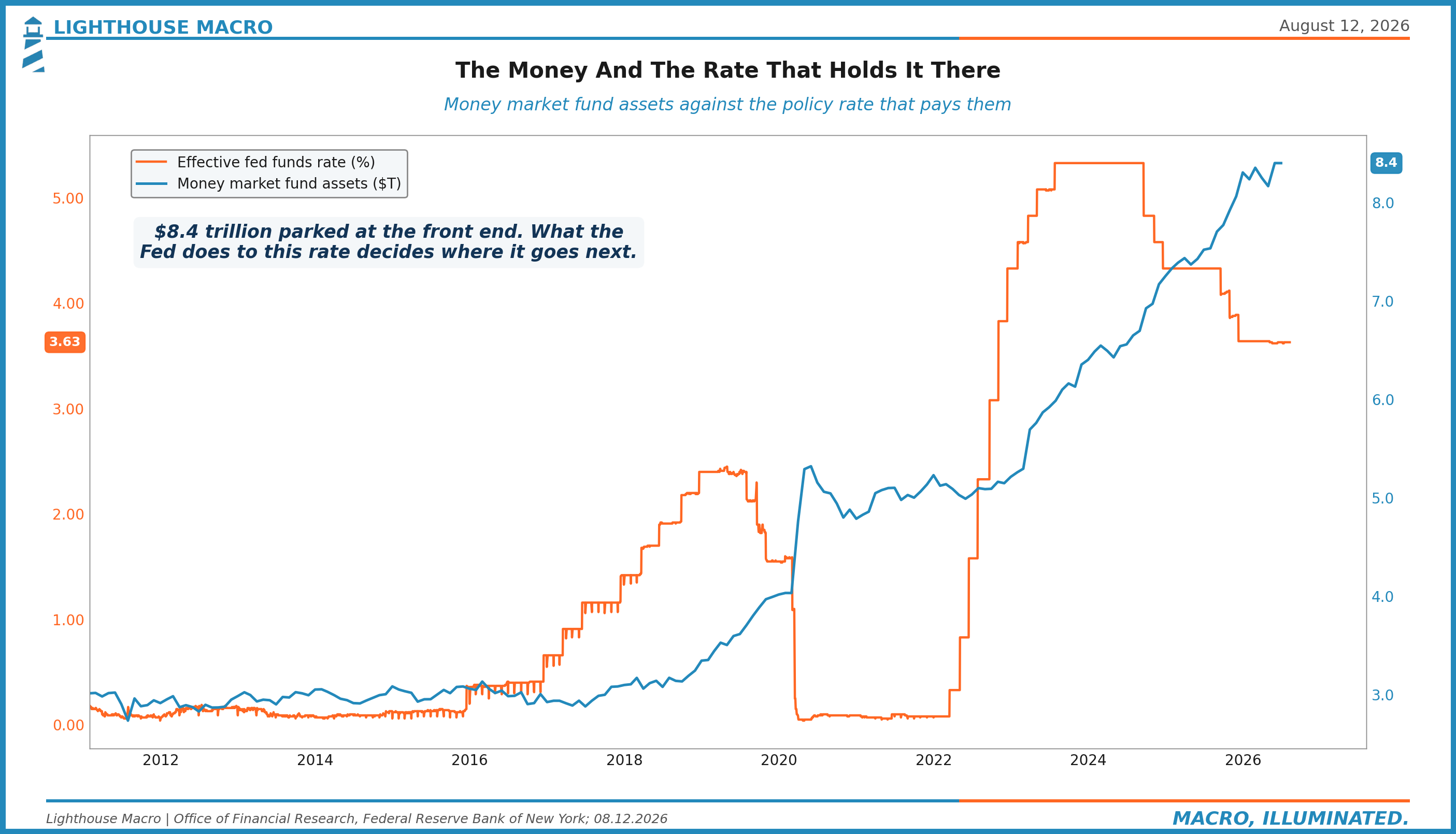
Chart 30. Money market fund assets against the policy rate that pays them. Eight point four trillion dollars, one decision away from everything.
11. Structure
The tape's internals, which have been better than the macro all year.
Chart 31. Share of the S&P 500 above the 200-day, breadth against the index.
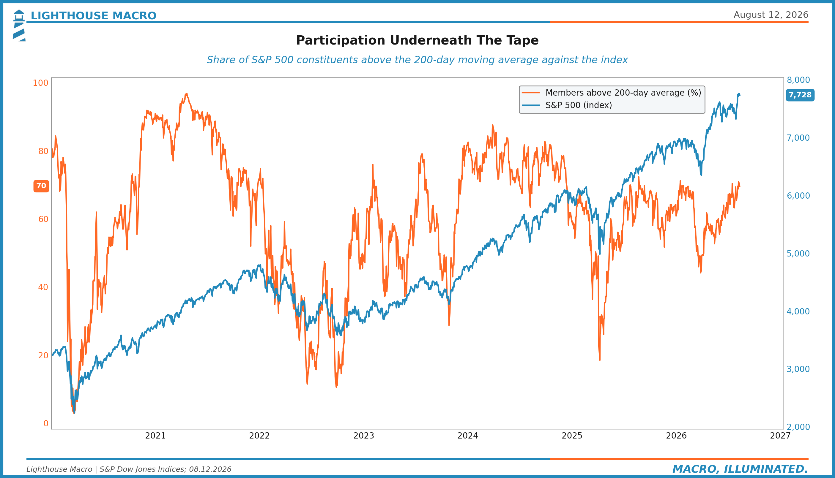
Chart 32. The advance-decline line against the index, the distribution detector. Right now the line confirms the highs.
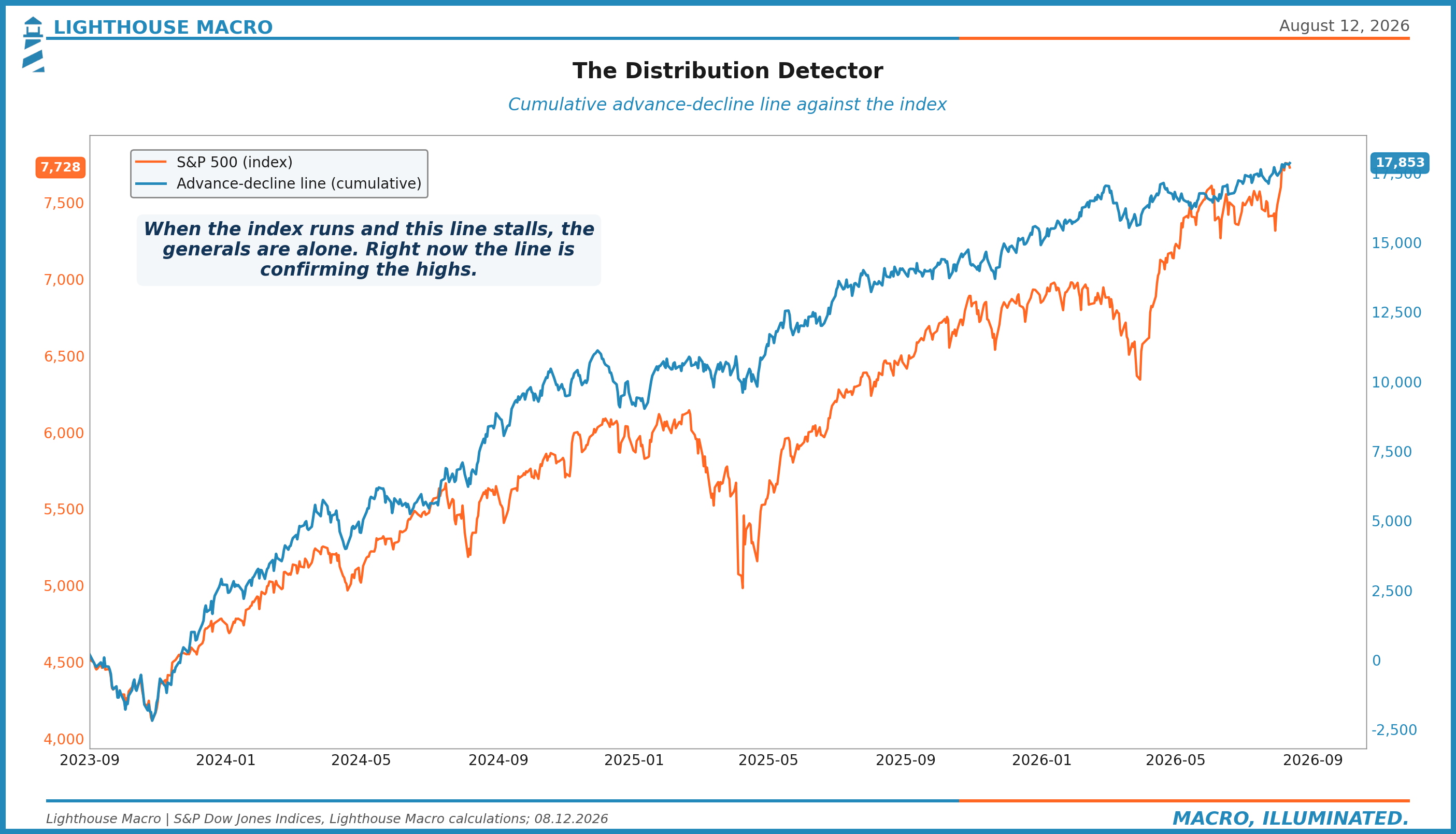
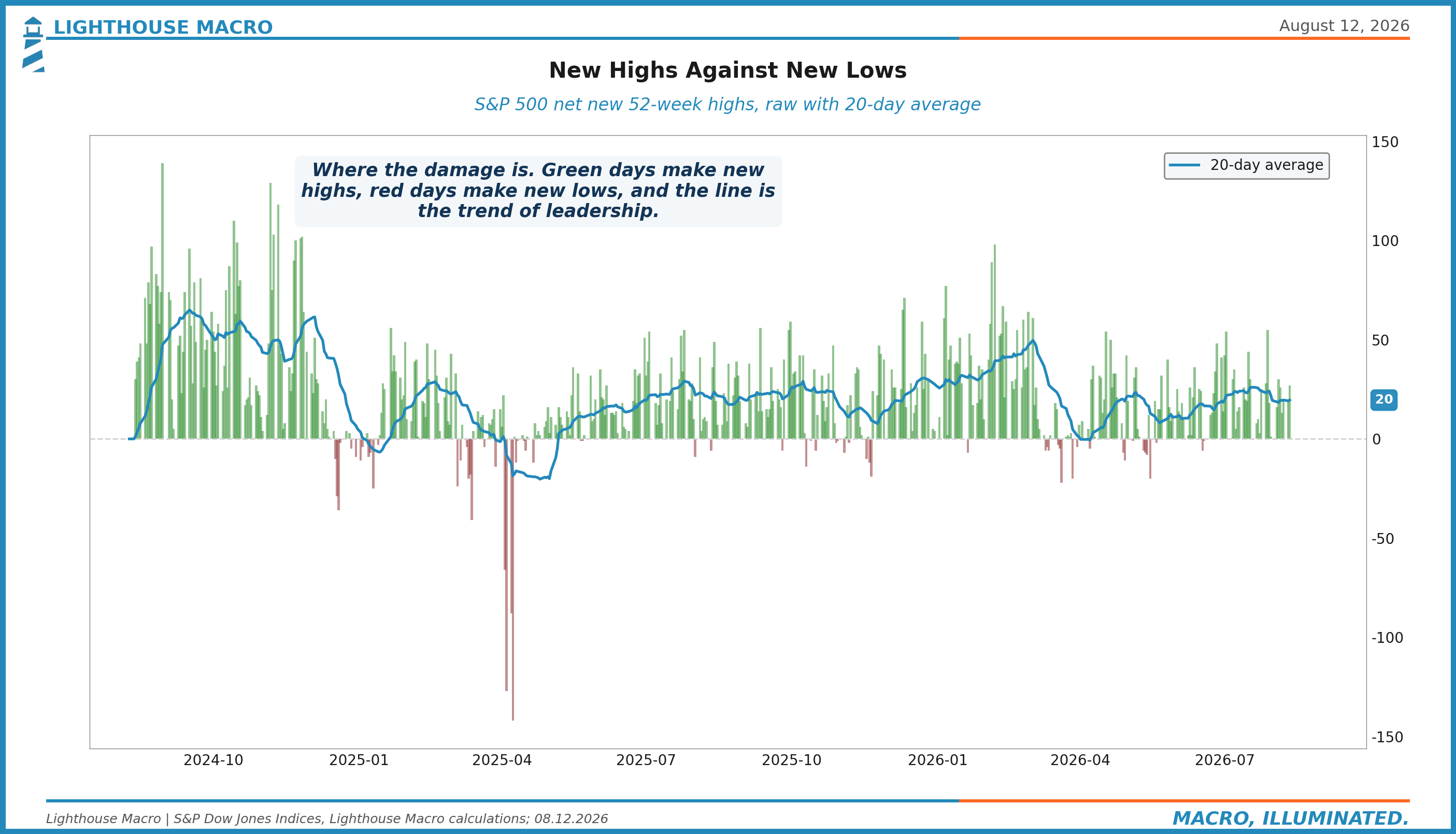
Chart 33. Net new 52-week highs, raw with the 20-day trend. Where the damage is, and currently there is not much.
12. Sentiment
Contrarian at extremes only, and one of these is at an extreme.
Chart 34. AAII bulls minus bears, the retail truth serum, euphoria and capitulation shaded. Contrarian at extremes only.
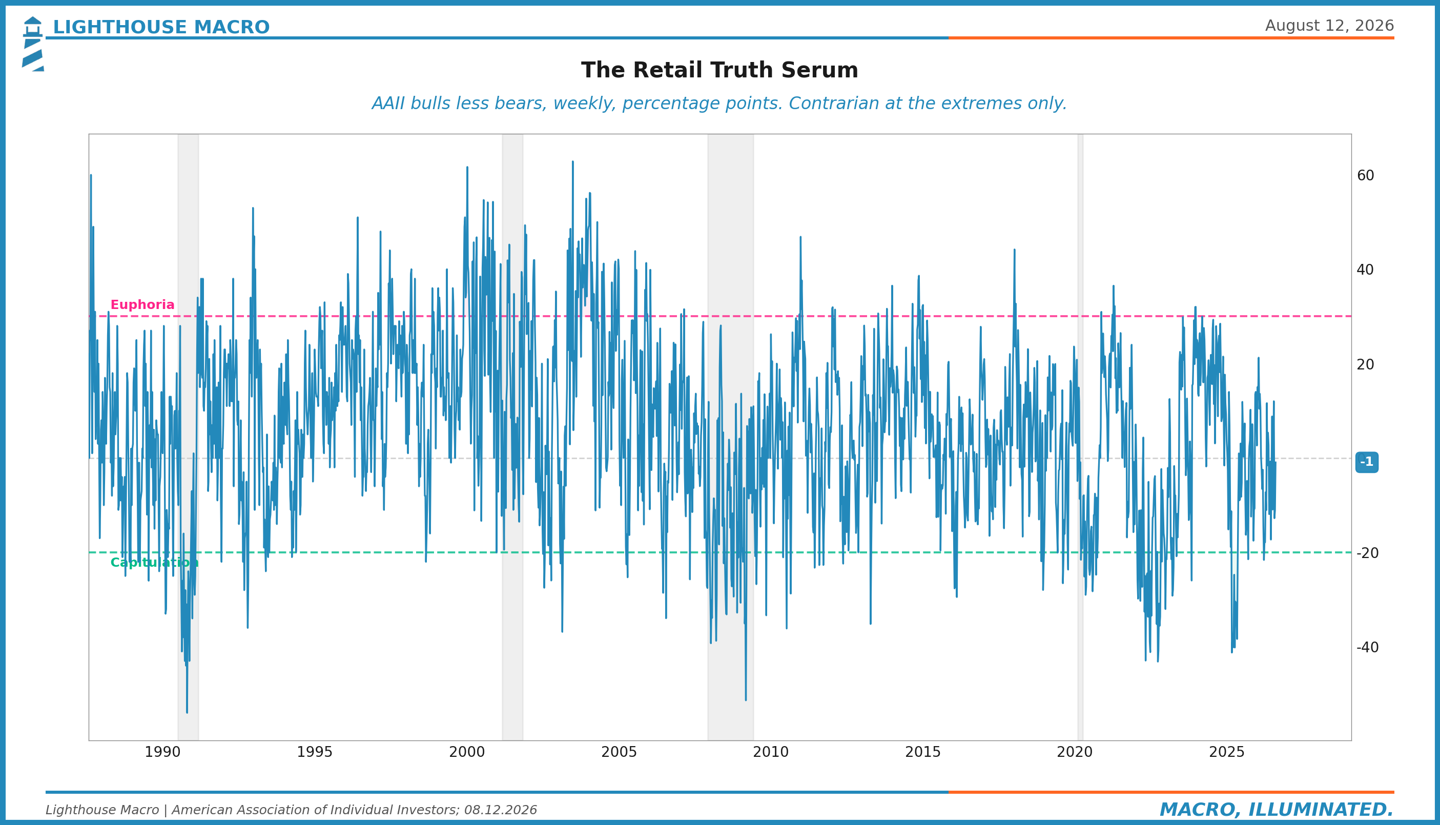
Chart 35. Equity insurance against credit insurance, asleep at the same time, into a negative payroll month.
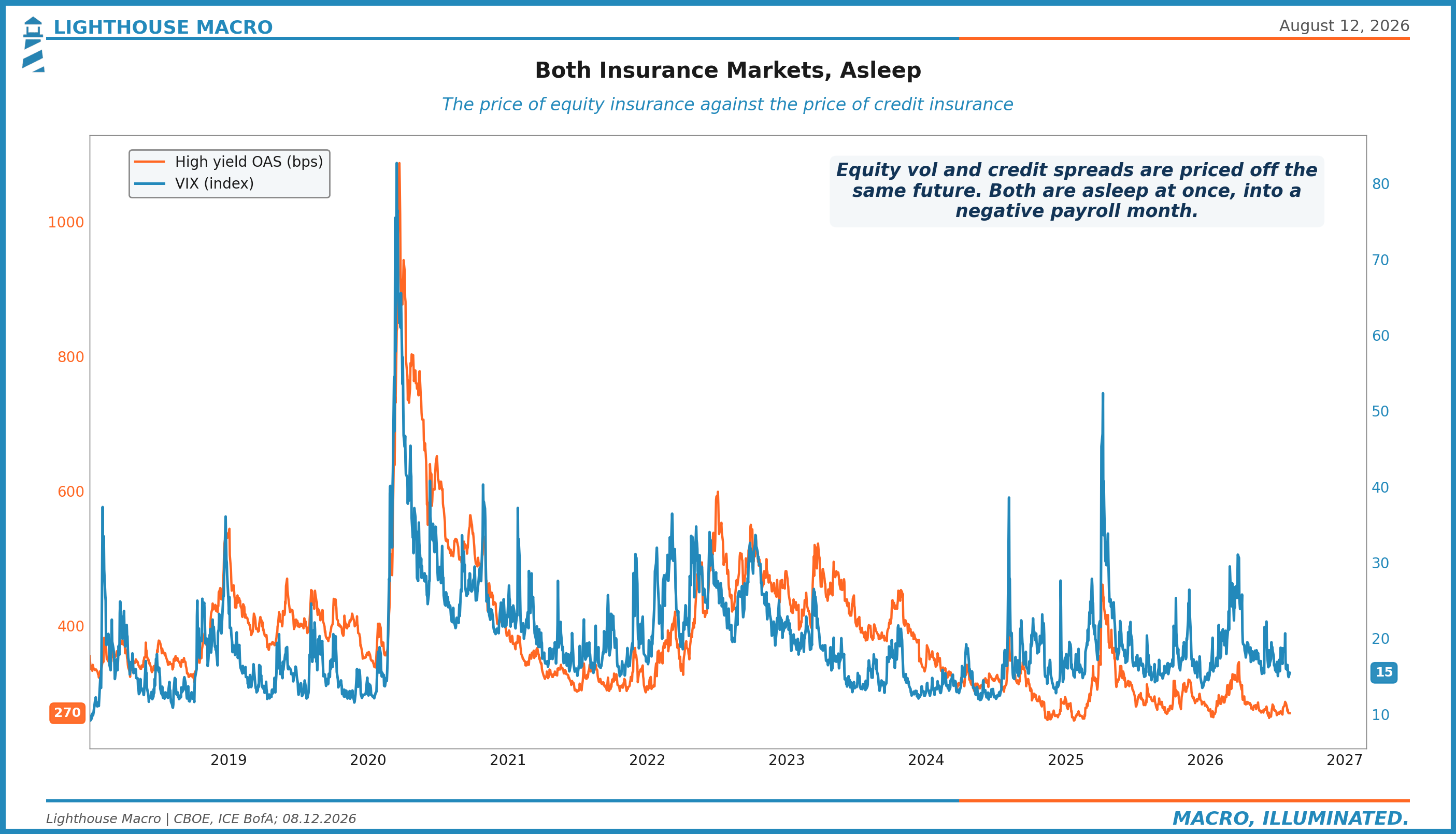
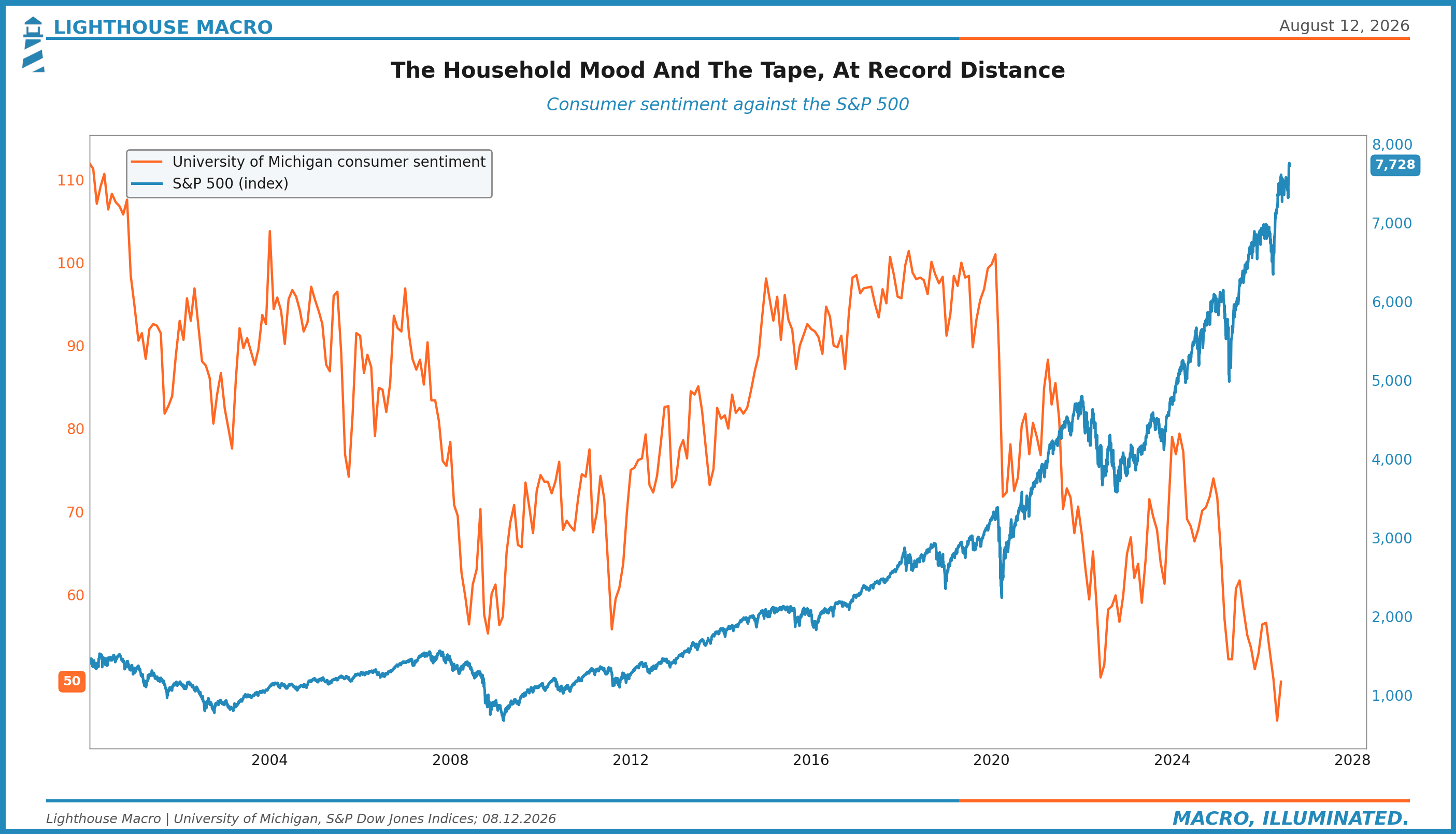
Chart 36. Consumer sentiment against the index: the household mood and the tape, at record distance.
That is the full board. The market spent last week celebrating a story that requires wages it does not have, priced by a credit market that is not watching the one pillar that broke. We have been wrong about the timing of this disagreement before, and we have said so each time. But the labor market has now done the thing, the put did not show, and the price of being early just got a lot smaller than the price of being wrong.