

Markets Turn in Order
The Beacon · June 6, 2026

The leading reads were flashing for weeks while credit and volatility slept. Friday was the tape catching up to an inside that had been coming apart since February.
Markets do not turn all at once. They turn in order.
The leading parts go first, quietly, in the places that never make the front page, and the lagging parts go last, loudly, on the day everybody is watching. A framework earns its keep in the gap between those two events. The print broke the tape on Friday, but the story had already broken weeks earlier, and the point is the sequence: the leading reads were flashing for weeks while the lagging reads slept, and what looked like a single ugly session was the moment the surface finally caught up to an inside that had been coming apart for months.
The Sequence Is the Point
Here is the claim, stated plainly so you can hold us to it. The reads that move early were already moving. Breadth internals had been hollowing out since February. The term premium was sitting at the top of its own range, dragging the long end higher for a reason that has nothing to do with growth. Real rates had pushed to fifteen-year highs. All of that was true before Friday. The reads that move late, credit and volatility, were still asleep. So when the May payroll print landed hot and the tape finally cracked, it was the surface catching up to a structure that had been failing for weeks.
That is the whole thesis. What leads is the internals, the term premium, the real cost of money. What lags is price, and price is what most people call “the market.”
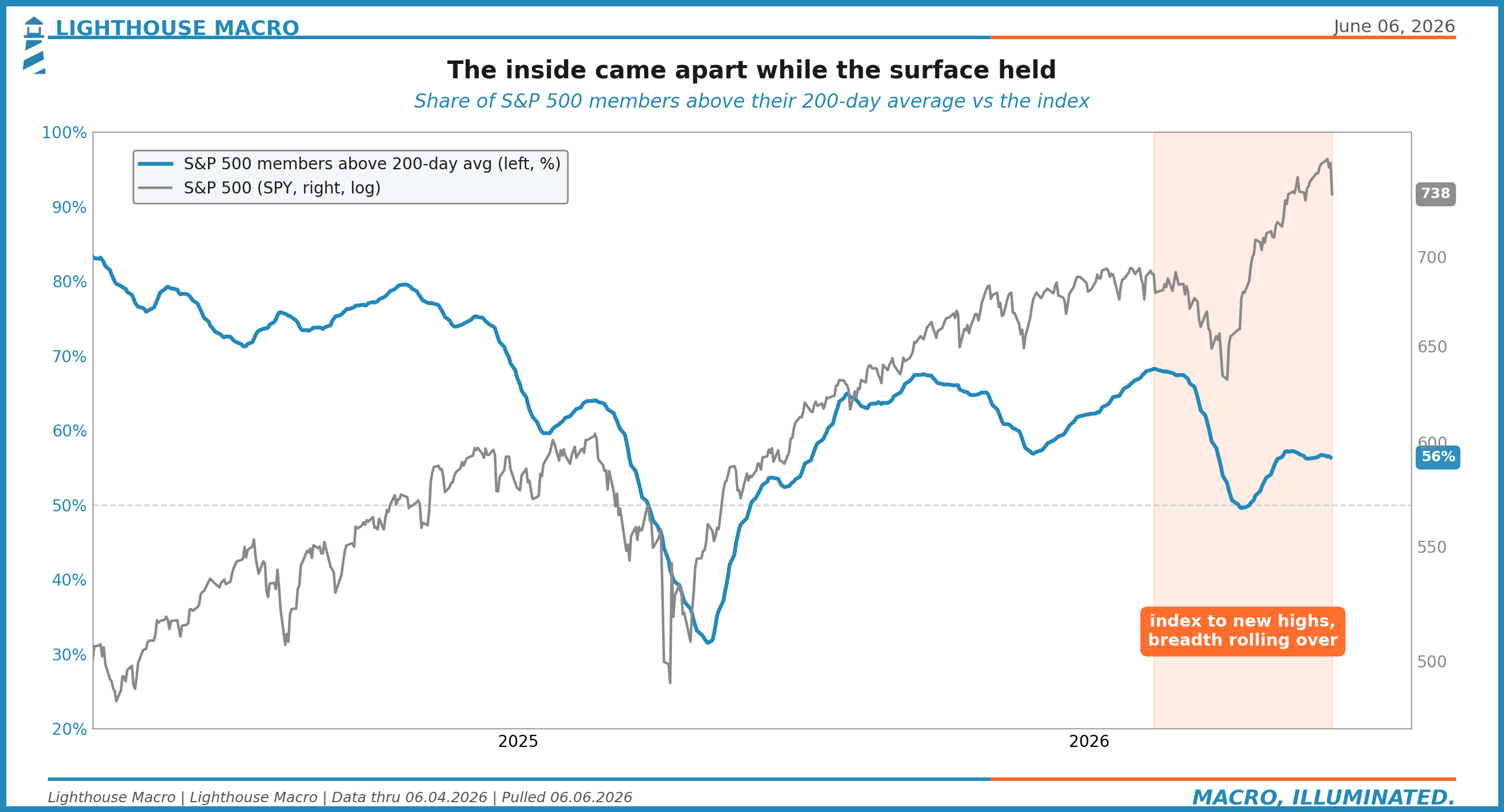
The index made new highs into early June. Underneath it, fewer and fewer names were participating. By the time the headline made its high, only a slim majority of the five hundred were even above their own long-term trend. The surface said all-time high. The inside said fewer soldiers carrying the flag every week. That is distribution, and it had been running for four months in plain sight.
What Actually Happened on Friday
The proximate cause was the jobs report. May payrolls came in at +172,000 against a consensus near 80,000. On the headline, that is hot, more than double what the street penciled in. The reflex read was simple: strong labor, no cuts, sell duration. And the tape obliged.
The S&P 500 had its worst day since October, closing around 7,384. The Nasdaq fell more than four percent. A nine-week winning streak ended. It was the first down week in ten. Those are real numbers and they hurt, and we are not going to dress them up.
But pay attention to what fell together, because this is where the easy story breaks. On June 5 the Dow dropped 1.35 percent and the Russell 2000 dropped 3.5 percent. Both. At the same time. There was no clean rotation out of the megacaps and into the forgotten old-economy names, no healthy passing of the baton from growth to value. Small caps and cyclicals went down with the giants. When everything sells at once, that is money leaving risk, not a baton pass.
The semis took the worst of it over several sessions. Broadcom fell about 3.8 percent on June 5 after failing to raise its AI outlook, and the larger double-digit damage you may have seen quoted was the cumulative multi-session slide across Micron, AMD, and Intel, not one name on one day. The difference matters. A cluster of AI-adjacent names repricing over a week is a story about crowded positioning unwinding, not a single earnings miss.
And the labor headline itself deserves a second look. The headline was hot, yes. Underneath it, the quits rate is rolling toward the 2.0 line, the level that historically marks workers losing the confidence to walk, and initial claims are grinding higher. That is late-cycle flow softening hiding under a strong stock number. The headline is the lagging read of the labor market. The flows are the leading read. Same pattern, one layer down.
The Real-Rate Back-Up
This is the part the consensus is most likely to get backwards, so we are going to spend real time on it.
When yields back up, the lazy interpretation is inflation. Prices are running, the Fed will have to stay tight, term yields rise to compensate. Sometimes that is right. This time it is not, and the bond market itself tells you why.
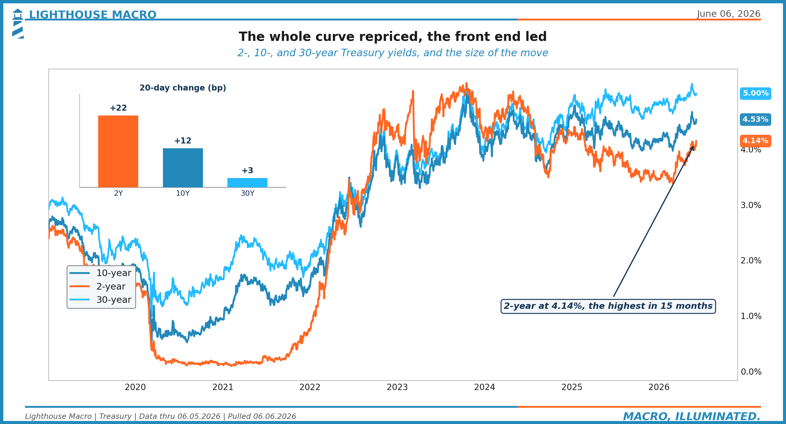
The front end led. Over the last twenty trading days the 2-year climbed twenty-two basis points while the 30-year barely moved, up three. When the short end leads a sell-off, the market is repricing the policy path, not a long-run inflation scare. It is saying the Fed will be higher for longer, or higher again, before it is saying inflation has gotten loose.
Now decompose the long end into its two pieces, the real yield and the inflation compensation buried inside it.
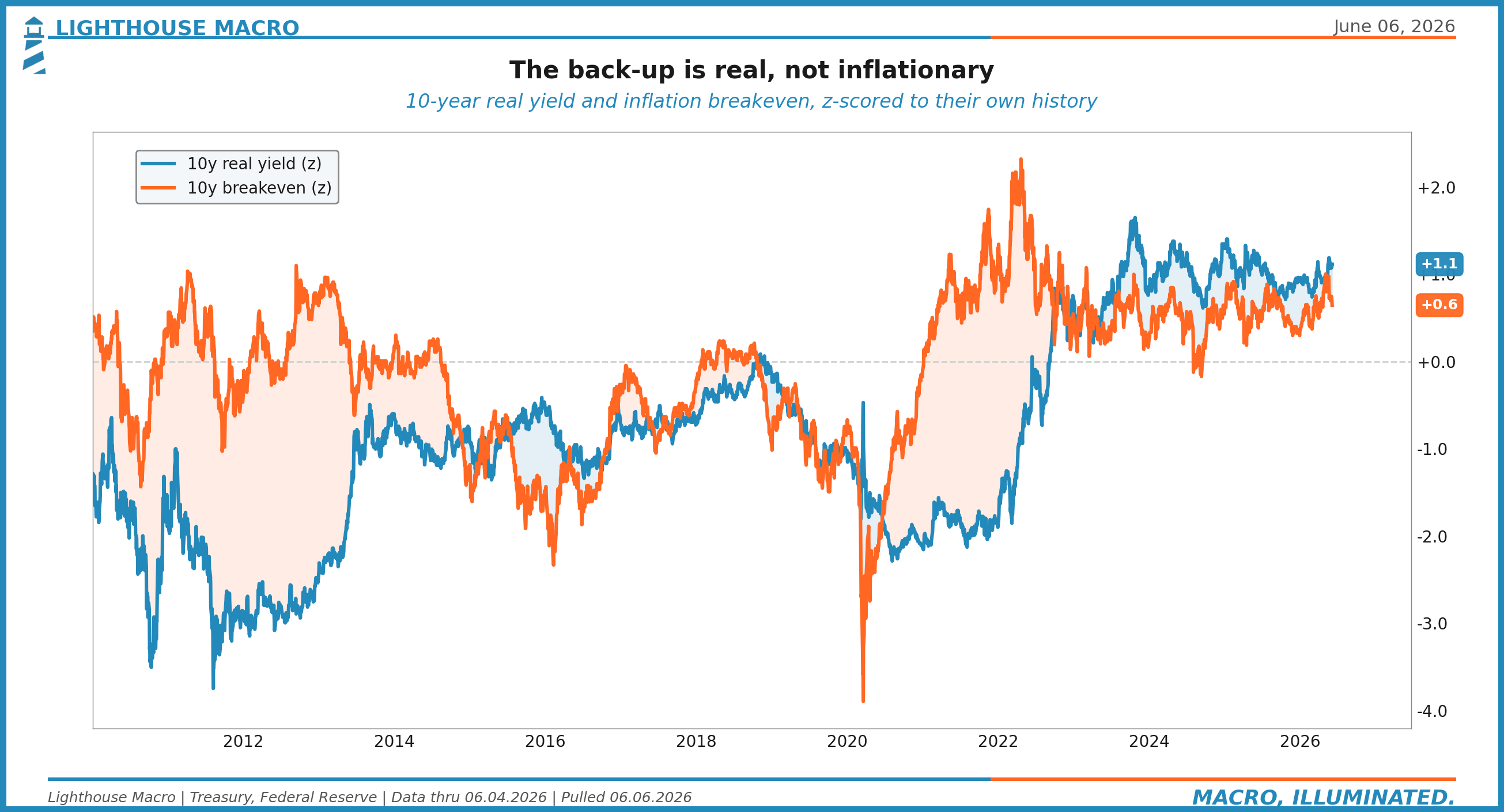
The real yield is at +1.1 standard deviations on our scale, with the actual real rate near 2.1 percent, the high end of its fifteen-year range, though still shy of the late-2023 peak near 2.5 percent. The breakeven, the market’s inflation expectation, is at +0.6, with the number near 2.36 percent. Real is running hotter than inflation compensation. That is the signature of a real-rate-driven move. The bond market is demanding more yield because the real cost of money is rising, and because someone has to be paid to hold a lot of long-dated government paper. It is not demanding more yield because it fears prices.
One honest caveat, because the inflation read is not a clean grind lower. That 2.36 percent breakeven is a pullback from a mid-May spike near 2.50 percent, when a Middle East oil scare briefly pushed inflation expectations up. So the breakeven coming down is partly the unwind of an oil fright, not a serene fade. The conclusion holds, the move is real-rate-led, but we want you to see the texture, not a smoothed cartoon.
What Is Actually Carrying the Long End
If the back-up is real and the front end is leading the policy path, what is doing the work at the very long end of the curve? This is where one of our proprietary lenses earns its place in the argument.
We track the 10-year term premium through what we call the Fiscal Pressure Index. Term premium is the extra yield investors demand to hold a long bond instead of rolling short ones, and it captures the part of the long rate that is not about expected policy at all. It is about supply, about deficits, about who is willing to fund the government at the long end and at what price.
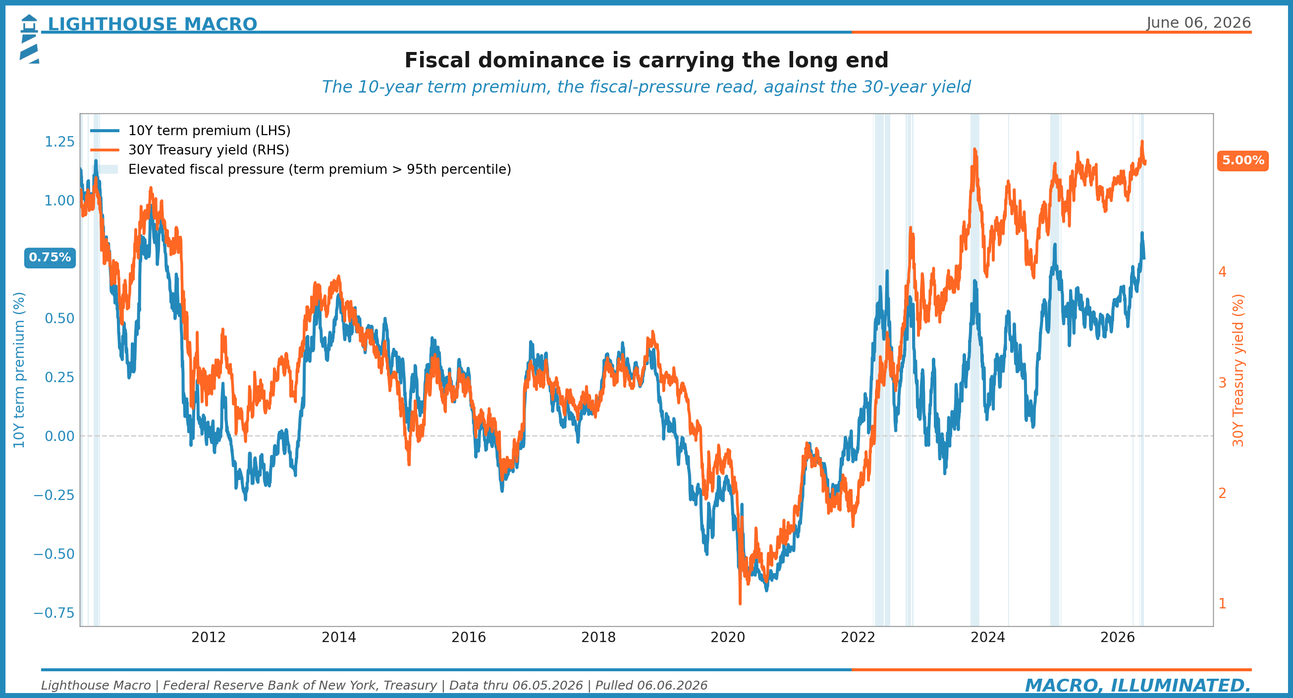
The Fiscal Pressure read is above its 95th percentile against its own recent history, around 0.75 percent, above where it peaked in 2023. That is the engine under the 30-year. The long bond is near five percent because the market is demanding a fatter cushion to absorb the supply, not because anyone expects five percent inflation for thirty years. This is fiscal dominance showing up in a price. The deficit has a yield now, and you can read it off the curve.
That is the leading-read story in three figures. Breadth thinning since February. The front end leading the repricing. The term premium carrying the long end. None of it required Friday’s print to be visible. All of it was visible before.
The Laggards Were Still Asleep
Now turn to the reads that move late, because their silence is the tell.
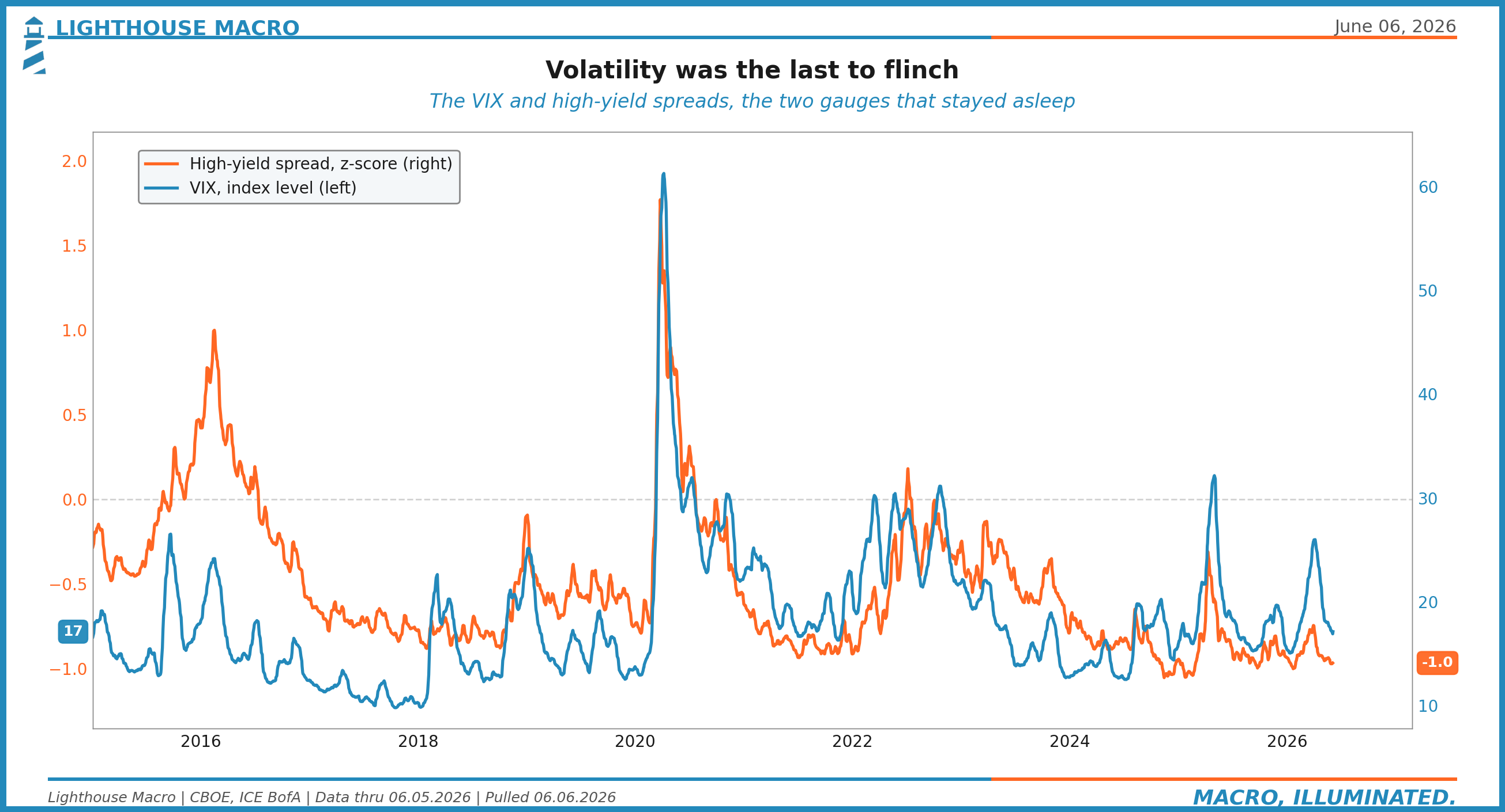
Volatility spent months pinned near its lows. It did not start pricing risk while breadth was hollowing out, while the term premium was climbing, while real yields were grinding to multi-year highs. It waited until the tape broke, then jumped about forty percent in a session to a 20-handle. That is the textbook behavior of a lagging read. It reacts to price, it does not lead it.
Credit is the other laggard, and credit is still sleeping at the tights.
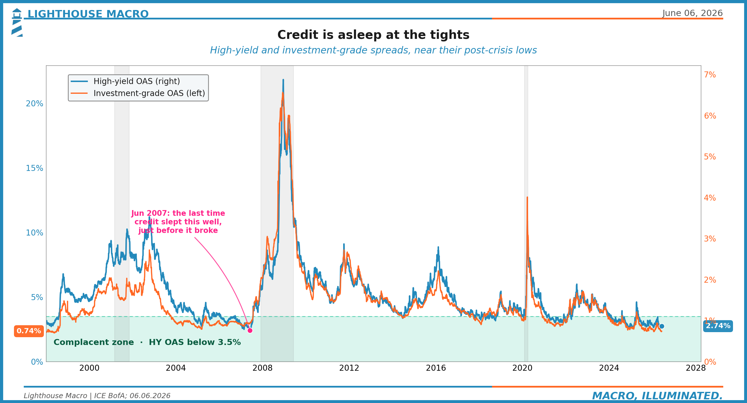
High-yield spreads sit near 2.74 percent, investment grade near 0.74 percent, both close to the lowest levels since the financial crisis. Spreads this tight say there is no default risk worth pricing. And the historical rhyme is uncomfortable. In 2007, investment-grade spreads camped out near 80 basis points well into the year, looking calm, looking fine, right up until they were not. The blow-out came after, with high-yield gapping toward eighteen points the following year. Tight spreads here are a sign that the part of the market that prices safety has not looked up yet.
Here is what makes the credit calm more than just complacency, and this is where the word camouflage earns its keep. Underneath the public index spreads, private credit is already cracking. The private credit default rate is running at 6.0 percent on a trailing-twelve-month basis, a record by Fitch’s count. Business development companies have been gating redemptions, slowing the door so investors cannot all leave at once. And once you count liability-management exercises, the polite restructurings that keep a loan from being formally tagged as a default, the leveraged-loan default rate runs close to double the clean number. The public tape shows you 2.74 percent and a quiet VIX. The private books show you something else. The stress is real. It is just wearing camouflage, off-exchange, marked quarterly, out of the index.
Credit Is Ignoring the Labor Read
Our second proprietary lens makes the credit complacency precise. We call it the Credit-Labor Gap, and it does one thing well: it measures whether credit markets and the labor market are telling the same story.
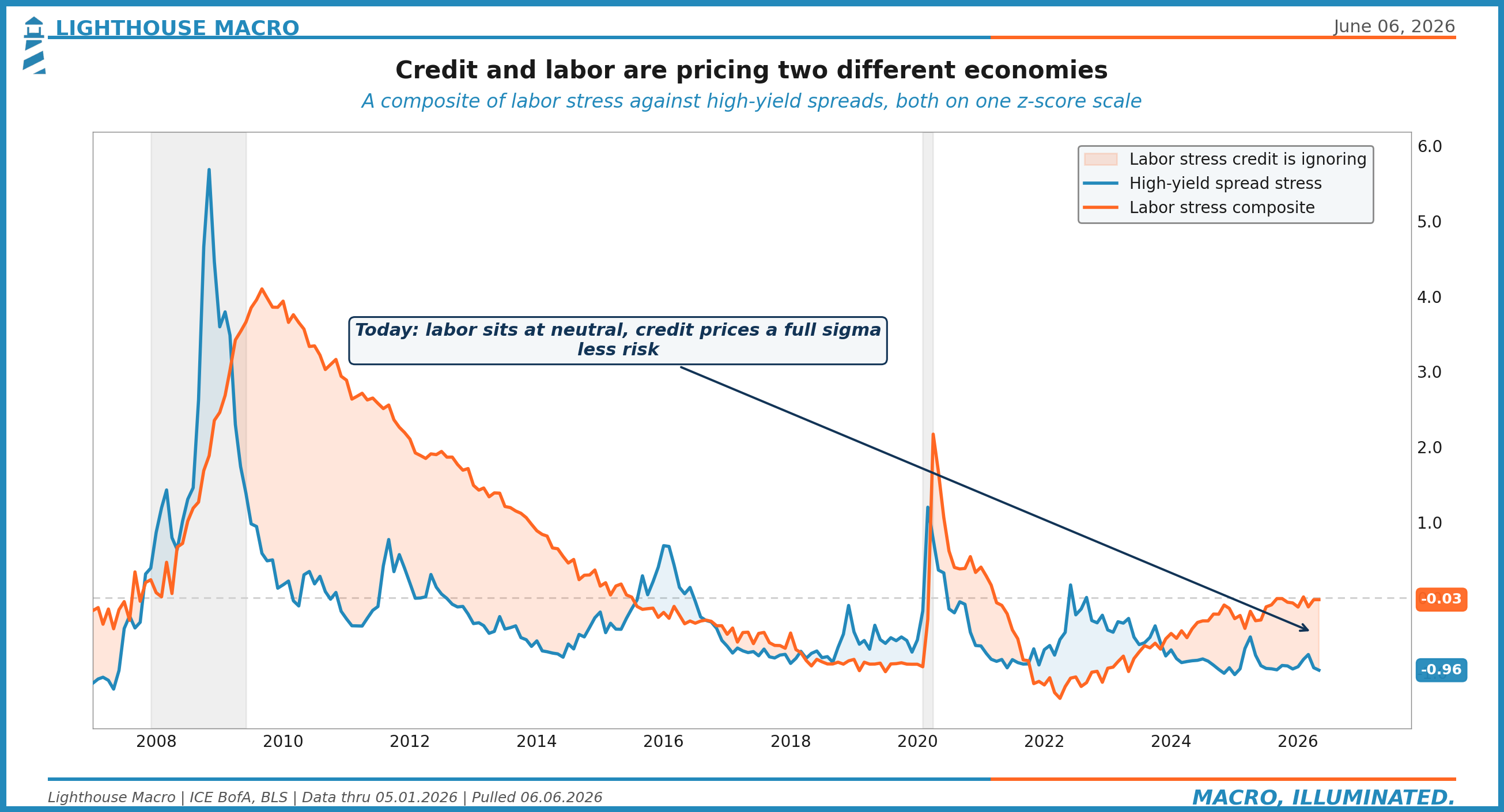
Read it carefully, because the honest version is more interesting than the dramatic one. The labor side is neutral, a z-score of roughly -0.03. Labor is not screaming. It is not stressed. It is sitting right at its average. So we are not going to tell you the jobs market is falling apart, because the composite does not say that.
The credit side is the problem. High-yield spread stress is at -0.96, nearly a full standard deviation into complacency. So the gap is this: credit is pricing a full sigma less risk than even a merely neutral labor backdrop would justify. The two are not looking at the same economy. Labor says fine. Credit says better than fine, nothing to see. When credit is this much calmer than the rest of the data warrants, the gap usually closes the hard way, with spreads moving toward the data rather than the data drifting up to meet the spreads.
Breadth Was Rolling Over for Months
We showed you one breadth read at the top. Here is a second, independent one, because a single internal can mislead and two pointing the same way is harder to wave off.
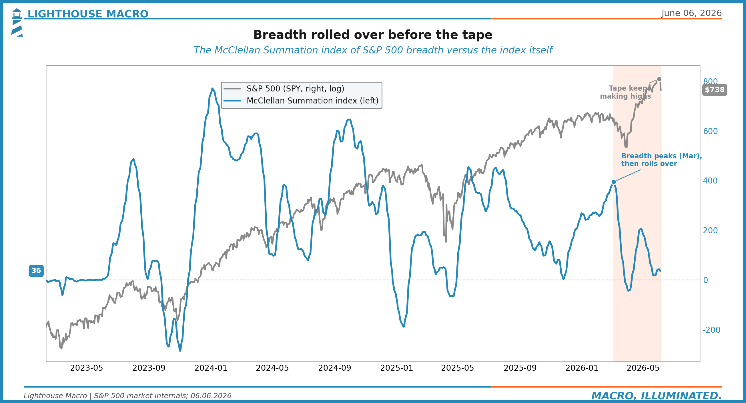
The McClellan Summation Index is a longer-horizon measure of advancing versus declining issues, a way of asking whether the broad market is accumulating or distributing. It peaked in early March near 394. It then fell off a cliff, collapsing toward 36, even as the headline index kept printing new highs into June. Two different breadth tools, measured two different ways, both saying the same thing months apart from the price high. The participation was draining while the index climbed.
This is the same shape as the share-above-the-200-day chart, and it is the same shape as the labor flows under the labor headline, and it is the same shape as private credit under public spreads. Surface up, inside down. The non-confirmation was not subtle and it was not new. It just was not on the front page.
And it sits on top of a concentration problem that makes the thin breadth more dangerous, not less. The top ten names are roughly 40 percent of the index, a higher share than the dot-com peak. The other four hundred ninety carry the rest. When breadth narrows in a market that concentrated, the index can keep rising on a handful of names long after the typical stock has rolled over. That is exactly what the figures show. The flag stayed up because ten people were holding it.
A Hawkish Bear-Flattening
Put the rate move and the policy path together and the curve gives you a clean read.
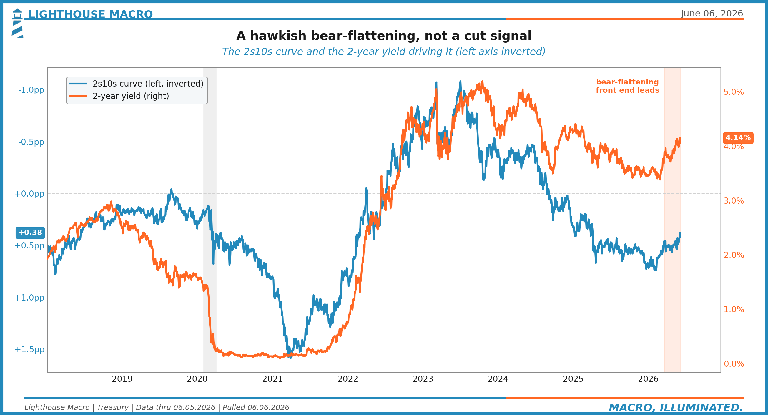
The 2s10s spread sits near +38 basis points and it flattened on the way up, with the front end leading. There are two ways a curve flattens. One is friendly: the front end falls because the Fed is about to cut, the long end holds, the curve steepens later as relief arrives. That is a bull-steepening setup and it is what risk assets want. This is the other kind. The front end rose and dragged the curve flatter, a bear-flattening, the market pricing tighter policy for longer. The curve is signaling resolve.
And the path has moved with it. The market has flipped from pricing cuts to pricing a hike by year end. We are not going to put a precise probability on it, because the number bounces around and pretending to three-decimal certainty is its own kind of dishonesty. The direction is the point. The conversation has shifted from “when do they cut” to “do they have to go again,” a regime change in expectations that happened underneath a stock index sitting at all-time highs.
Two Economies in One Print
Step out of the bond market for a moment, because the same divergence that runs through credit and breadth runs through the household data too.
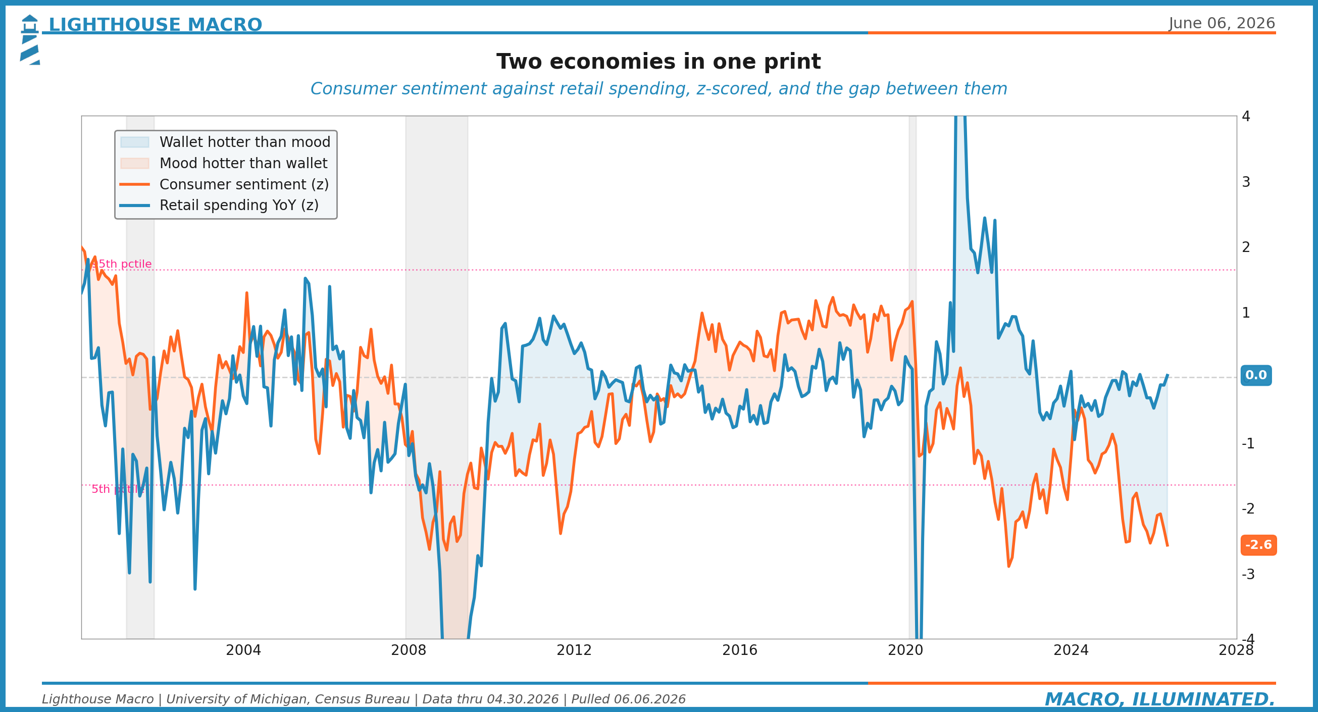
Consumer sentiment is at -2.57 standard deviations, a record low mood. People feel terrible. And yet retail spending is at +0.03 year over year on our scale, essentially average. The wallet is still moving even though the mood has cratered. That gap between how people feel and what they spend is the two-economy signature, and for us it is the thing that decides how you read the American consumer right now.
It resolves the way these things always resolve, by cohort. The top of the distribution has assets, the assets went up, and that cohort keeps spending no matter what the survey says. The bottom of the distribution lives on wages, and real average hourly earnings have turned slightly negative year over year. Their paycheck is buying a little less than it did a year ago. That is who answers the sentiment survey with a record low and who keeps the headline spending number from rolling over only because the top cohort is carrying it. One print, two economies. The aggregate hides the split, and the split is the story.
Oil Round-Tripped, the Rate Move Did Not
Oil is the obvious place a skeptic would look to call the rate move inflationary after all. It does not hold up.
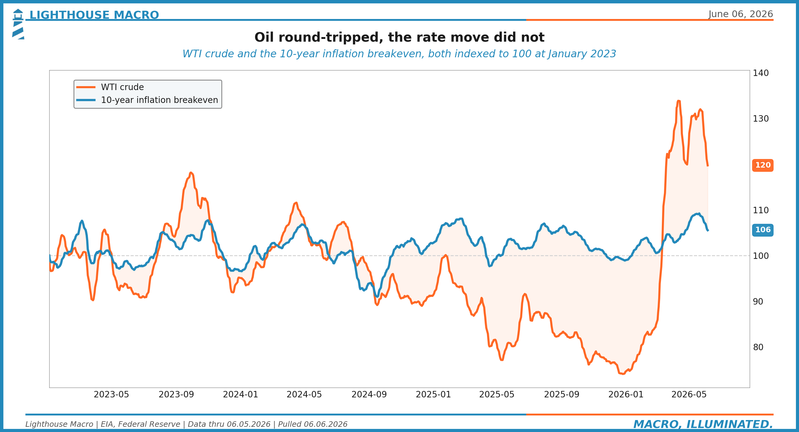
Crude spiked when the Strait of Hormuz scare hit, the same scare that briefly pushed breakevens to 2.50 percent in mid-May. Then it round-tripped, back to roughly $90.54 by June 5. And here is the tell: oil gave it all back, but the rate move did not. If the yield back-up had been an oil-and-inflation story, yields would have eased as crude retraced. They did not. The breakeven settled back near 2.36 percent and the real yield kept climbing. The reflation cover is gone. Strip out the oil round-trip and what is left is a clean real-rate move, which is exactly what the term premium told us in Figure 4.
The Dollar Says Stress, Not Yet Global
One more cross-check. The external channel.
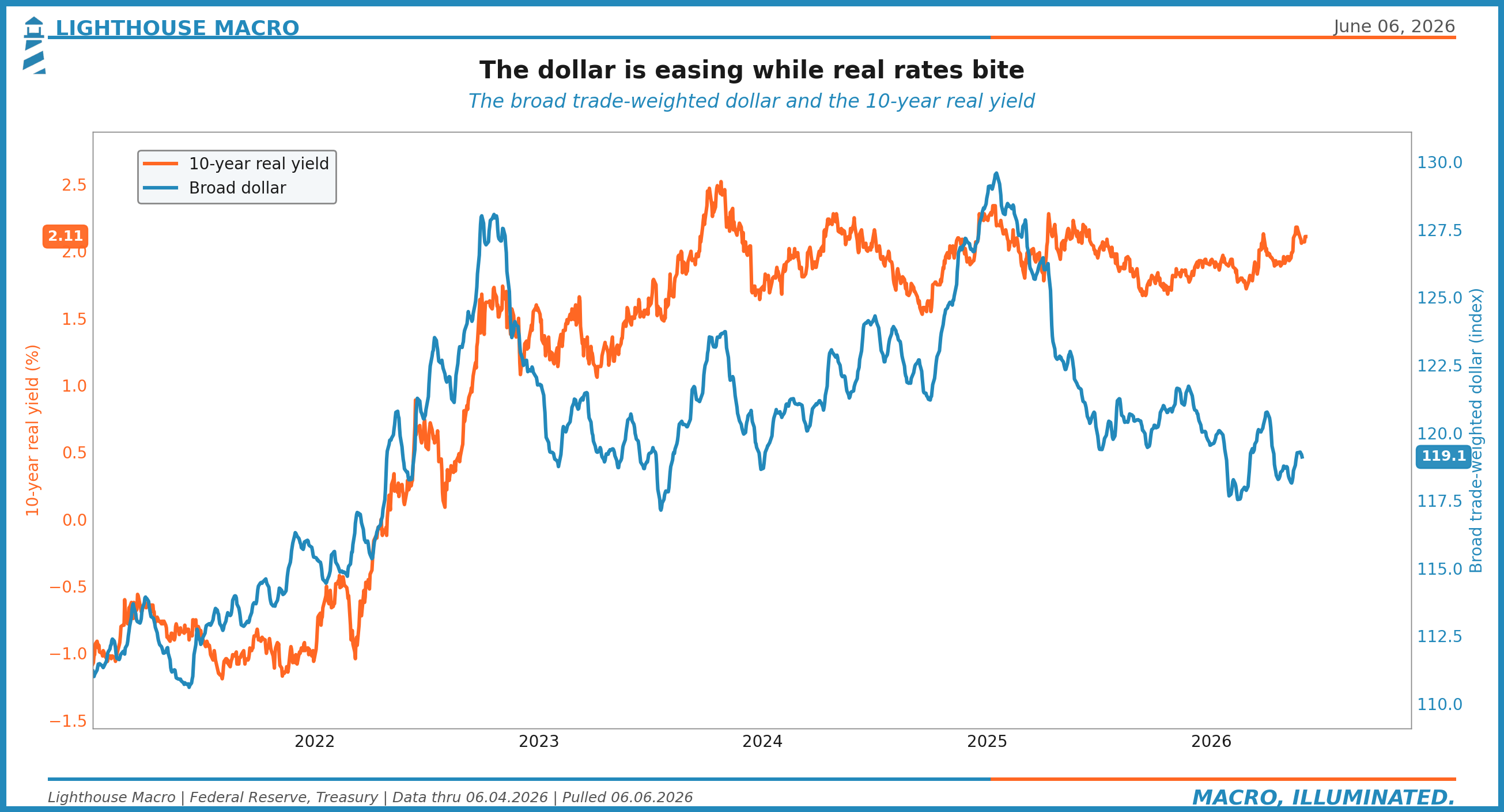
Normally, rising real yields pull the dollar up as capital chases the higher real return. This time the broad trade-weighted dollar is off its highs even as real yields rise. The external channel, the one that transmits US tightness to the rest of the world through a strong dollar, is actually loosening a touch. The internal channel, the real cost of money at home, is tightening hard. That combination tells you the stress is domestic for now and has not yet spilled into a global dollar squeeze. It is a relief valve, and it is worth watching, because if the dollar turns and joins the real-rate move, the stress stops being a US story.
This Was Not a One-Session Panic
It would be comfortable to file Friday under “bad day, moving on.” We do not read it that way, and the reason is the calendar. Two events sit directly ahead, and both can extend this rather than end it.
The first is the May inflation report on June 10. Consensus has core around 2.8 to 2.9 percent, soft. And here is the counterintuitive part that we want to be very clear about: the dangerous print for risk is the soft core, not a hot headline. A hot headline this month is mostly oil, and the Fed looks through oil. A soft core, though, takes away the market’s excuse to keep dreaming about cuts in a world where the front end is already pricing the opposite. The soft print removes the last reason to disbelieve the curve.
The second, and the bigger one, is the FOMC on June 16 and 17. The decision itself is close to a foregone hold. The event is the projections. Whether they drop the last cut from the dot plot, whether the dots shift up, that is what moves markets, not the rate line. And this is the first meeting under the new chair, who has been clear about wanting a steeper curve and more term premium, pursued through balance-sheet composition: shorter holdings, less mortgage exposure, more bills. If that intent shows up in the projections, the term premium story in Figure 4 stops being a passing reading and becomes policy, and the thing carrying the long end gets an official sponsor that is unlikely to step back for a long time.
So this is not one ugly session to shake off. It is a setup with two near-term catalysts that can confirm it.
What It Means If You Do Not Trade It
Most of the people who read us do not trade a book, and this section is for you. You run a business, you sign the checks, you plan the year. Here is what the framework says you should take from all of this, in plain terms.
The cost of capital just went up, and it went up for the durable reason. This is not a temporary inflation spike that the Fed will cut its way out of in a quarter. The real cost of money is rising and the term premium is rising with it, which means borrowing long is more expensive and likely to stay that way. If you are financing anything multi-year, a buildout, an acquisition, a real estate decision, the rate you get quoted now is not a fluke to wait out. Plan around it.
Your demand base is splitting. The top-cohort consumer is fine and will keep spending. The bottom-cohort consumer is feeling a record-low mood and a paycheck that buys slightly less than last year. If you sell to the broad middle and lower end, the softness in sentiment is going to show up in your receipts before it shows up in any headline, because the headline is held up by the cohort that is not your customer. Watch your own numbers, not the aggregate.
And plan for a widening gap between the economy you read about and the economy you bill. The headline will keep saying the consumer is resilient because the aggregate is resilient, and your receipts may say something else entirely, and that gap will keep widening for as long as assets and wages keep diverging, because it is not a data wobble that mean-reverts next quarter, it is the two economies showing up in your own ledger.
What Would Change Our Mind
Strong views, weakly held. Here is what breaks this read, stated up front so you can hold us to it.
The thesis is wrong if three things happen together, not one of them, all three. Credit spreads have to stay tight, meaning the laggard never wakes up and the camouflaged stress really was nothing. Breadth has to re-broaden, meaning the share above the 200-day turns back up and the McClellan Summation reverses higher, so the inside re-confirms the surface. And real yields have to roll back over, taking the pressure off the term premium and the cost of capital. Tight credit and broad breadth and falling real rates, all at once, and the distribution story dies. We would take the other side gladly, because that is a healthier market than the one we are describing.
Any one of those alone is not enough. Spreads can stay tight while breadth rots, that is just the laggard sleeping longer. Breadth can bounce while real yields keep biting, that is a relief rally inside a downtrend. The three have to come together, because the whole argument is about the reads moving back into alignment from the leading edge in, not the lagging edge out. Until they do, the sequence stands.
We watch the parts that lead, and we wait for the part that lags to catch up. This week it caught up. The inside has been coming apart since February.
The surface finally noticed on Friday.
That’s our view from the Watch. We’ll keep the light on...
Bob Sheehan, CFA, CMT
Founder & Chief Investment Officer
Lighthouse Macro | Research | @LHMacro