

Crypto Liquidity Impulse
How We Track the Money That Actually Moves Bitcoin


Most liquidity indicators tell you where the ocean is. We built one that tells you which way the current is running.
Everyone has a liquidity model now.
Global M2. Net liquidity (balance sheet minus TGA minus RRP). The Hayes framework. The Alden framework. They all capture something real, and we respect the work behind them. But after building Lighthouse Macro’s broader research architecture across 12 macro pillars, we kept running into the same problem: none of the existing liquidity indicators captured how money actually reaches crypto.
Global M2 tells you the tide is rising. It doesn’t tell you whether the water is flowing into Bitcoin or sitting in money market funds. Net liquidity tracks the plumbing but ignores the crypto-native channels that have become the dominant transmission mechanism. And most frameworks are narrative-driven rather than statistically grounded, which makes them hard to size positions around.
So we built one that does all three.
What the CLI Is (and Isn’t)
The Crypto Liquidity Impulse is a weighted z-score composite measuring how fast global liquidity transmits into crypto. Not how much liquidity exists. How fast it’s moving.
That distinction matters. “Impulse” rather than “Stock” because we’re measuring rate of change, the second derivative. Impulse is a flow concept: it captures the acceleration of liquidity transmission, not the cumulative level.
The architecture is three tiers, eight components, spanning from the global macro backdrop down to on-chain capital deployment. Each tier captures a different lead time, and they compound. When all three tiers align, the signal is strong. When they diverge, something interesting is happening.
Tier 1: Macro Liquidity Tide
Lead time: 11-13 weeks. Highest weight.
This is the global backdrop. The tide that lifts (or sinks) all risk assets. Two components.
Global M2 Momentum measures the year-over-year change in broad global money supply. This isn’t controversial. Empirical research on global liquidity transmission shows roughly 40% of Bitcoin’s systematic price variance traces to global liquidity conditions, with Granger causality peaking at weeks 11-13. The debate isn’t whether this matters. It’s whether it’s sufficient. (It isn’t.)
Dollar Direction captures the rate of change in the trade-weighted dollar. Dollar peaks align with BTC cycle bottoms. This is the global risk appetite proxy, the capital flow signal that tells you whether the world is seeking safety or deploying into risk. When the dollar weakens and M2 expands simultaneously, you get the strongest macro tailwind crypto can have.
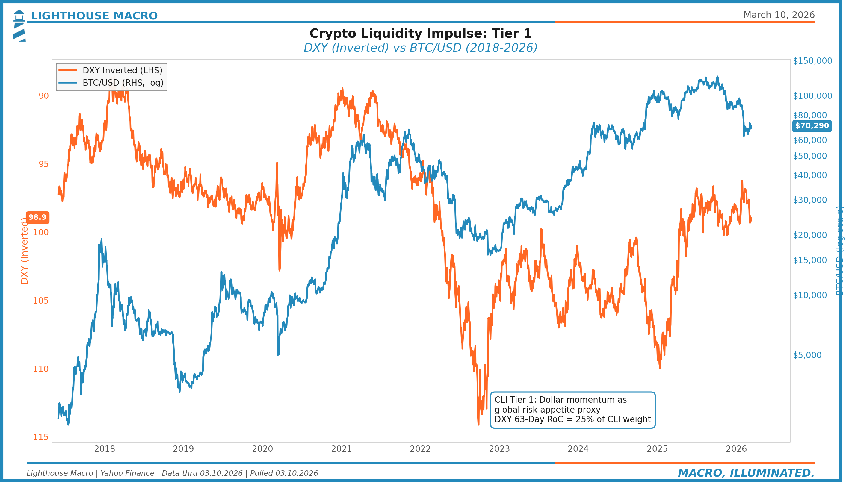
The chart tells the story. The relationship isn’t perfect, and it shouldn’t be. Pre-2020, BTC occasionally moved with the dollar, not against it. But the structural correlation has strengthened as institutional adoption has grown, and the divergences are often more informative than the convergences.
Tier 2: US Plumbing Mechanics
Lead time: 1-6 weeks. Second highest weight.
This is where most crypto liquidity actually originates. The internal plumbing of the US financial system. Five components.
Fed Balance Sheet (WALCL) tracks weekly changes as a proxy for aggregate liquidity supply. Straightforward. When the Fed’s balance sheet expands, reserves increase, and that liquidity finds its way into risk assets.
TGA Drawdown/Buildup Rate is the one most people underestimate. Treasury General Account movements directly affect bank reserves and available liquidity. When Treasury draws down the TGA (spending), reserves increase. When Treasury rebuilds the TGA (issuing debt), reserves decrease. The rate of change matters more than the level.
RRP Facility Balance was the liquidity buffer of 2022-2024. Post-depletion (effectively zero in 2025), this component has changed character entirely. TGA rebuilds now hit bank reserves directly with no cushion to absorb the impact. This is a regime change that most net-liquidity trackers haven’t internalized. Standard net liquidity formulas (BS - TGA - RRP) break when RRP is zero because the denominator of the buffer equation disappears.
SOFR-IORB Spread is the wholesale funding stress indicator. When this widens, money market plumbing is under strain. It’s a 1-4 week lead on broader financial stress.
HY OAS (Inverted) captures credit conditions as a transmission channel. Tight spreads signal risk-on, which is supportive for crypto flows. Wide spreads signal risk-off, which chokes the transmission mechanism.
Tier 3: Crypto-Native Transmission
Lead time: 0-2 weeks. Lowest weight but highest immediacy.
This is the channel that separates CLI from every other liquidity indicator. Macro liquidity can be expanding, plumbing can be accommodative, and crypto can still underperform if the transmission channels are broken. This tier captures whether the money is actually arriving.
Stablecoin Supply Momentum measures the rate of change in aggregate stablecoin market cap (USDT + USDC primarily). Bitcoin Magazine Pro has documented a 95% contemporaneous correlation with BTC. Stablecoins are the on-ramp. When stablecoin supply is growing, capital is entering the ecosystem. When it’s contracting, capital is leaving.
BTC ETF Net Flows (20-day) became a first-order variable after the spot ETF approvals. FalconX Research found an F-statistic of 8.48 (p = 0.004) for Granger causality from ETF flows to BTC price. With US spot Bitcoin ETFs holding roughly 1.3M BTC (approximately 7% of total supply), this channel is no longer marginal. It’s structural.
Exchange Stablecoin Reserves track on-chain capital sitting on exchanges, ready to deploy. This is the “dry powder” signal. High and rising reserves combined with expanding stablecoin supply and positive ETF flows creates the full transmission picture.
The Leverage Regime Filter
Here’s where it gets interesting.
Approximately 17% of the time, crypto positioning dynamics override macro liquidity trends entirely. Perp funding rates are screaming, forced selling or forced buying takes over, and the macro backdrop stops mattering for a while.
Perpetual futures funding rates proxy this leverage buildup. The regime filter is applied multiplicatively after the base composite calculation. When leverage gets extreme, the liquidity signal stops mattering because it’s all about positioning unwind. The filter catches that and adjusts the composite accordingly.
This filter is the difference between a model that works in normal regimes and one that doesn’t blow up during crypto-specific dislocations.
The Backtest
Sample: 2018-2025, roughly 2,900-2,950 daily observations.
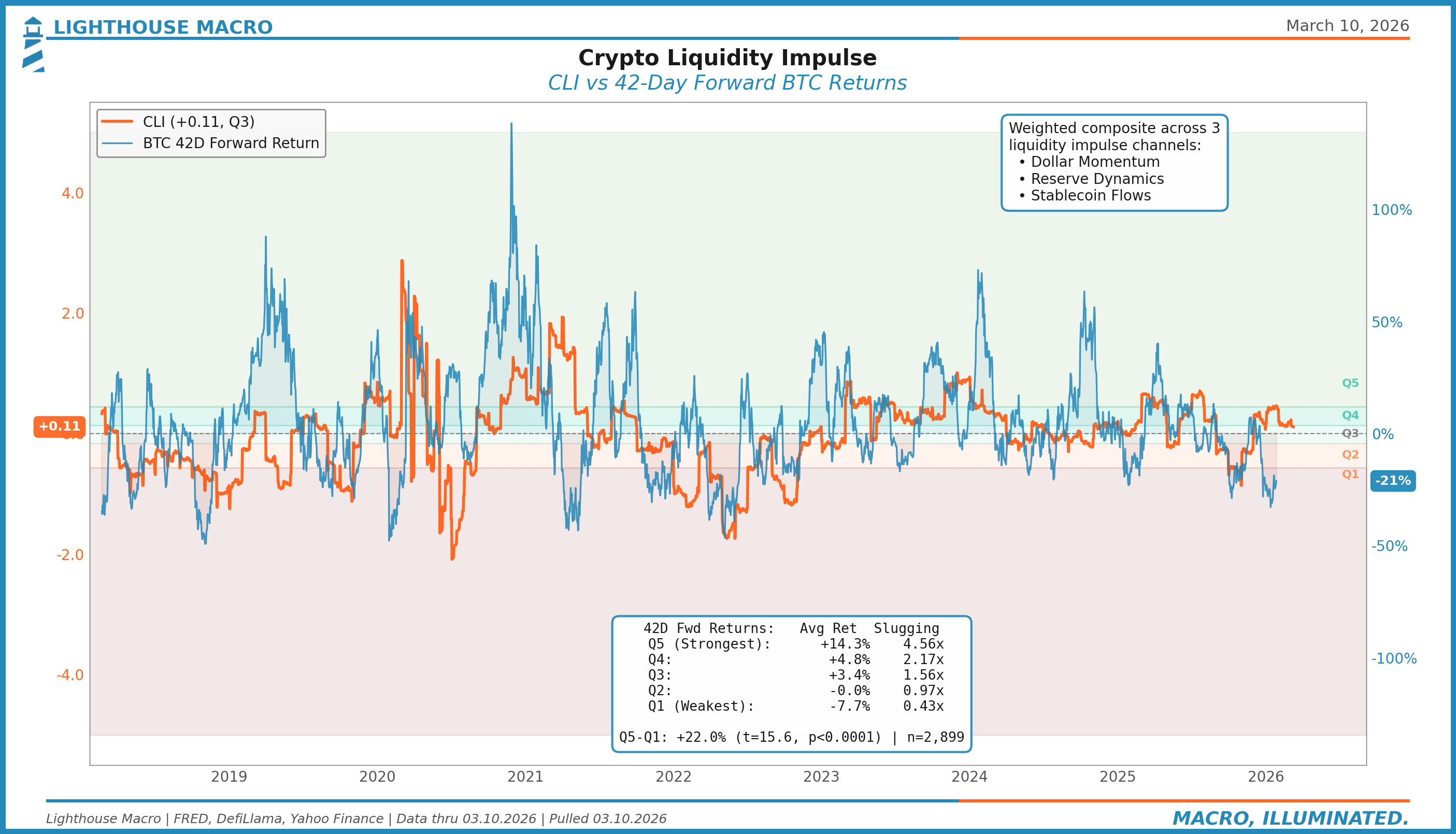
We sorted every day by CLI reading into quintiles and measured forward BTC returns at 21, 42, and 63-day horizons.
Quintile Sort: CLI to Forward BTC Returns
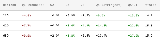
Monotonic at all horizons. Every step up in CLI corresponds to higher forward returns. All p-values below 0.0001.

The quintile chart is the money shot. The monotonic staircase is clean. No inversions, no noise. Q1 to Q5, the relationship holds at every horizon.
Slugging Percentage
This is where it gets conviction-worthy. Slugging percentage measures the ratio of average win size to average loss size.
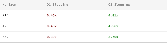
In expanding liquidity environments (Q5), wins are nearly 5x the size of losses at shorter horizons. In contracting environments (Q1), losses dominate by more than 2:1. This isn’t just a directional signal. It’s an asymmetry signal.
Tercile Regime Stats (63-Day Forward)

The expanding regime delivers over 16% average returns over 63 days with a 72% win rate. The contracting regime loses 8.3% with only a 33% win rate. The regime classification alone provides significant edge.
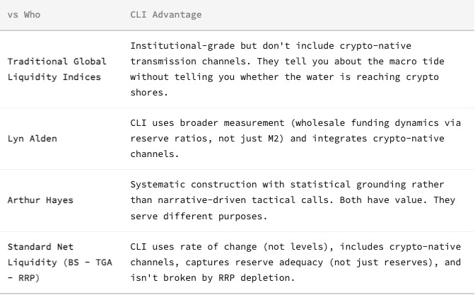
How CLI Differs from What’s Already Out There
This isn’t a criticism of existing frameworks. It’s a scope distinction.
Where We Are Now
CURRENT READING
CLI as of March 10, 2026: +0.11, placing it in Q3 (Neutral).
BTC: ~$70,000 · DXY: ~99 · VIX: ~31
The liquidity impulse has softened since late February. CLI has slipped from the Q3/Q4 boundary back into the middle of Q3 as dollar momentum stabilized and reserve dynamics lost some of their tailwind. The impulse isn’t contracting, but it’s no longer accelerating.
The backdrop is mixed. DXY has held near 99 as safe-haven demand from geopolitical risk offsets rate cut expectations pulled forward by weak labor data. February payrolls came in at -92,000, the worst monthly print since October. That should be dollar-negative through the rate channel, but geopolitical premium is keeping the dollar bid for now.
Meanwhile, price structure continues to diverge from the liquidity signal. BTC momentum (Z-RoC) has been negative, and price has struggled with both major moving averages. Macro liquidity says the impulse is neutral-to-supportive. Price structure says the market hasn’t responded yet.
That divergence either resolves with price catching up to liquidity (bullish) or liquidity rolling over to meet price (bearish). We’re watching which one blinks first.
When This Breaks
Every framework has conditions under which it stops working. Here are ours.
The CLI breaks if the correlation between dollar direction and BTC reverses persistently. It has before: pre-2020, Fed tightening occasionally increased BTC prices as it was still trading as a speculative novelty rather than a macro asset. If Bitcoin reverts to that identity, the macro liquidity channel weakens.
It breaks if stablecoin market structure changes fundamentally. A regulatory crackdown that eliminates the on-ramp channel would sever the Tier 3 transmission mechanism.
It breaks if reserve dynamics decouple from risk asset transmission, implying a structural regime shift in Fed operations.
And it breaks if Bitcoin’s correlation to macro liquidity collapses entirely as it transitions to a different asset class identity (pure store-of-value, for instance, with gold-like correlations rather than risk-asset correlations).
We don’t think any of these are imminent. But we list them because the framework can be wrong, and you should know under what conditions it would be.
What’s Public, What’s Not
Architecture, components, tier structure, and empirical results: public. That’s everything above.
Z-score calibration methodology, normalization windows, outlier treatment, component weights, and regime filter parameters: proprietary. That’s how the indicator is actually built.
We share the framework because the logic should be scrutinized. We keep the calibration because that’s the edge.
Bob Sheehan, CFA, CMT | Founder & Chief Investment Officer
Lighthouse Macro | @LHMacro
The tiered structure here is interesting because it acknowledges that liquidity isn’t just a macro condition. It has to transmit through specific channels before it affects an asset. That transmission step is where many traditional liquidity models break down.